The Challenge
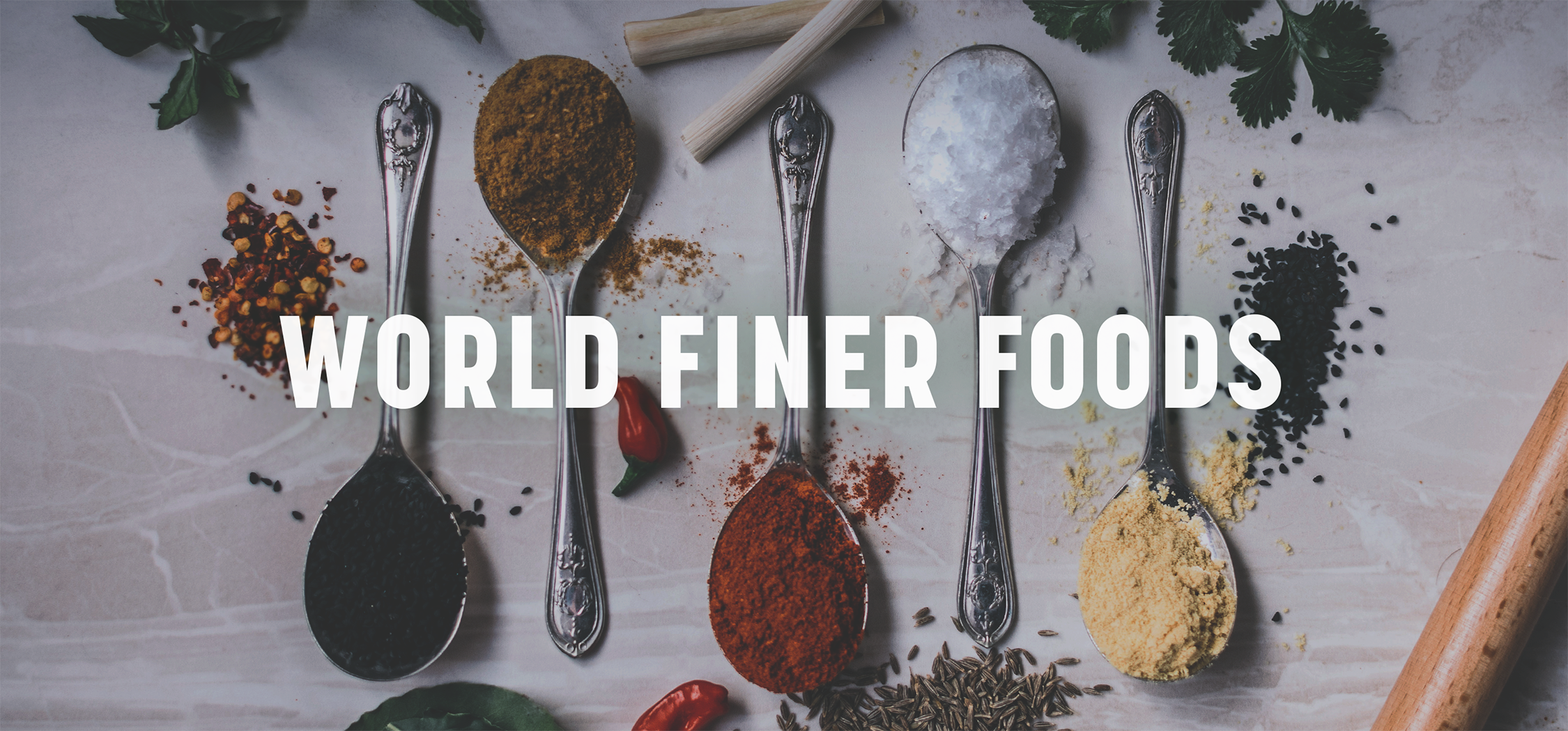
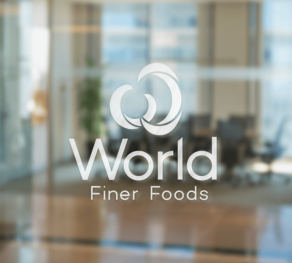
World Finer Foods is a major distributor of premium specialty food, beverage and personal care brands. They were looking to define their company’s core brand attributes and visualize them with a new corporate identity. The goal was to capture the essence of the company’s personality in a way that would be true to their vision and compelling to customers and clients.
Agency Services
Strategy & Positioning
Visual Identity/Logo Design
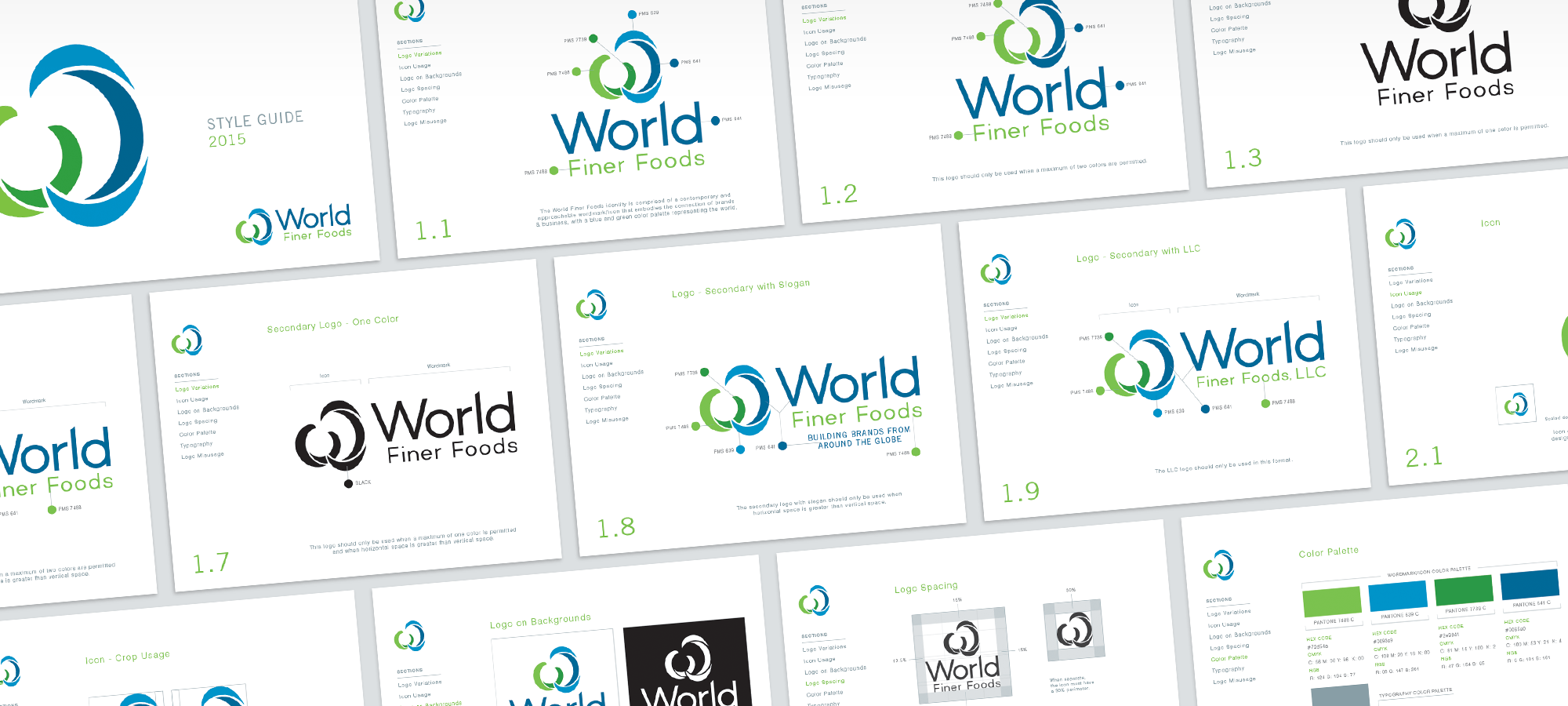
Brand Standards
Marketing Materials
Print-Ready Files

The Solution
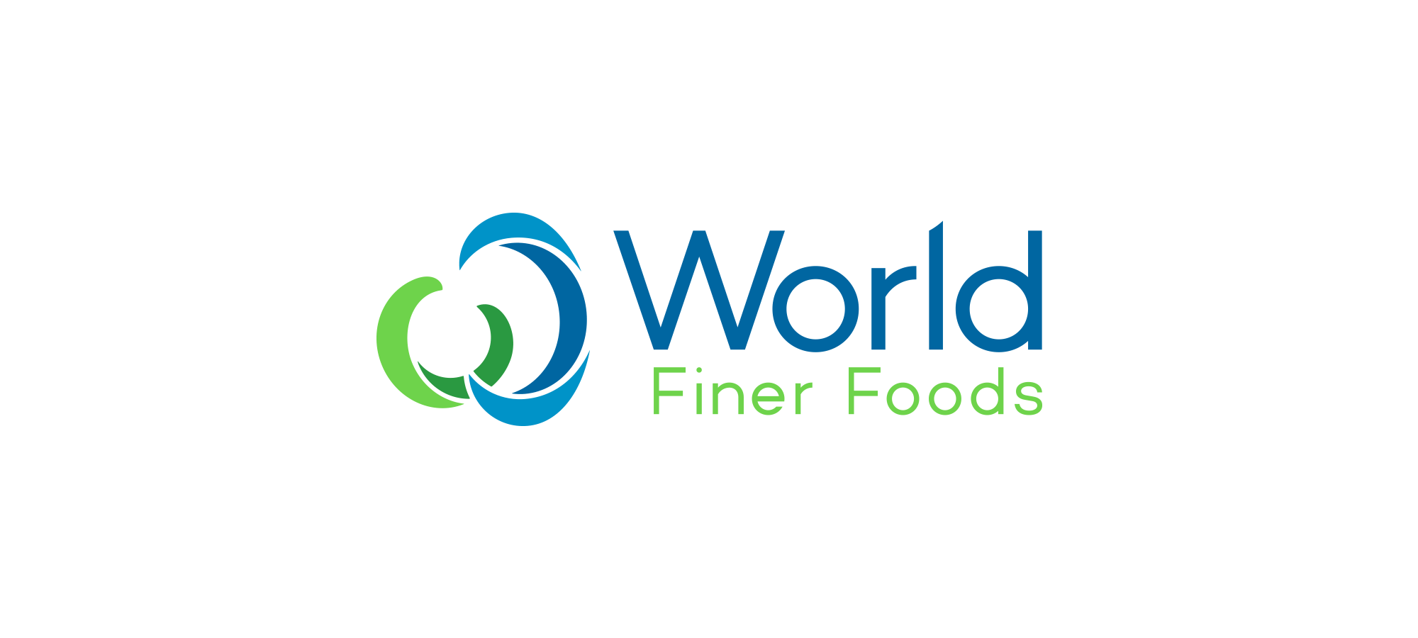
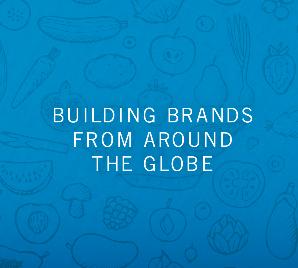
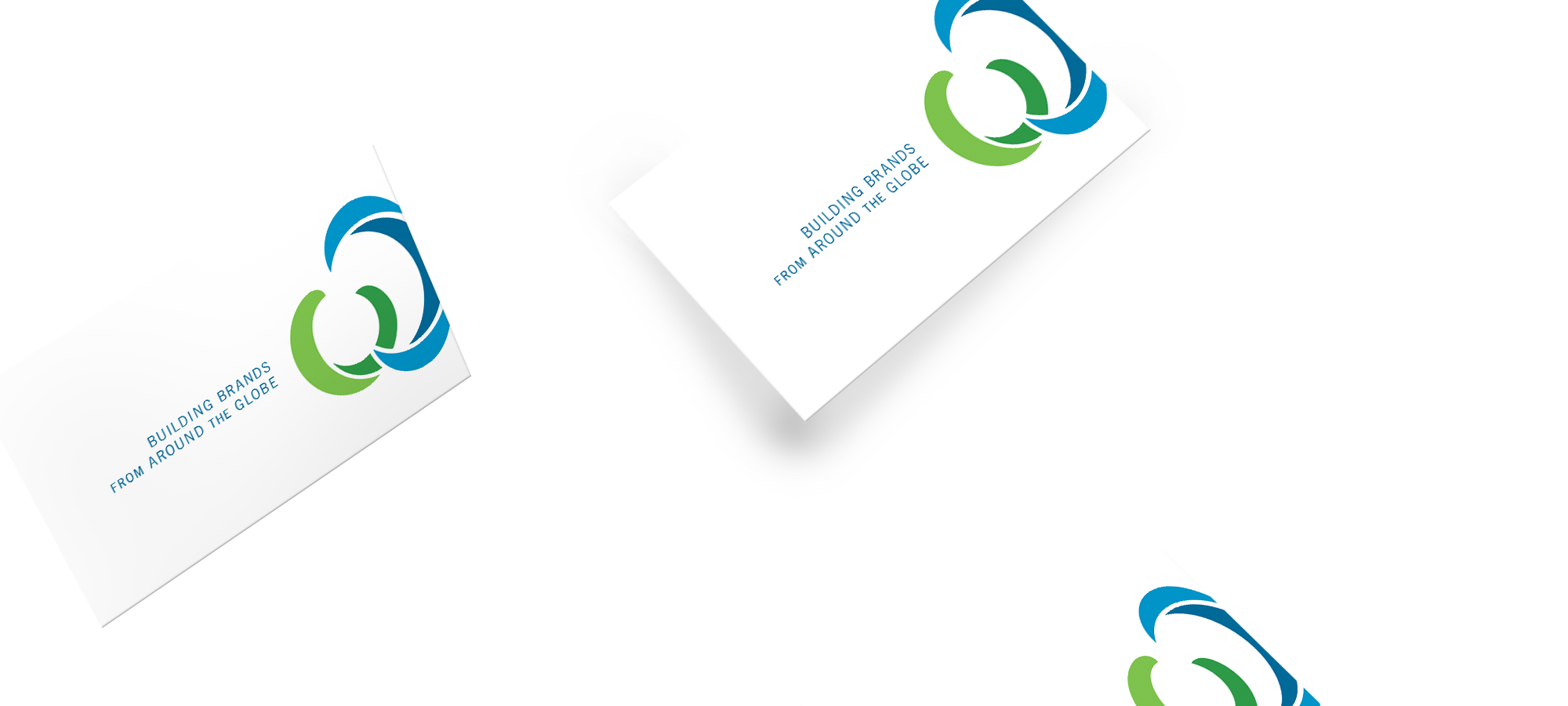
We started with a brainstorm of the company’s core characteristics and worked in collaboration with World Finer Foods to define who they are as a brand. The resulting attributes were: Professional, Approachable, Contemporary, Global, Premium Quality and Trusted. The new identity communicates all of these properties with a fresh, modern logo that is flexible and adaptable. We also created a tagline, “Building Brands from Around the Globe.” This defines the company while expressing its goals and strengths clearly and simply.
Brand Assets
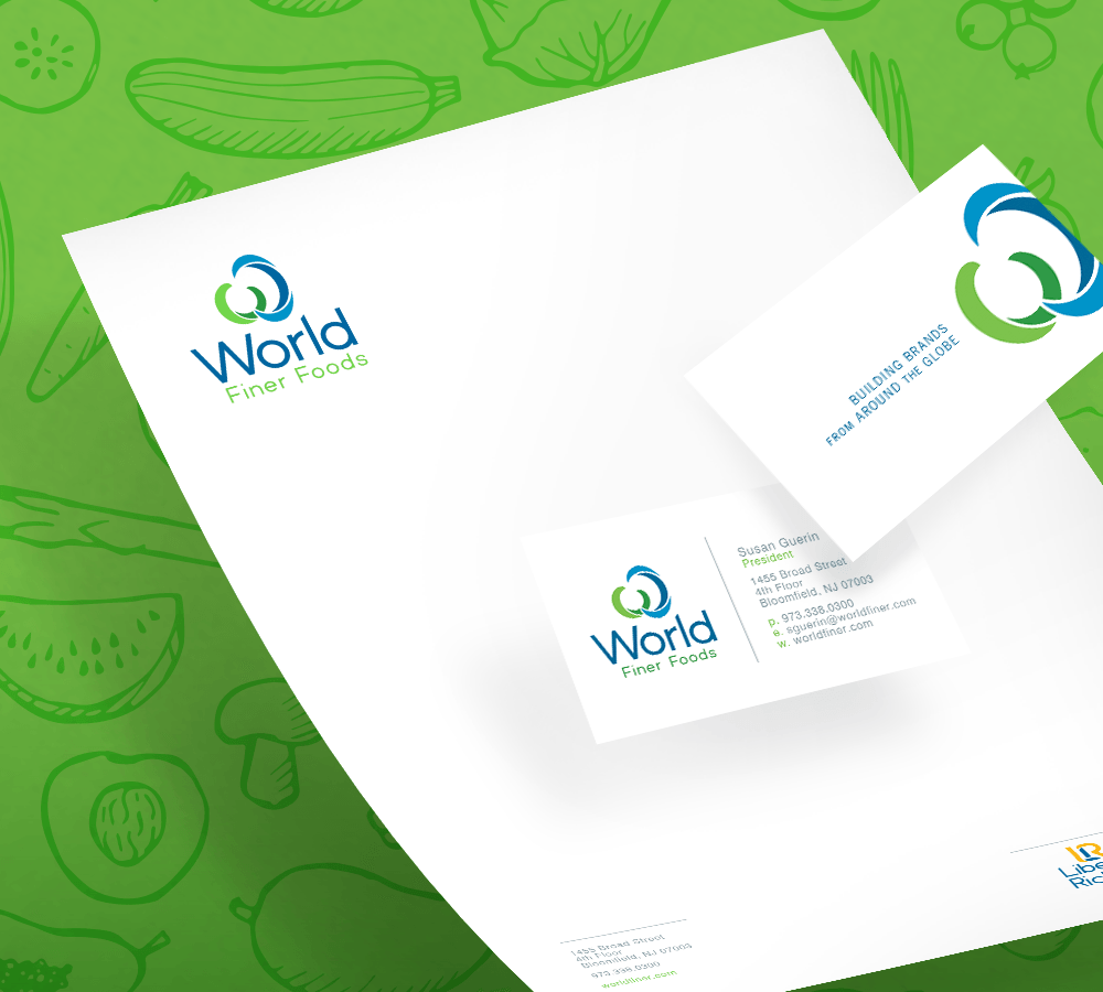
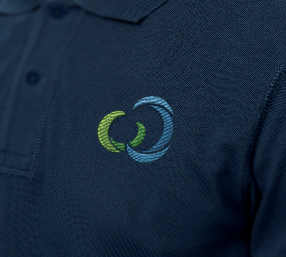
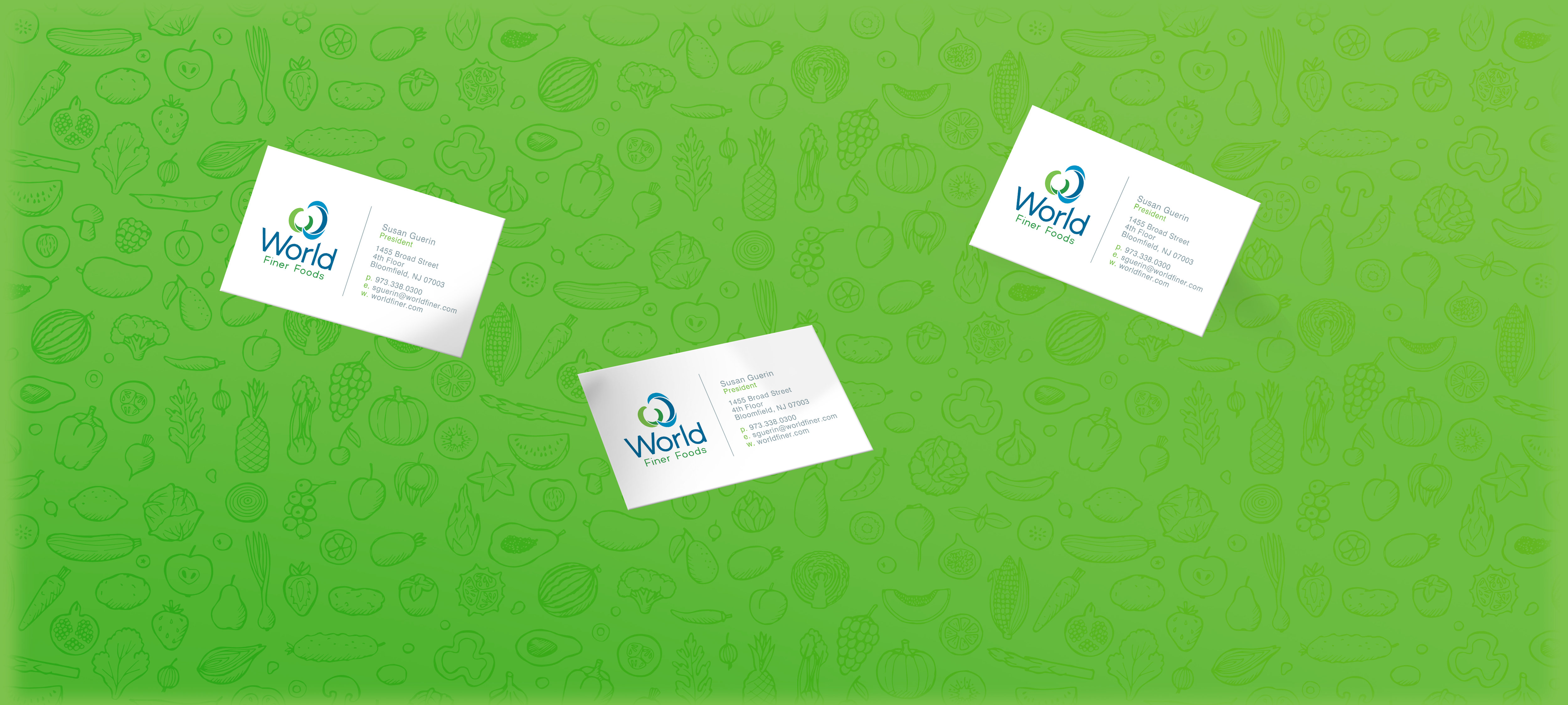
The new identity has been extended throughout the corporate headquarters. Accent walls have been painted with the green and blue color palette and the logo and tagline have been implemented across multiple touch-points. We also created the company’s business cards, letterhead and marketing collateral.
Logo Evolution
BEFORE
AFTER
A Family of Brands
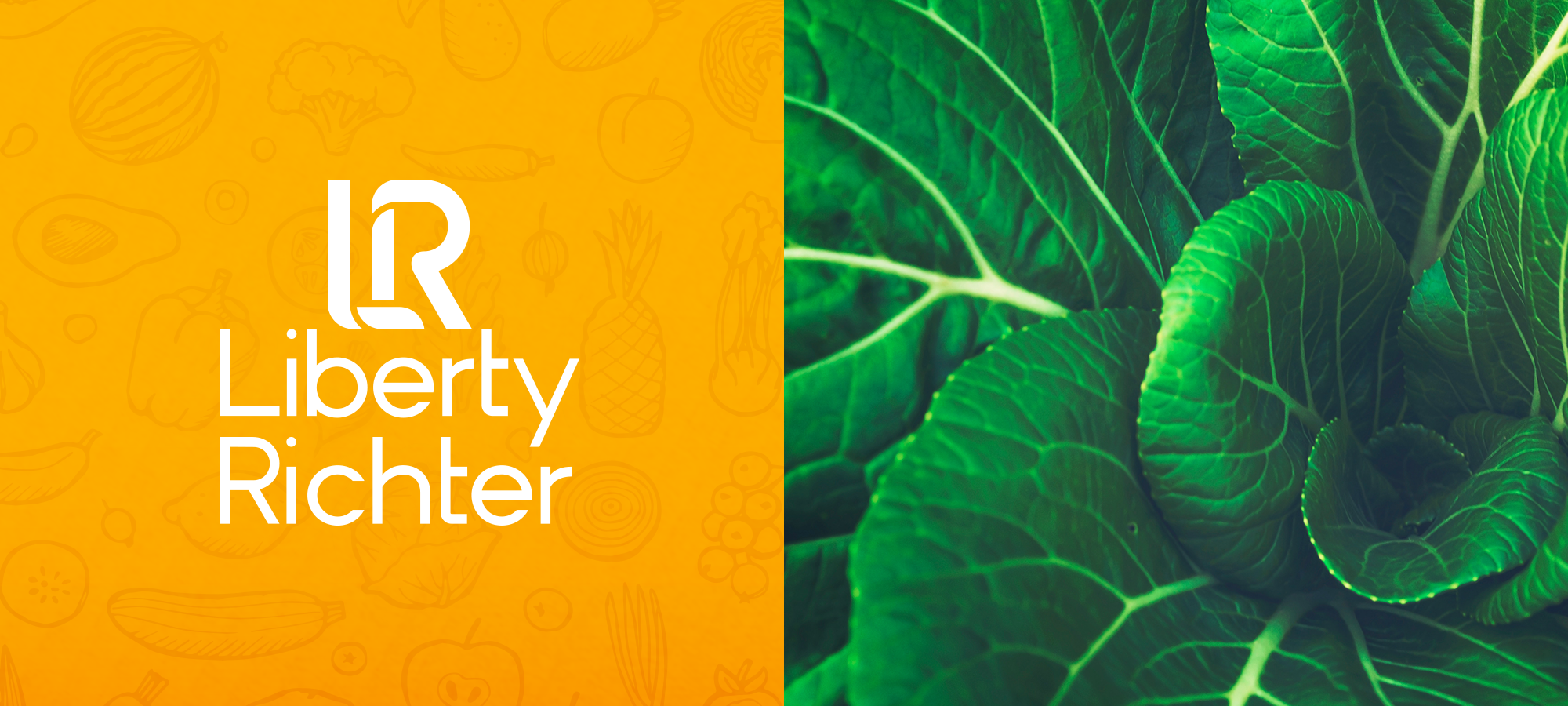
We also redesigned two of World Finer Foods’ subdivisions to create a modern and unified appearance across the line. The new American Marketing Team and Liberty Richter logos were crafted after the look and feel of the World Finer Foods identity. Each logo has interrelated attributes that tie them together to form a single visual language.


Logo Evolution
BEFORE
AFTER
BEFORE
AFTER