Newman’s Own
Designers React
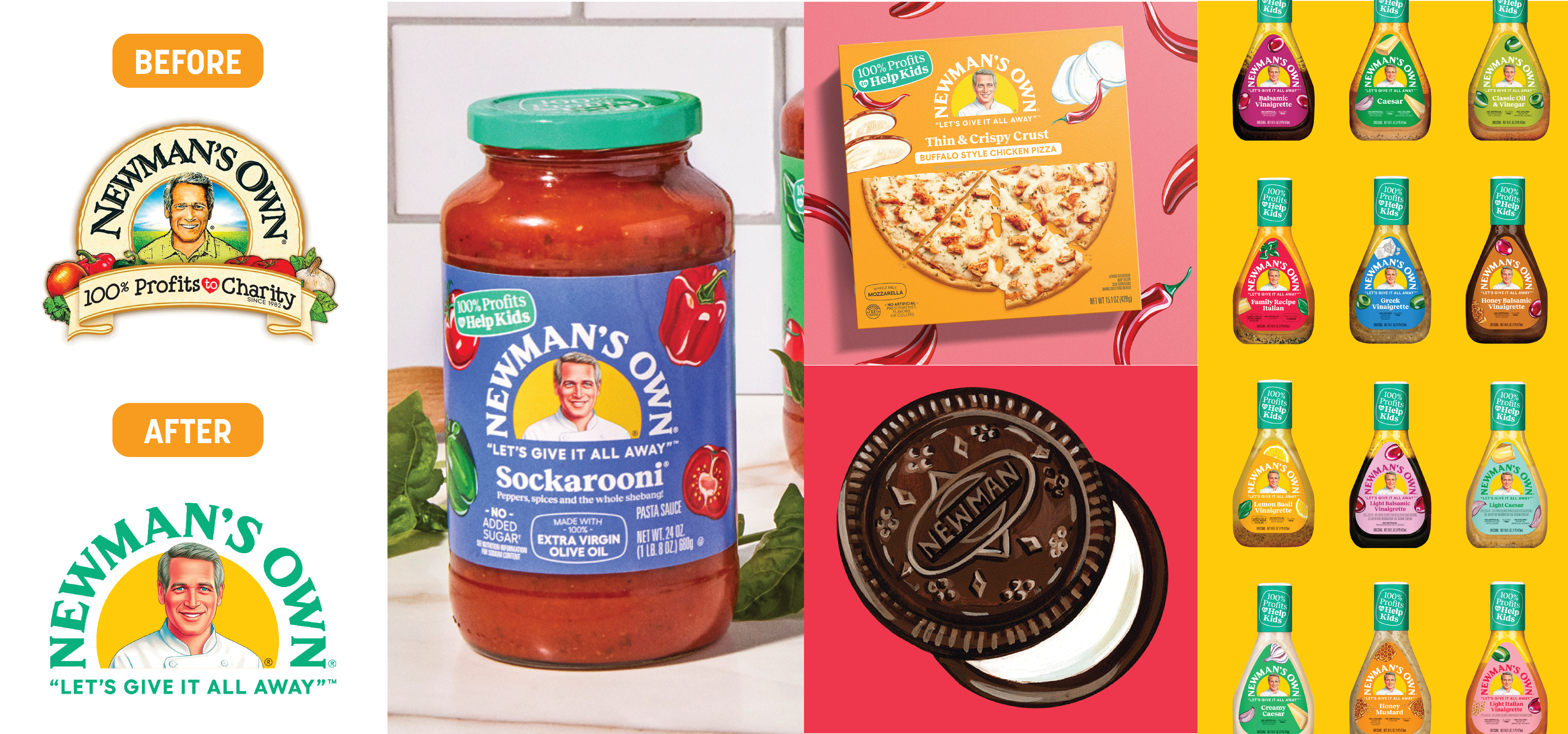
Today, we get our designers’ take on the recent Newman’s Own rebranding.

IMAGE SOURCE: Under Consideration
NT: “As a frequent buyer of the Newman’s Own Pizzas, I took notice of the redesign right away. The new look is quite a drastic departure from the previous, but the shift brings new life to a brand that was on its way to appearing dated and mundane. The vibrant and saturated colors used in the brand’s palette are attention grabbing and surely stand out on shelf. I also love how the product photography works together with the ingredient illustrations to communicate a certain quality and freshness.
The logo leaves me feeling conflicted. While I love the updated typography and overall simplification of the lockup, the illustration of Paul is a part I can’t seem to get past. As an iconic brand element, I understand why maintaining the portrait might be mandatory, but the ‘face lift’ feels realistic versus illustrated, which I find more distracting than integrated. Nonetheless, I like the logo more than dislike – and that tagline update, *chef’s kiss*!”
DN: “I was surprised to see this redesign on shelf at the supermarket! I was on autopilot, looking to restock some salad dressing, and couldn’t find the Newman’s Own brand I typically purchase. It was only when I really looked for it did I notice the brand’s redesign.
I’ve always thought the brand’s design was dated and hokey, but I saw it as a heritage brand—one of the few companies that could get away with that unique look and feel. I feel like, while it’s a drastic change, it’s much more modern and cohesive.
It definitely stands out on the shelf now… so much so that I never even considered that it was Newman branded (when I first saw it). The colors are bright and aggressive, which I think will resonate with a younger audience of shoppers. The illustrations are fun and straightforward. The only thing I’m not convinced they got right was the illustration of Paul. Either way, I’m still buying Newman’s Own!”
AA: “Although the new logo is more modern, I don’t love the update. The overly realistic approach to the chef illustration seems odd – I wish it was more sketched and had more texture like the old version. I’m also not sure about using mint and yellow as the primary colors because the combination feels unappetizing.
In terms of packaging layouts and illustrations, though, I LOVE it! It feels clean and inviting while being fun and expressive.”
Designers’ Ratings


Inspired by Under Consideration


