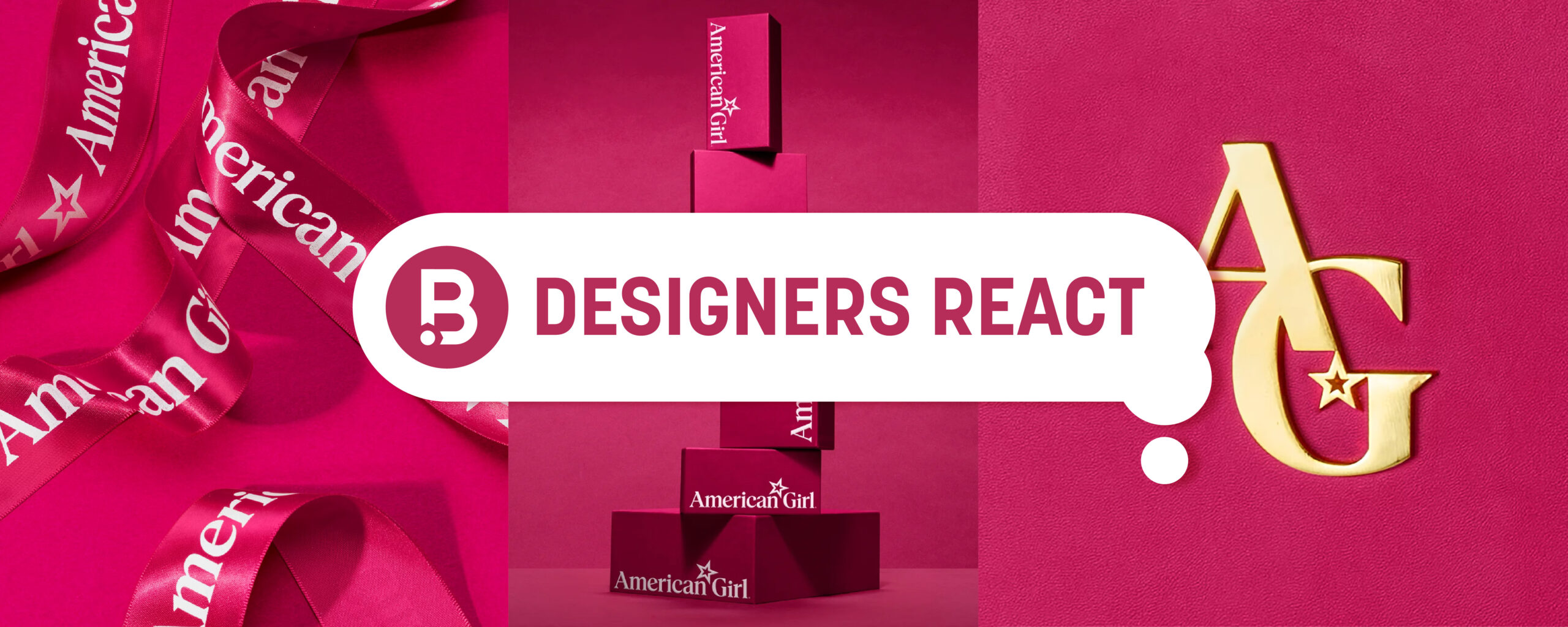
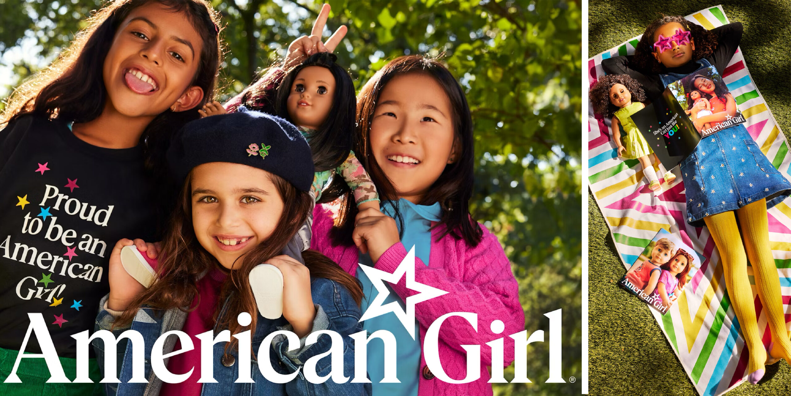
American Girl
Designers React
Today, we get our designers’ take on the recent American Girl refresh.
Image Sources: Pentagram
NT: “I may be one of the only 90’s girls who didn’t have an American Girl doll growing up (I was a My Twinn doll girl), but the brand is certainly one that I recognize and remember from my childhood. It’s not necessarily the doll’s names or their unique backstories that are most memorable to me, it’s the history, confidence, storytelling, and girl-power energy of the brand and its characters that I distinctly remember. Fast-forward to today, it’s so awesome to see those same aspects of the brand’s original positioning still apply yet speak to a completely different generation of young girls. It’s a true testament to the relevancy and longevity of American Girl’s message of empowerment.
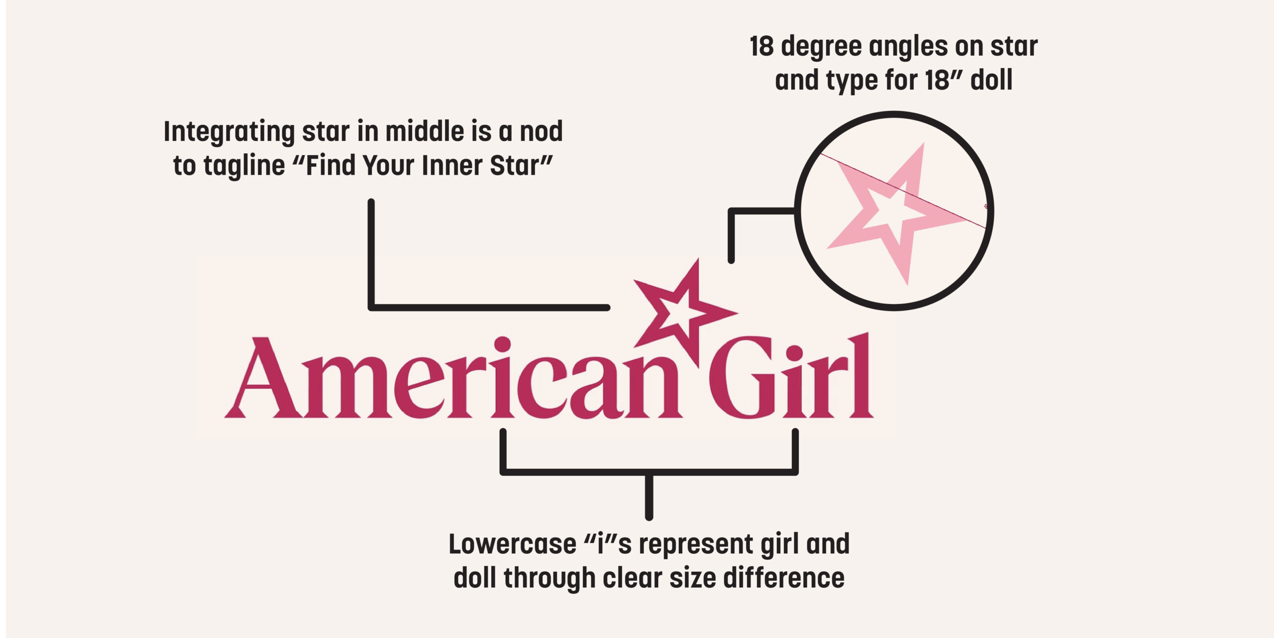
Pentegram, the agency behind the American Girl refresh, pointed out that this brand evolution came at a perfect time, and I agree, as many women of the 90’s are now becoming moms to young girls. Tapping into the brand’s generational appeal and nostalgia is an effective strategy to continue to keep audiences of women and girls emotionally connected to the brand. American Girl’s refreshed logo does a nice job at honoring its timeless look while adding impact and intention in many clever ways, such as angling the slant of the star and letters to play on the significance of the number 18. I appreciate the technical typographic improvements of the brand’s wordmark, but without the explanation to support it, those technical details may go unnoticed.
I found it interesting how the brand’s identity extends for sub-brands like Bitty Baby, Truly Me, and Create Your Own. Incorporating the AG star symbol in every wordmark helps reinforce brand recognition and eliminates the need for ‘American Girl’ to be written in every situation. However, the way the star is integrated into Bitty Baby appears disjointed from the rest since it is so small and worked into a letterform that the star doesn’t usually appear. If the star was worked into the dot of the lowercase ‘i’ in ‘Bitty,’ it would have appeared more consistent with the other sub-brands like Wellie Wishers and Girl Of The Year.
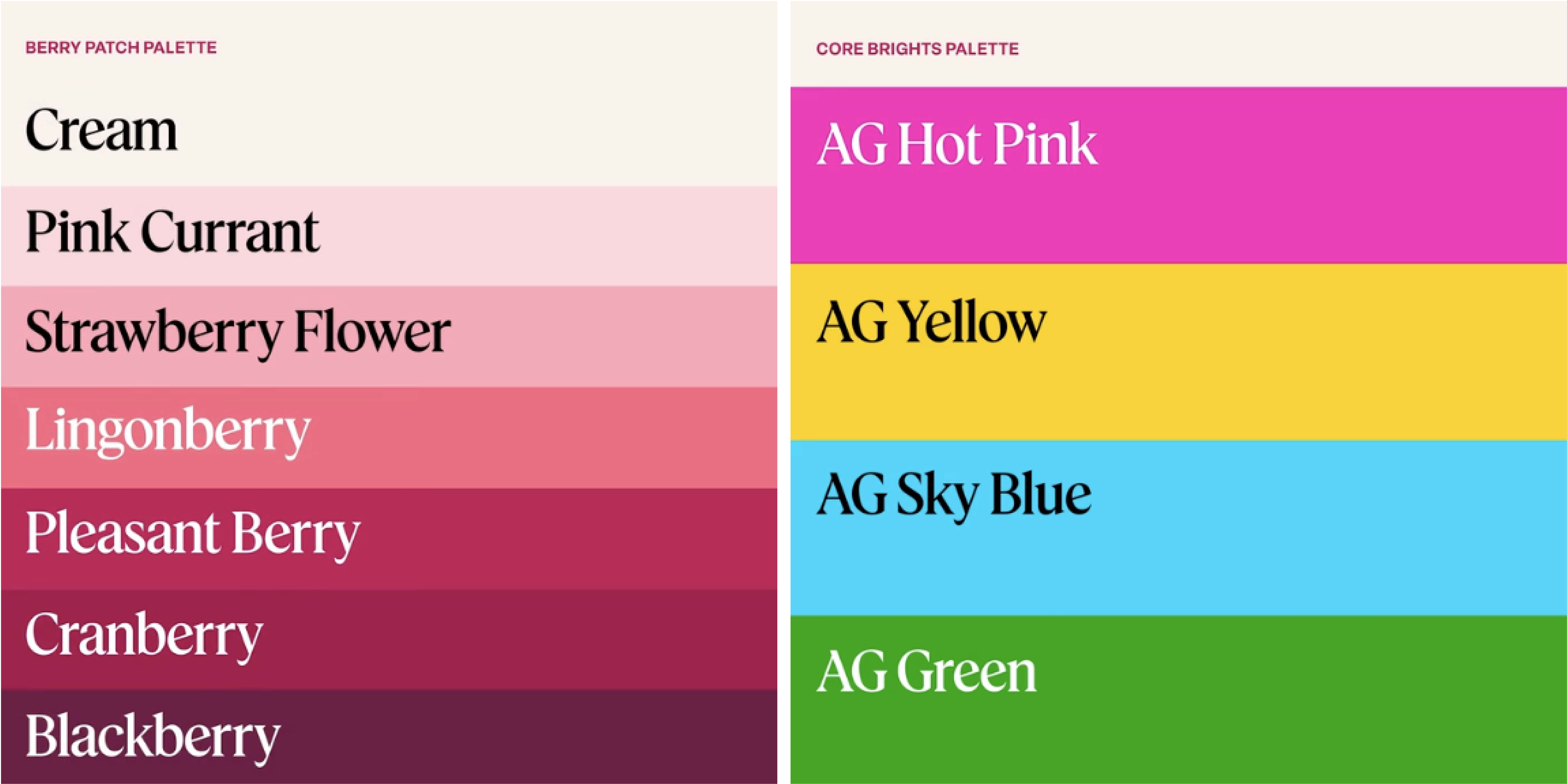
The color palette extensions also caught my attention because of how bold and vibrant they are in comparison to the brand’s primary color, Pleasant Berry. I can’t say that I love the way the AG Hot Pink, Yellow, Sky Blue, and Green blend with the muted maroon color. I appreciate how the color palette feels like a blend of ‘classic meets contemporary,’ but the ‘RGB-like’ vibrancy of the new colors are lacking a bit of warmth in my opinion.”
Image Sources: Pentagram
DN: “American Girl was a part of my childhood, like most young girls. I had a Molly doll that I adored. I never paid much attention to their branding until I saw their recent refresh. The logo was reworked nicely with intention and rationale that really sells the concept. I especially enjoyed how the relationship between doll & girl was symbolized in the “i”s.
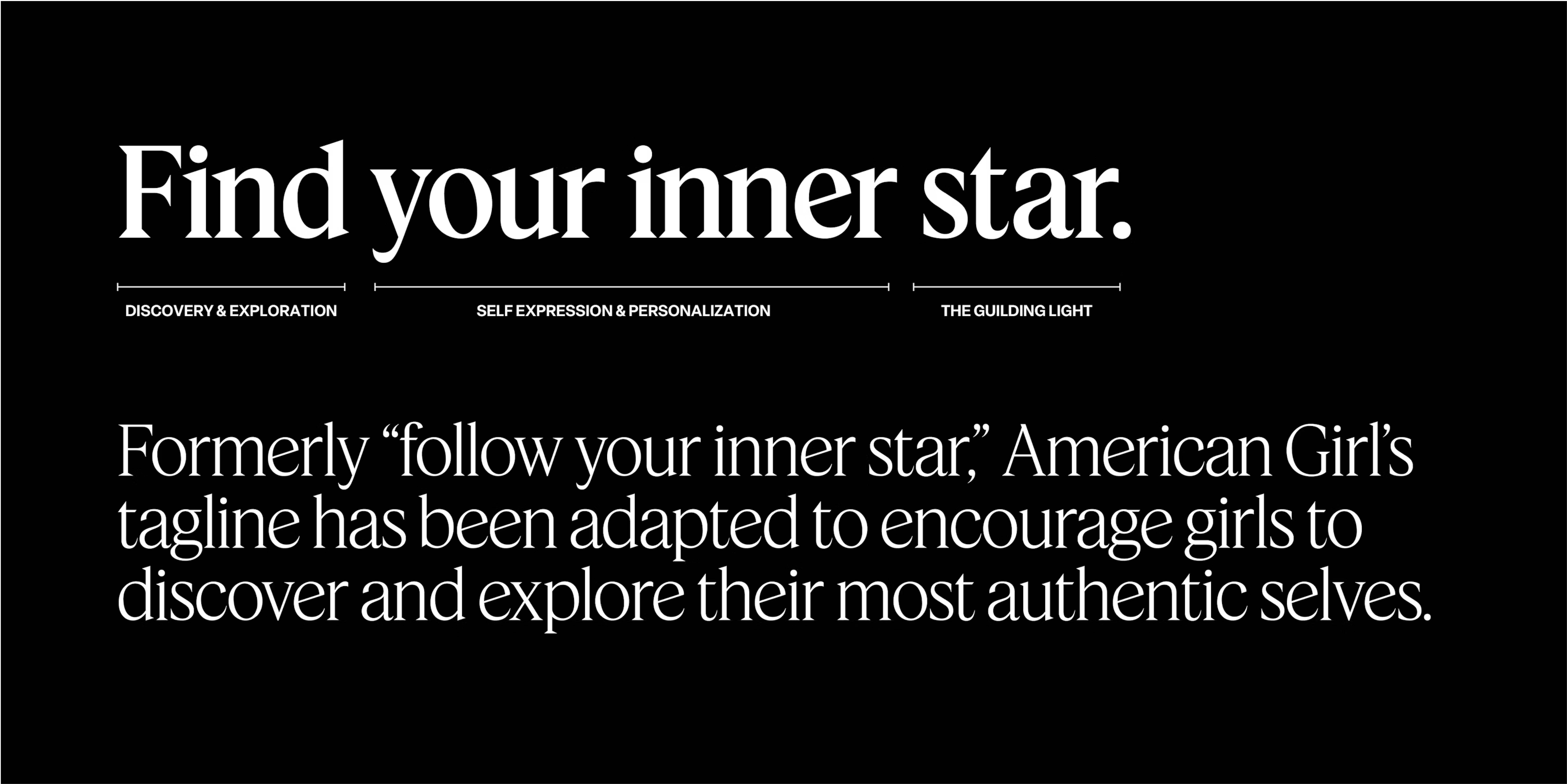
I also thought it was interesting how they tweaked their tagline from “Follow your inner star.” to “Find your inner star.” It’s such a small tweak, but I like how they’ve adapted the language to better fit in today’s world. Not to mention the refresh to their brand serif font, which achieves a modern yet nostalgic feeling at the same time (in a good way!)
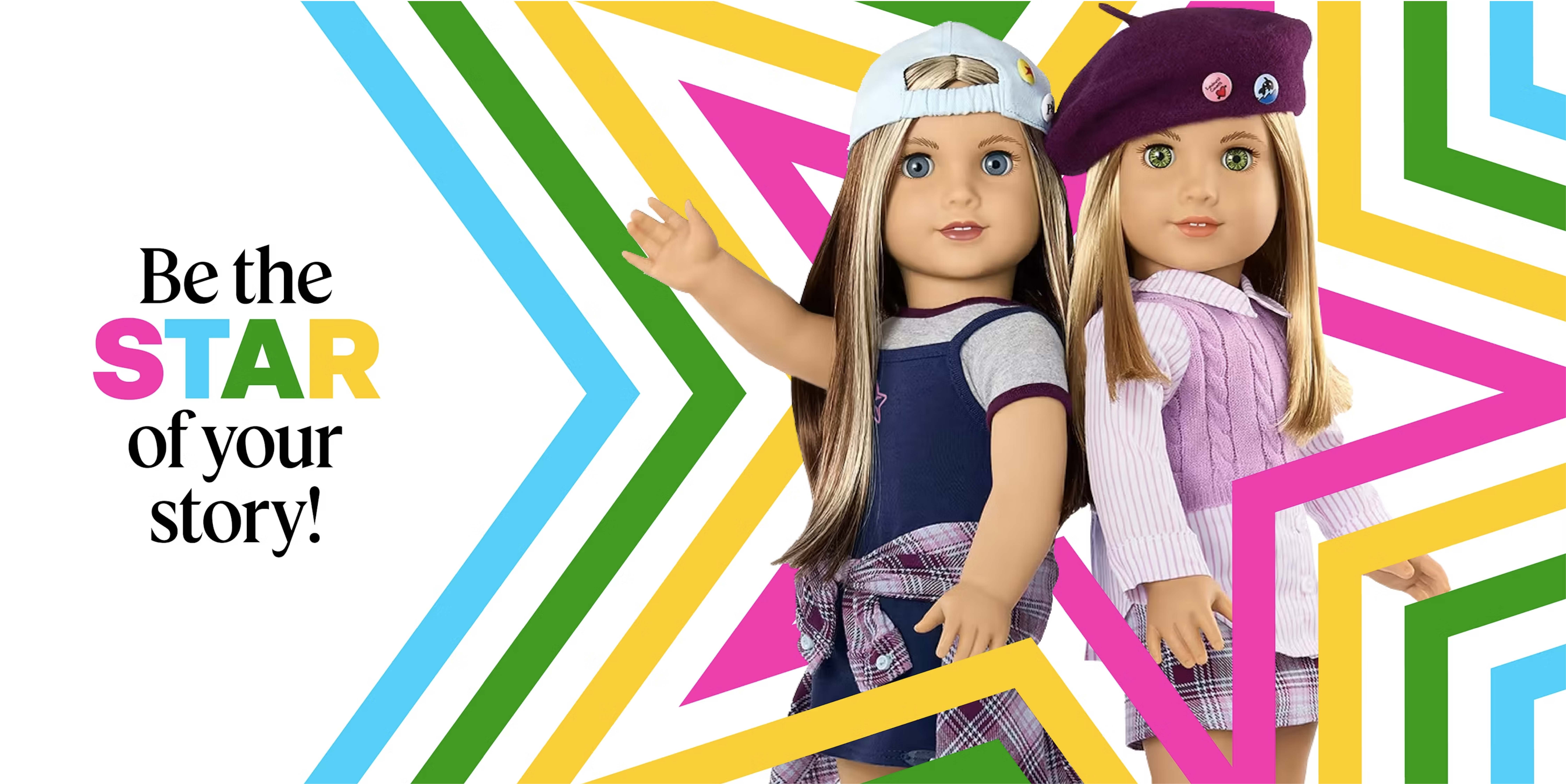
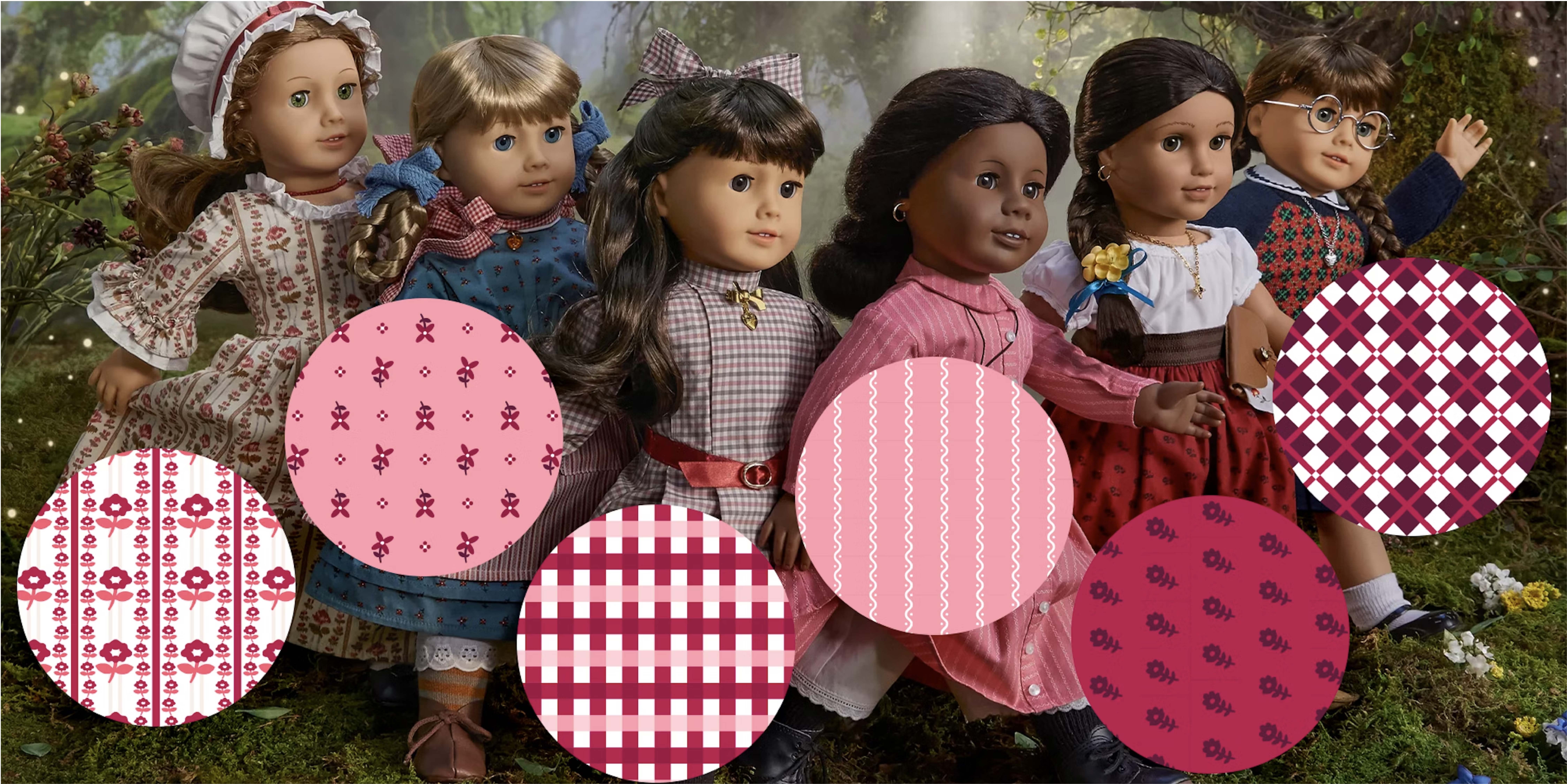
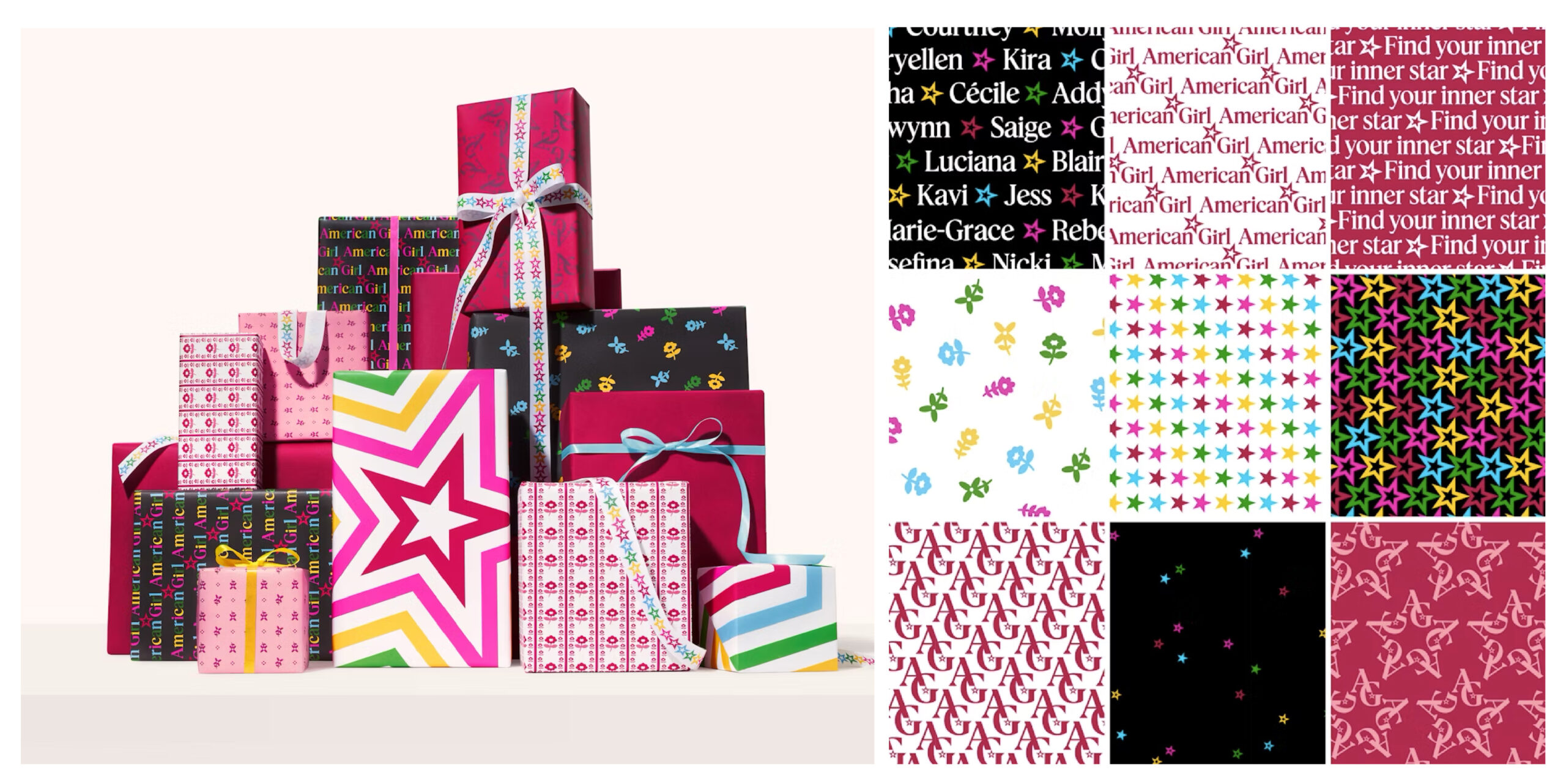
But where this redesign really shines for me is in its application. I love the silhouettes and patterns as well as the lifestyle imagery—it’s bright and punchy and makes total sense. The color palette is a little all over the place at first glance, but the updated berry color is beautiful. It serves as a nice bright but grounded brand color.
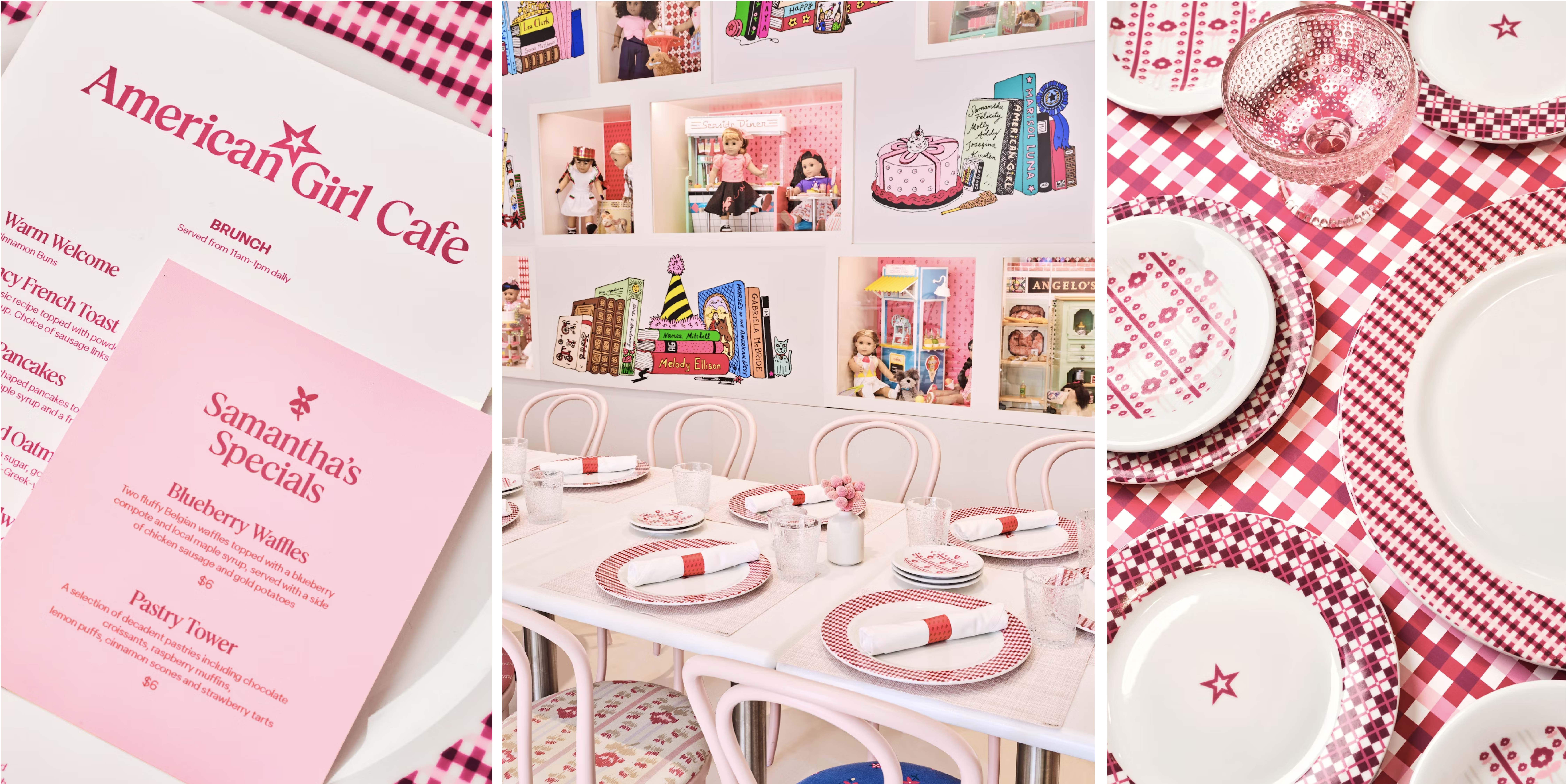
The packaging would have excited a young Devon if she were to receive it as a gift. Similarly, I dare say a trip to the store and café offers excitement and sparks joy for all ages! I think the rollout of the refresh to the website was nicely handled as well, which can sometimes feel like an afterthought. I enjoyed how creative they got with using the star in so many different applications. They are also doing a great job of staying relevant on social media—although I am curious who is their audience (moms?) as I would think most young girls aren’t on Instagram.“
Image Sources: Pentagram
AA: “The most intriguing thing about this redesign for me was the rationale and intention put into updating this brand. At first glance, I was surprised at some of the sharper characteristics of the letterforms because of the soft/feminine nature that comes to mind when thinking of a doll brand. With more thought about the story that this new logo is telling, I realized maybe these angular edges are more appropriate when telling the story of confidence, strength, and most importantly, GIRL POWER.
There are some great easter eggs in this redesign! You’ll see that the angles of the star & the letterforms are at 18 degree angles to reference the 18 inch dolls, the integrated star is a nod to the tagline (Find Your Inner Star), and the two lower case “i”s represent a girl and her doll in their size difference. These details are exceptionally clever. Another detail I noticed in the logo design (that I’m not sure was intentional) was that the “feet” (serifs) of the letterforms look extremely similar to the way an American Girl doll’s feet look! Maybe this was a subtle nod or just a happy accident, but I can’t unsee it!
I have to give this rebrand credit in that though it is refreshing, it doesn’t stray too far modern and keeps a close touch to its beginnings. The brand chooses to bring modernity in other areas like in its fun collection of patterns, its bold color palette, and its lively photography – without forgetting its nostalgic roots in the vintage-like illustration styles and silhouette icons.
I think this redesign is successful in achieving its goal of staying true to its nostalgic roots, positioning more premium, and representing the wonder of girlhood. Every asset feels extremely intentional and cohesive. I also think the women who grew up with this brand near and dear will appreciate the refresh as they bring their own daughters to get their very own American Girl doll.”
Designers’ Ratings


Inspired by Under Consideration


