Popeyes
Designers React
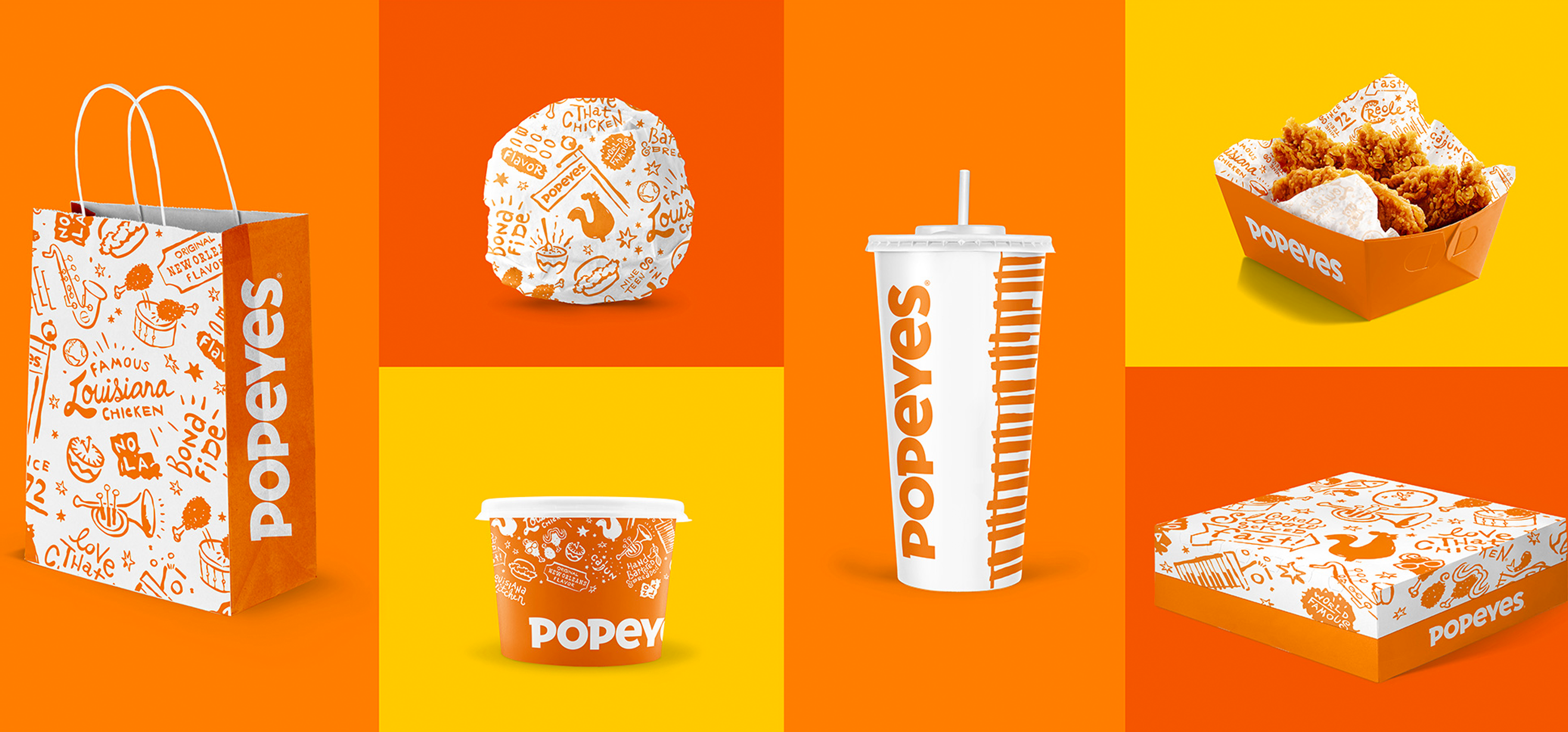
Today, we get our designers' take on Popeyes recent refresh designed by the agency Jones Knowles Ritchie.

RF: "I'm honestly not thrilled by this. The logo is a fine refreshment. I would have kept the “y” since it fits with the rounded “P," but it's cleaned up while not losing all its personality by going straight sans serif like everyone else.
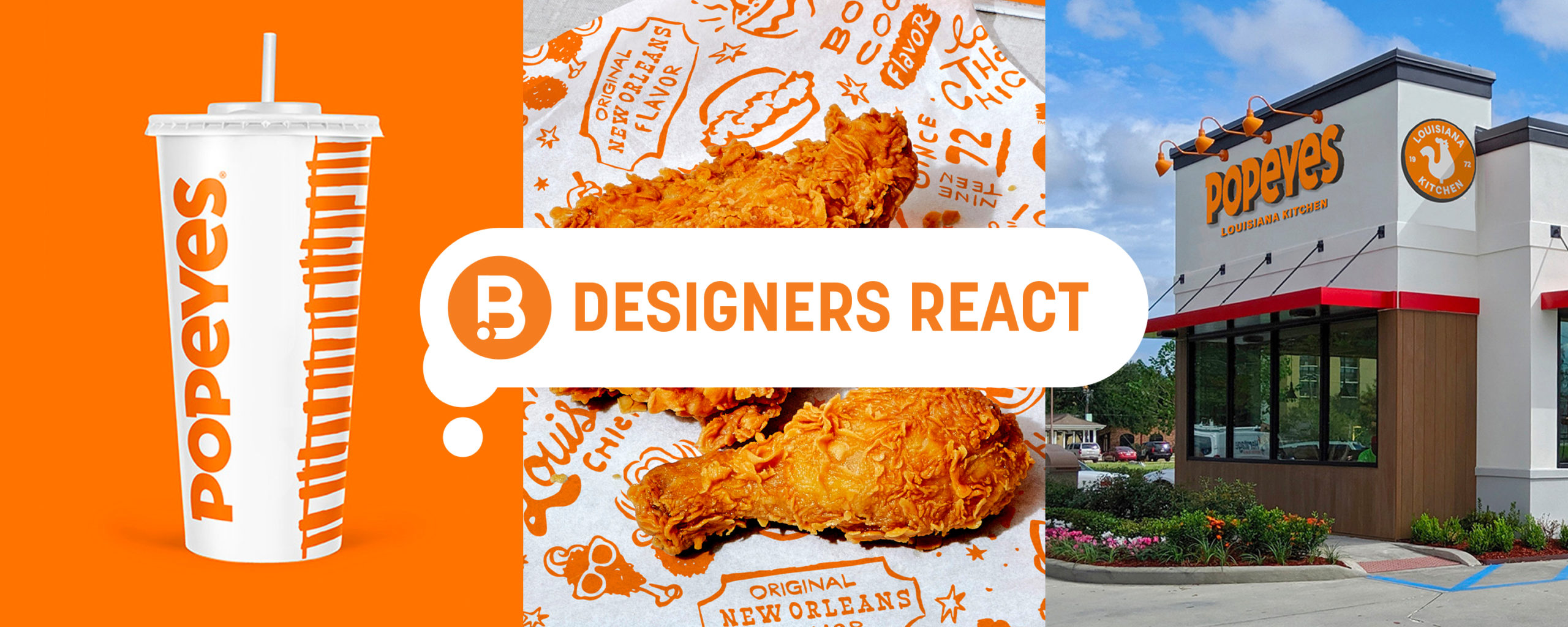
I’m torn on the pattern. This feels like something I would have done and many brands have done 6-7 years ago with words+illustrated pattern, but I do appreciate the roughness of it to go with the fried chicken feeling.
I would prefer the chicken guy to be textured from the pattern and not smooth like they are using him in the secondary mark. I don’t think it fits with everything else. Like I said, if the chicken and the circle around it had the personality of the pattern, I would be more on board.
I do like the chicken playing the Sax on the entryway on the China store."

NT: "I think the refresh has a lot of personality. The contrasting use of modern / contemporary elements with “hand crafted” accents feels nicely balanced to me. I also love the orange & teal color palette used in store at the location in China. Overall it feels warm, approachable and inviting."

DN: "Personally, I like it. It’s a fresh & modern take on what they had. Logo still has character and they kept their iconic orange branding, but now it’s less gimmicky!
The pattern is fun, a bit expected, but nice all the same. (Side note: that chicken looks AMAZING!)
The stores are fun, too, and overall are a great representation of modern fast food throughout the world."

BN: "I really like this refresh. They kept the playfulness of the old logo and implemented it in other areas.
The balance between the clean logo and the drawn pattern is really nice, one doesn’t overpower another.
I love the fact that they added more color to their palette other than just the orange and red."

Images from Under Consideration


