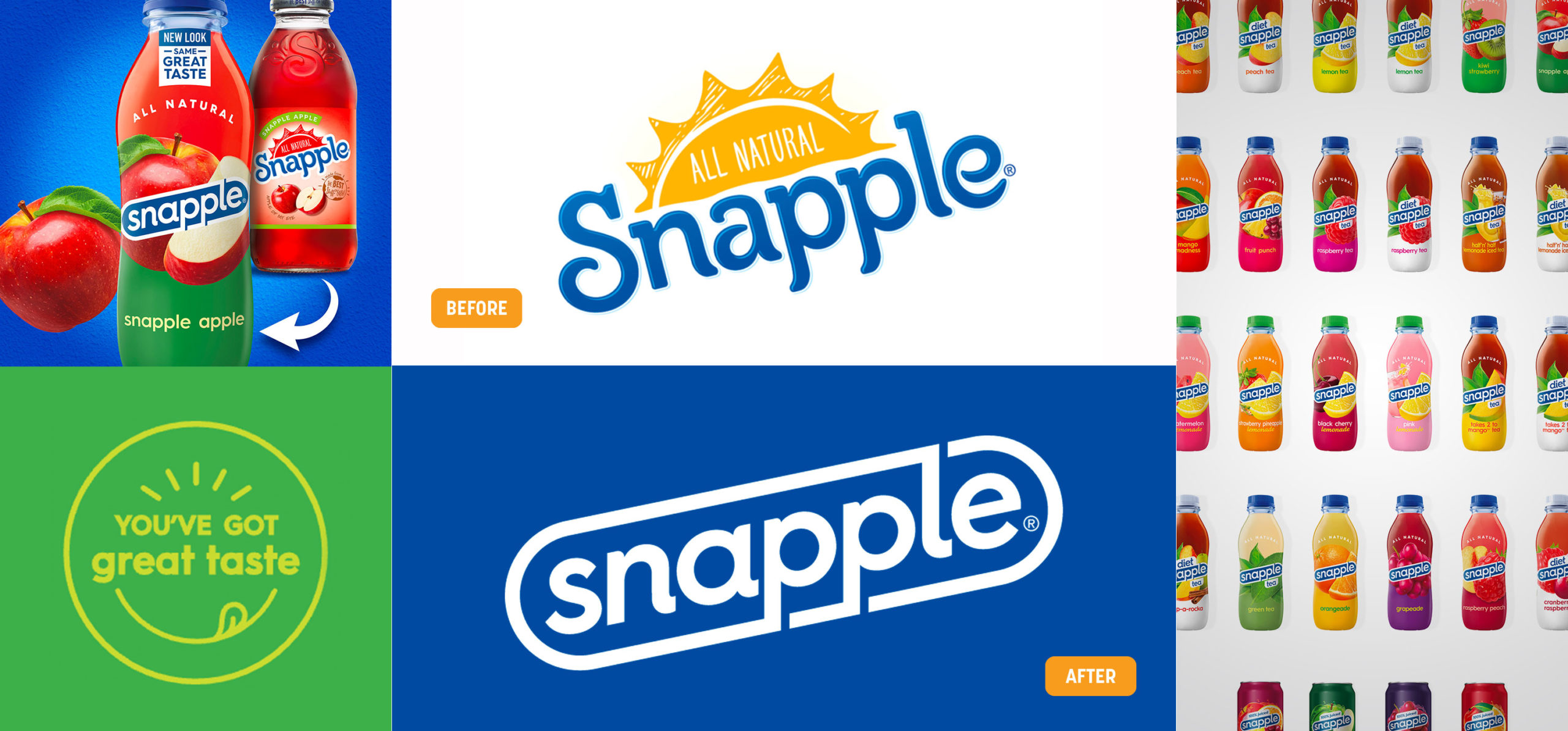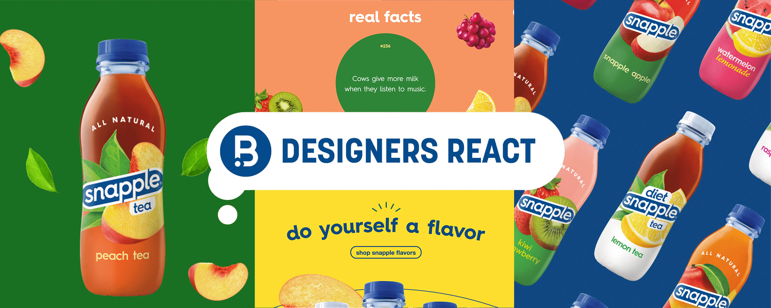
IMAGE SOURCE: Under Consideration & Snapple
RF: "Before even getting into the design of it all, I was disappointed in Snapple removing two features that I think of first when I think of them and their drinking experience. The metal cap with the “snap” sound and the fun facts underneath it. I’ve done some research and there is no trace of it, but I always reversed engineered the naming of the Snapple brand to come from the “snap” sound that comes every time you untwist their bottles. So for me, it is a big departure from who they are.
As for the branding, the whimsical, friendly, homemade aesthetic is completely stripped away from the brand. The logo itself is bringing back the outline shape from its original logo, which I do like. Though there will be some Durex jokes which might have been prevented with a capital “S” or some flair kept from the wordmark from the more recent logos. Overall the logo is nice.
As for the packaging, I understand what the goal was. Make the flavor name playful, segment the color of each flavor more easily and play up the appetite appeal while locking up with the logo. So it does what it is trying to do, but at what cost? It now looks generic or blends with all the other brands, especially in the iced tea world. The uniqueness of the design to the structure of the bottle makes Snapple who they are, and they aren’t Snapple anymore."
DN: "I think I should start by disclosing that I've never had a Snapple, so my opinion is probably a little different than my fellow designers. The things I associate with Snapple are the kitschy design, glass bottle, and the facts underneath the cap—all of which they've (seemingly) gotten rid of!
I think the logo, while much more modern, is very generic now. In fact, it looks uncomfortably like the Durex logo. The packaging, is a nice upgrade as far as looks go. It's significantly cleaner, but then again it looks like all we've seen is the beauty renders for the new rollout, so who knows how accurate that is. And I miss the glass bottle (both for environmental and aesthetic reasons!). I think it's also safe to assume there are no more facts under the lid, which make me sad—even as a non-Snapple drinker!
Overall it's better than it was, but I think they missed a big opportunity to evolve the design forward. All they achieved was looking the same as all the other beverages in the category, which is kind of disappointing for a brand as established as Snapple."
NT: "Snapple is a drink that I would reach for to satisfy the craving for something sweet & fruity. I really like how the new bottle design emphasizes the fruits and flavors of each drink with large ingredient illustrations. The vibrant color palettes for each flavor also help to reinforce the sweet & fruity taste of the product. Since I’m such a fan of the illustrations, it saddens me that they are covered by the Snapple logo. It’s possible the logo could have been just as impactful if it were placed at the top of the bottle above the fruit lockups. Then, the “All Natural” callout could be integrated with the beverage flavor name for a straightforward read of product information. I like the simplicity of the new logo wordmark, but there’s something about it that doesn’t appear as “yummy” as the rest of the graphic elements on the bottle.
Snapple’s shift to a plastic bottle from their iconic glass bottle also intrigued me. Their website provided some really nice education and information around the new bottle and sustainability initiatives they are implementing moving forward. By using 100% recycled plastic, they are helping to reduce their environmental footprint while also setting themselves apart from other beverage companies. Another cool aspect of the bottle design is that it is printed with washable ink so the bottle can be reused and made into new products! These are really exciting options for brands to consider for the future of their packaging. I would love to see more companies move to using more sustainable materials & methods such as these.
Lastly, I found myself wondering, “What about the Snapple facts?!” It’s unclear to me if the caps of the new bottles feature the Snapple facts, but the brand’s website does! It seems they are taking a more digital approach to sharing the Snapple facts by encouraging people to sign up and receive a daily Snapple fact via text message. Kudos to the brand for thinking of a simple way to give Snapple-Fact-Fanatics their fact if it’s not on the bottle cap!"
Designers' Ratings


Inspired by Under Consideration


