Triscuit
Designers React
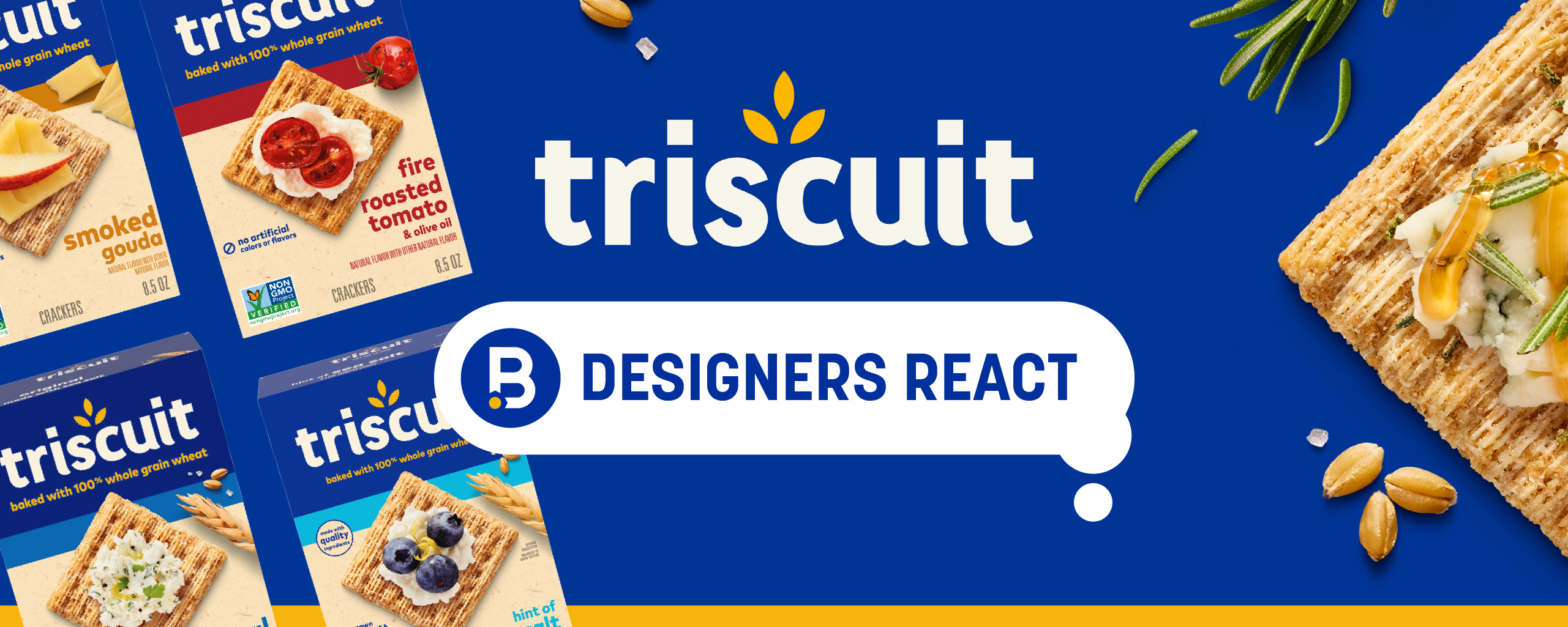
Today, we get our designers’ take on the recent Triscuit redesign.
Image Sources: (1) SoulSight (2) PR Newswire & SnackWorks (3) SoulSight
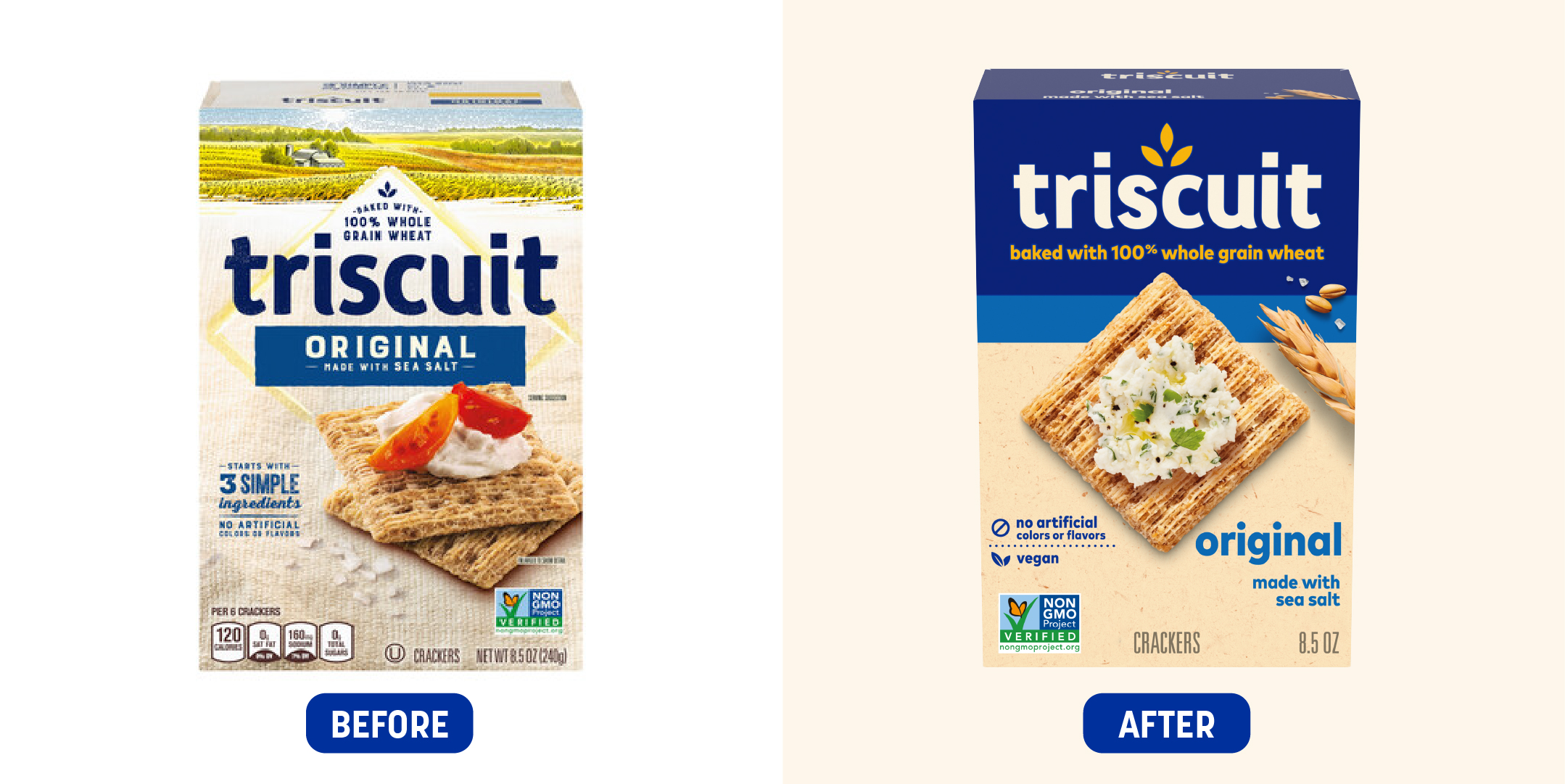
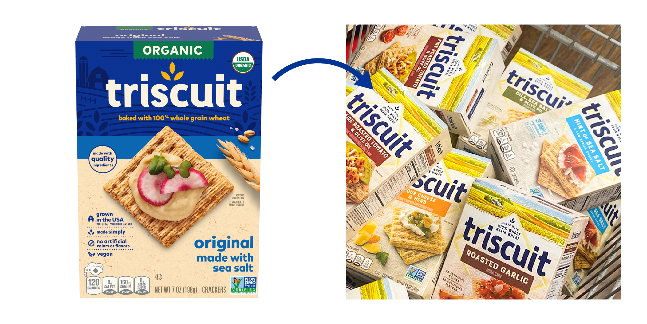
NT: “The Triscuit refresh is a great example of how evolutionary design strategies can modernize a brand without sacrificing recognition. As a familiar brand in the cracker and snackfood space, I’d imagine that maintaining key elements of the Triscuit identity was important when approaching this redesign. Looking at Triscuit’s before & after packaging comparison of their core whole grain wheat crackers, it’s clear that many of the same design elements have been represented on the new packaging, just in a reimagined way.
The Diamond
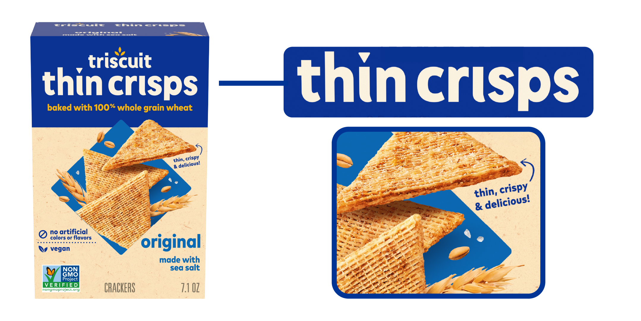
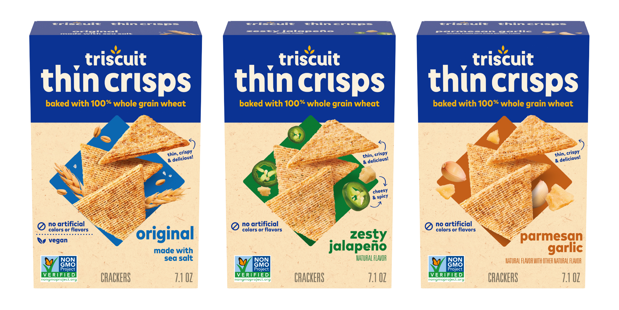
On previous package designs, the diamond shape behind the Triscuit wordmark was a subtle graphic representation of the classic Triscuit cracker and helped pull focus to the logo. Now, the product photography establishes a strong diamond shape in the center of the package, spotlighting the actual cracker to create a much more impactful focal point. I love how the new design gives more purpose to the diamond shape. On product extensions, such as the Triscuit Thin Crisps, the diamond showcases its flexibility and adaptability by communicating the cracker’s unique flavor profile through color and ingredient imagery. Placing the Thin Crisps playfully at the center creates an impactful lockup that connects with the core cracker line while still giving Triscuit’s extended product offerings their own personality and flair. The consistency across the overall lineup should certainly grab shoppers’ attention on shelf.
The Product Photography
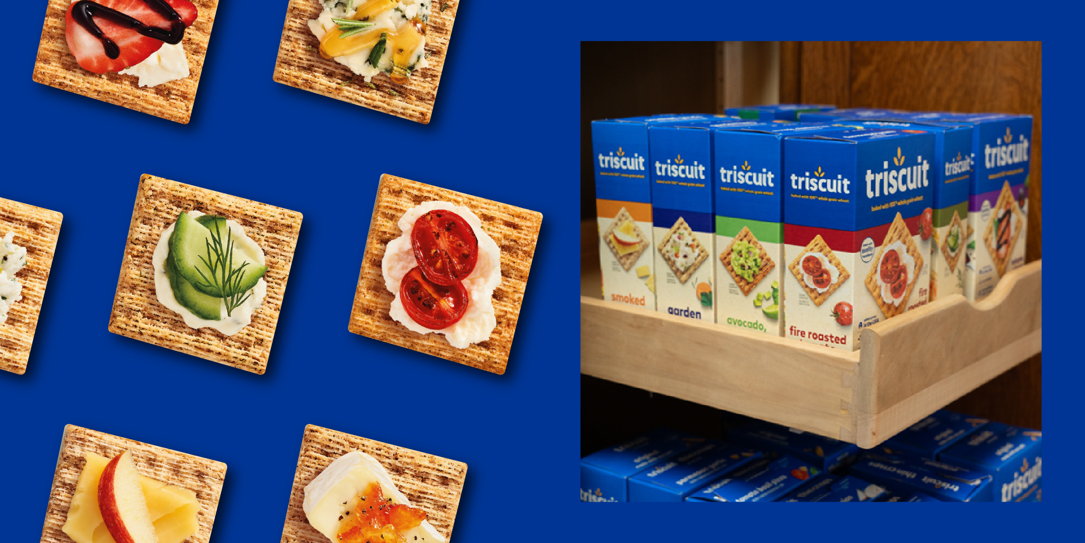
I particularly enjoy the way the product imagery has been emphasized and enhanced on the new packaging. The brand is doing a much better job at amping up the appetite appeal with serving suggestions that inspire consumers to elevate the eating experience. They’ve done a nice job at making the product appear more ‘upscale,’ yet the toppings and pairings still feel approachable and attainable for anyone to execute. I would definitely reference some of these pairings when creating a snack plate for a party! It’s nice to see that consumers can get inspired from visuals on the packaging rather than needing to rely on a digital touchpoint such as social media for serving suggestions. Nonetheless, the imagery entices you to explore more of what the brand has to offer, and they’ve effectively translated the brand refresh beyond packaging to areas like their Amazon Storefront and landing page where more unique recipes can be discovered.”
Image Sources: (1) SnackWorks & Facebook (2) SnackWorks & Facebook (3) SnackWorks
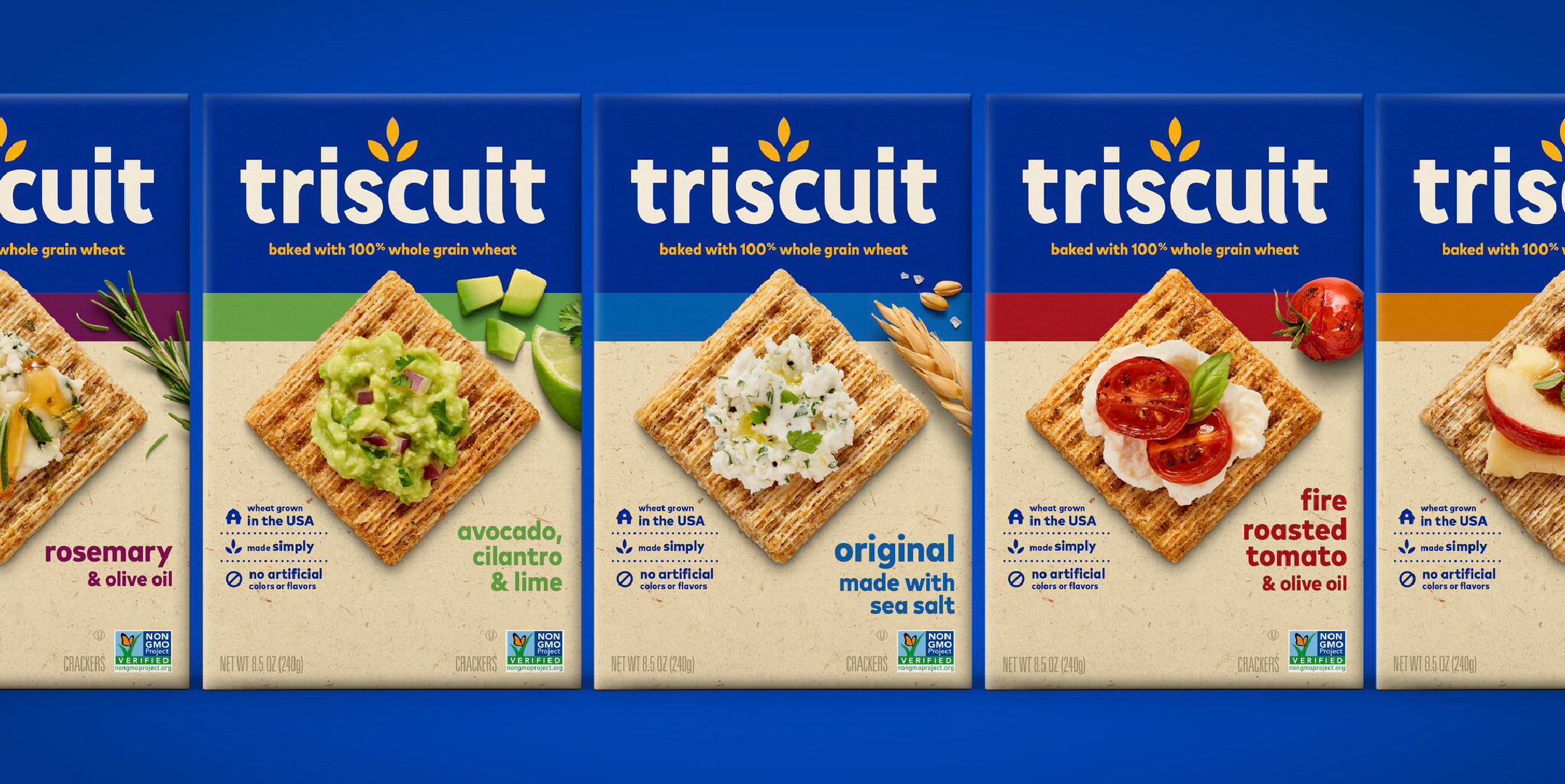
DN: “Overall, I think this is one of the nicest brand evolutions I’ve seen! When you look at the different product offerings, it feels very thought out. The cohesive look and feel are a result of Triscuit’s intentional use of color, layout, and product imagery.
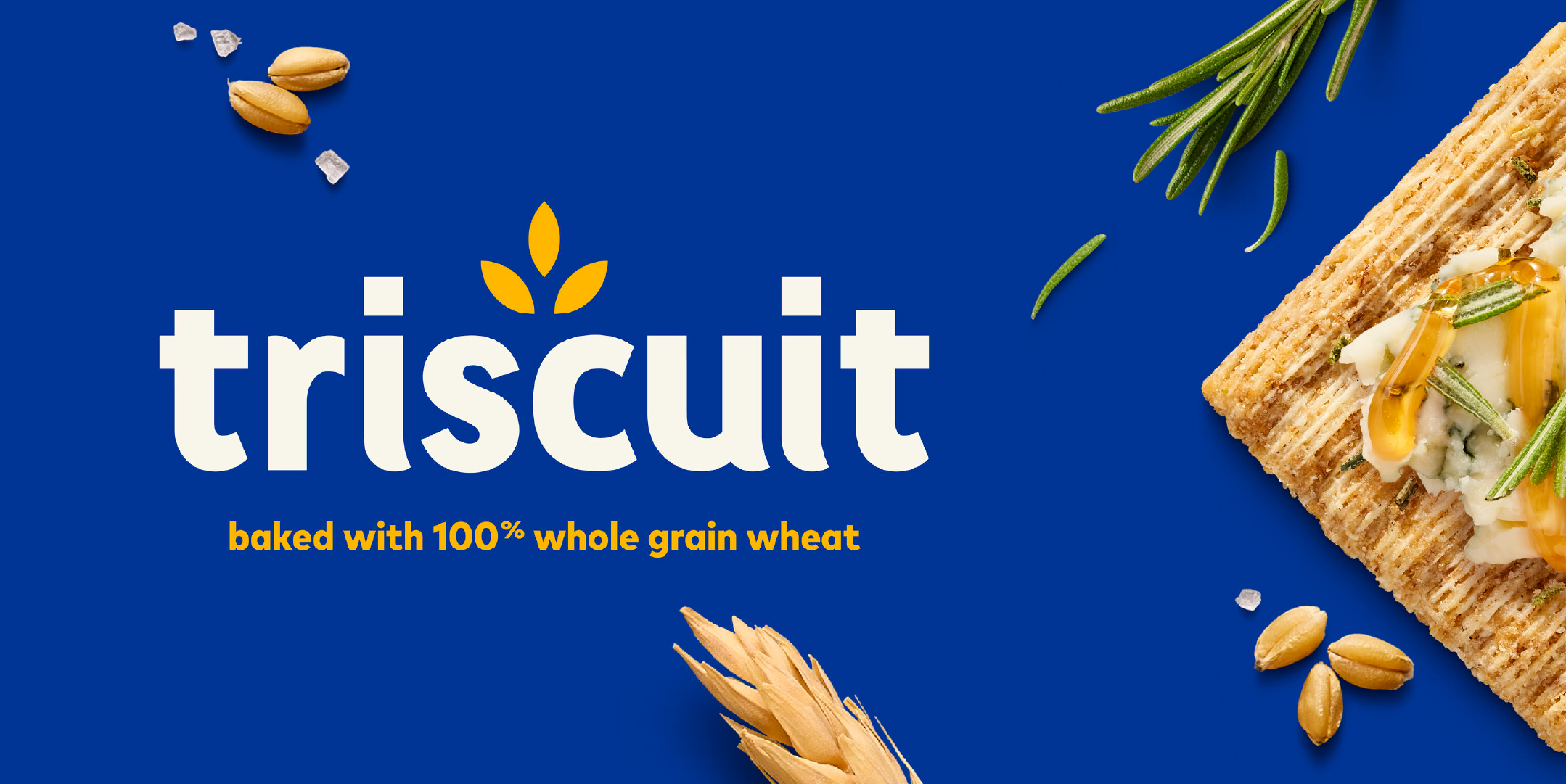
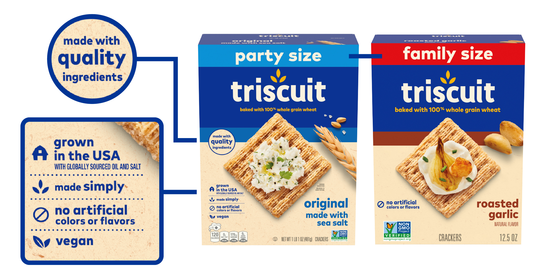
It appears they slowly modified the logo over the past few years so its evolution to the new wordmark feels natural. The text is clean and friendly, while the icon is inspired by the fact that it’s baked with 100% whole grain wheat. I also love the use of white & yellow, which pops nicely against the new blue brand blocking. They are also doing a much better job at highlighting the different flavors through accent color and cracker imagery. The enlarged, top view of the cracker is beautifully consistent from SKU to SKU and offers the same level of appetite appeal as before, but I find it more successful at grabbing shoppers’ attention. The callouts are simple & nicely arranged as well. I really appreciate how dedicated they are to the new packaging architecture!
My only critique is the “Party Size” and “Family Size” violators feel a bit lazy. I feel like that could have been better thought out. For example, the organic SKU has a smaller green violator but they also chose to repurpose the farm motif of their older packaging for the organic SKU—a small detail I enjoyed.
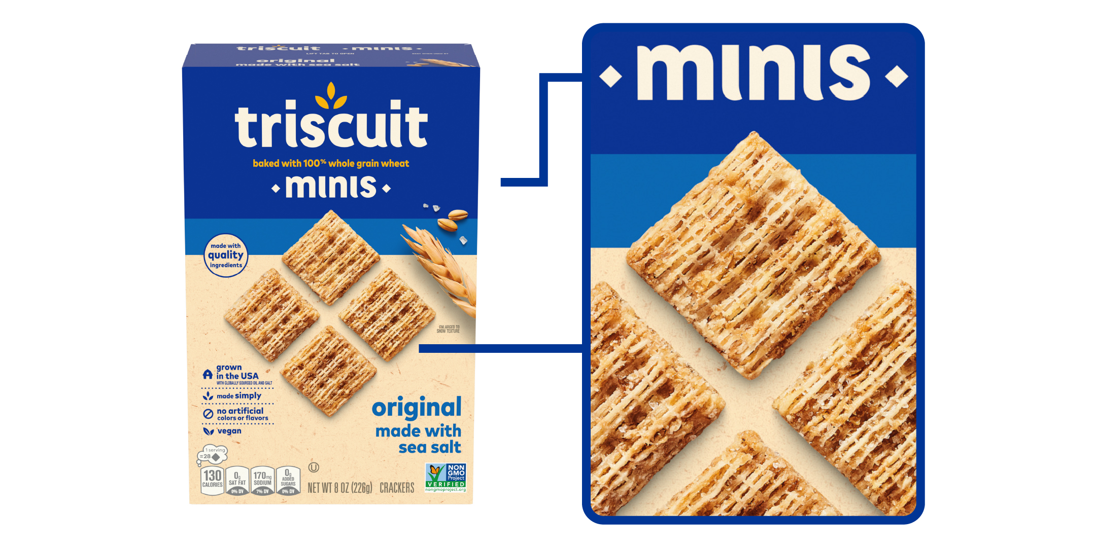
I also appreciated how the Thin Crisps and Mini wordmarks seamlessly fit in with the parent Triscuit branding while still maintaining some unique elements, such as how the primary imagery has been handled.
In my opinion they should have made a bigger deal of this rebrand! It’s too nice to not acknowledge the great design work that was done.“
Image Sources: (1, 2, 3) SnackWorks
AA: “This new packaging is the perfect example that sometimes less is more! The previous design had a significant number of elements and imagery that felt busy and lacked a true focal point. This new packaging is modern and streamlined with a clear sense of hierarchy.
I think it only makes sense that the logo and product imagery are top of hierarchy and even though these were both the largest elements on pack previously, there was so much distraction in the background that things started to get lost. This new layout really makes for a quick scan of information, which could easily motivate someone to grab it off the shelf. Rotating the cracker was a clever choice in replacing the graphic triangle from the previous design and it helps to lead the eye from the top of the package to the bottom. This treatment is also reflected in the minis and thin crisps but in their own unique ways, which was a good choice for consistency, while still creating visual interest.
This redesign is such a nice evolution from where they were previously! There are many details throughout the design that feel intentional and well-thought-out, but I think they really knocked hierarchy out of the park.”
Designers’ Ratings


Inspired by Under Consideration


