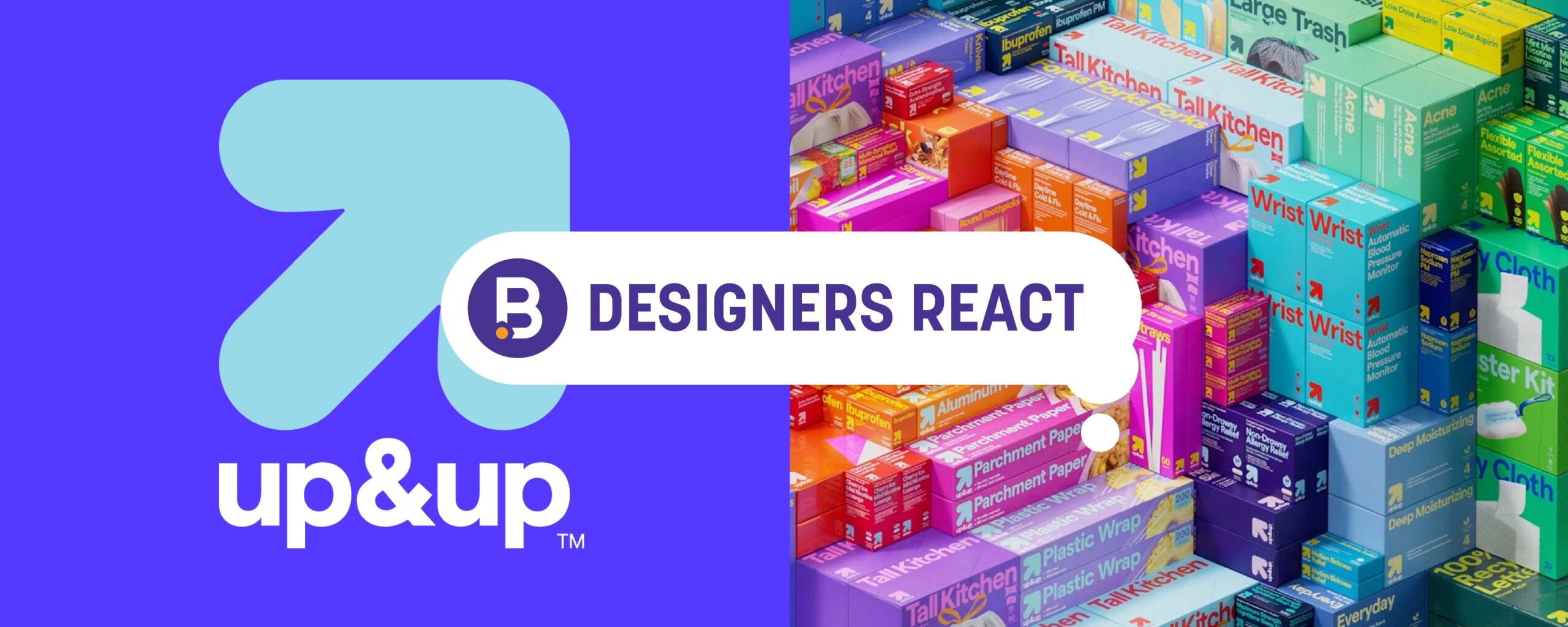
up&up™
Designers React
Today, we get our designers’ take on the recent up&up™ redesign.
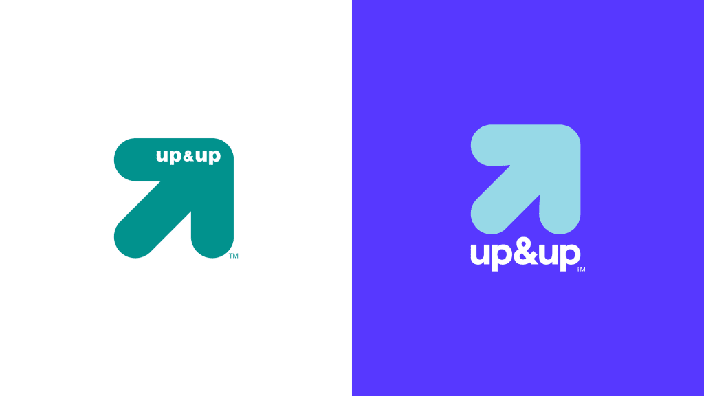
Image Sources: Fast Company
NT: Target’s up&up™ private label revamp is really stepping up the shelf presence!
First, let’s talk about all the cool colors! I love the way each product takes on a dual color palette. The color combos are expressive, disruptive, and feel on-brand for Target. Some colors could even be considered a bit unconventional depending on the category in which the product is shelved. Take the Ultra Strong Bath Tissue, for example. In a category oversaturated with blue, green, and white, the contrasting red-orange color of up&up™ is sure to stand out. The red-orange color also plays in the same space as Charmin’s Ultra Strong toilet paper.

Image Source: Target
Mimicking the color schemes of competing products is a familiar and strategic approach private label brands leverage to suggest a comparable quality to name brand competitors while offering a lower cost alternative. While this approach isn’t necessarily new, I find the psychological influence of color in this situation interesting.
More than the colors, the bold typography and attention to hierarchy throughout up&up’s™ product offerings excite me. The primary font is simple yet stylish and has great legibility. I particularly enjoy how the brand emphasizes a feature or benefit of a product prominently on pack in many instances. The Up&Up toothbrushes emphasize “Sonic Power,” “Battery Power,” and “Deep Clean” as opposed to “Toothbrush,” and the food storage containers call out “Snap & Store” first and foremost. Focusing on the features and benefits that consumers may not be aware of rather than the obvious details about the product makes for more effective on-pack communications. The product photography also does a nice job at reinforcing or explaining certain products.
In a world where on-pack communications have become overcomplicated, I believe up&up’s™ distinct approach will create an easier shopping experience for customers both in-store and online.
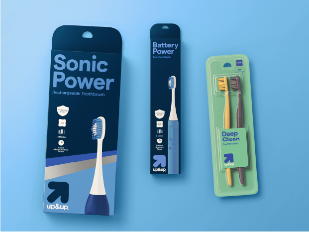
Image Source: Target
DN: The logo refresh is spot on; they addressed everything that hindered its legibility in past designs! By removing the up&up™ name from the arrow holding shape, the size of the wordmark was able to increase significantly. The more modern font choice and the way the ampersand fills the space is a nice but subtle touch. Another benefit of separating the wordmark and icon is that the arrow was able to be reduced without sacrificing its impact. Overall, this evolution is well executed and breathes new life into Target’s popular private label brand.
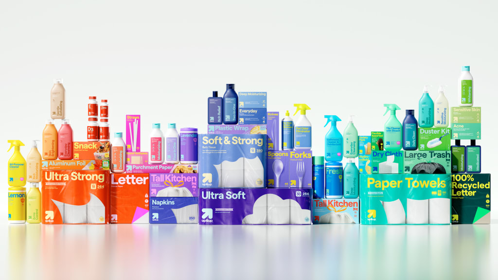
Image Source: Fast Company
There are things that I like about the new packaging… and there are things I don’t.
Let’s start with the positives! I think shifting their packaging from white to bold, bright colors was a smart move in terms of popping on shelf. While there is a trend of brands playing in this palette, it’s still unique enough to grab the eye. Not to mention, when your color palette is essentially a rainbow, the color pairings are endless! I also think the packaging is more impactful with its refreshed imagery and windows.
What they’ve been able to accomplish is a clean look without feeling empty. The packaging looks intentional and thought out, which most private label brands struggle with.
Now for the negatives: I don’t care for the styling of some of the text & icons/callouts. The text size, in terms of what is being emphasized, feels really strange. I understand that the intention was likely to communicate the most important attribute of the individual product, but it simply doesn’t work holistically. For example, for their scented wipes the scent is amped up; however, I would argue that when scanning the aisle, emphasizing “disinfecting wipes” would be more helpful.
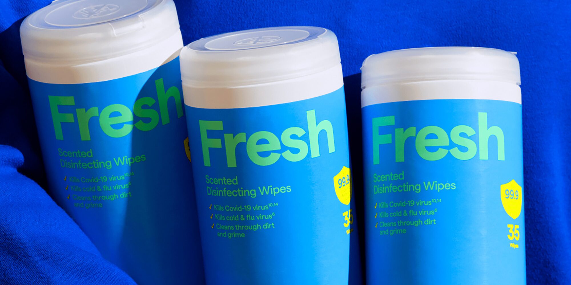
Image Source: Under Consideration
Another example is the up&up™ Automatic Blood Pressure Monitor, where “Wrist” is emphasized. I just don’t think that would help a shopper, especially when there is no imagery on the front of the packaging which would assist in a quicker understanding that it is a blood pressure monitor. Once again “wrist” feels like a more secondary attribute in terms of helpfulness.
When it comes to icons/callouts, there are some decisions that are real head-scratchers to me! As an example, the Tall Kitchen Fresh Scent packaging was more successful in terms of communication previously. In the new design, I find the overlapping count number and logo hard to read – plus the icons for odor control and UltraStretch™ have little contrast, making them hard to read. Granted, depending on the SKU, there appears to be more room for the communications to live. However, I think they should have found a better solve for this issue.

Image Source: Under Consideration
AA: I’m here for this redesign! The shift to vibrant colors is bold and instantly modernizes the brand’s aesthetic. The colors help the packaging feel fresh, and I think this will really help the products pop off the shelves. Traditionally, private label products have been seen as budget-friendly but uninspired in design, usually lacking the visual appeal of name-brand competitors. However, this redesign challenges that notion, positioning up&up™ as a contender in the retail space.
Another smart design decision was removing the text from inside the arrow and enlarging it outside of the shape. This adjustment increases brand recognition by making the wordmark more readable while maintaining its iconic form.
Overall, I think this redesign is a great improvement. This proves that the impact of thoughtful design choices can shift consumer perception on value items. With this vibrant and engaging packaging update, up&up™ is no longer just a budget-friendly alternative – it’s a brand worth choosing for both its aesthetic and its value.
Designers’ Ratings


Inspired by Under Consideration