The Challenge
As a brand that offers premium and delicious Chinese specialty cooking ingredients, the Ty Ling™ product portfolio includes an array of oils, sauces, vegetables, noodles, fortune cookies and other items to anyone looking to recreate the Chinese restaurant experience at home. Faced with significant competition in the Asian Food category, but with a variety of products and an established position in the marketplace, Ty Ling sought a new logo and package redesign as the first steps in their overall plan to rejuvenate the brand.
Agency Services
Competitive Analysis
Packaging Design
Photography
Line Extensions
3D Renderings
Production
Our Approach
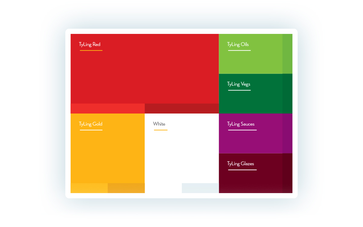
The Color Palette
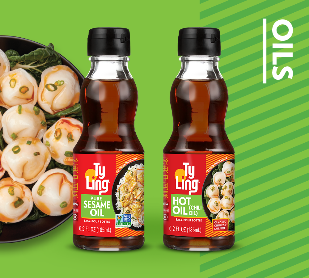
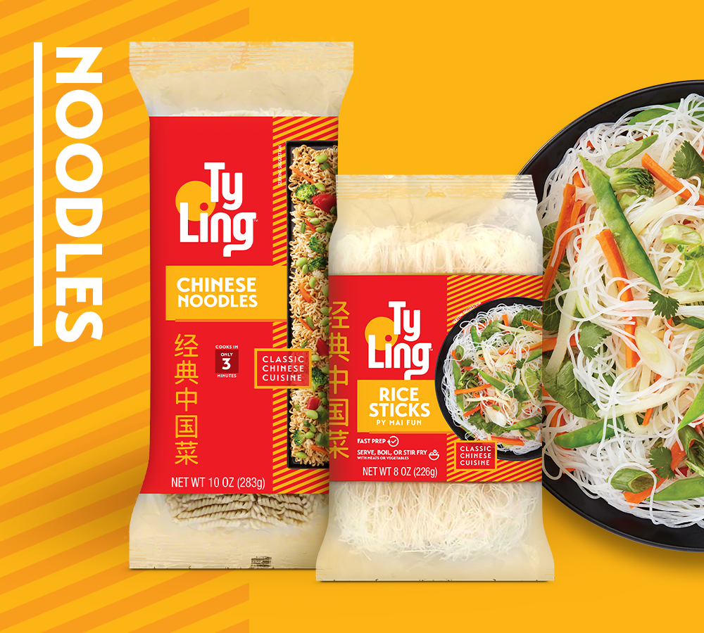
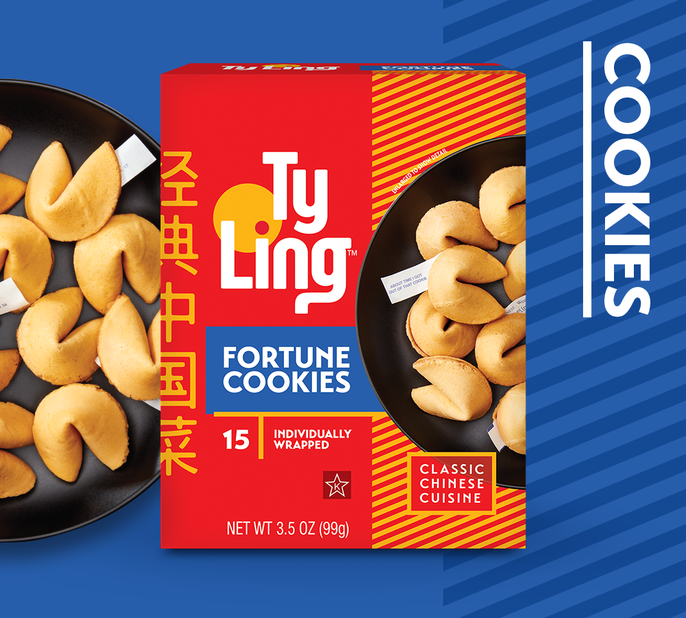
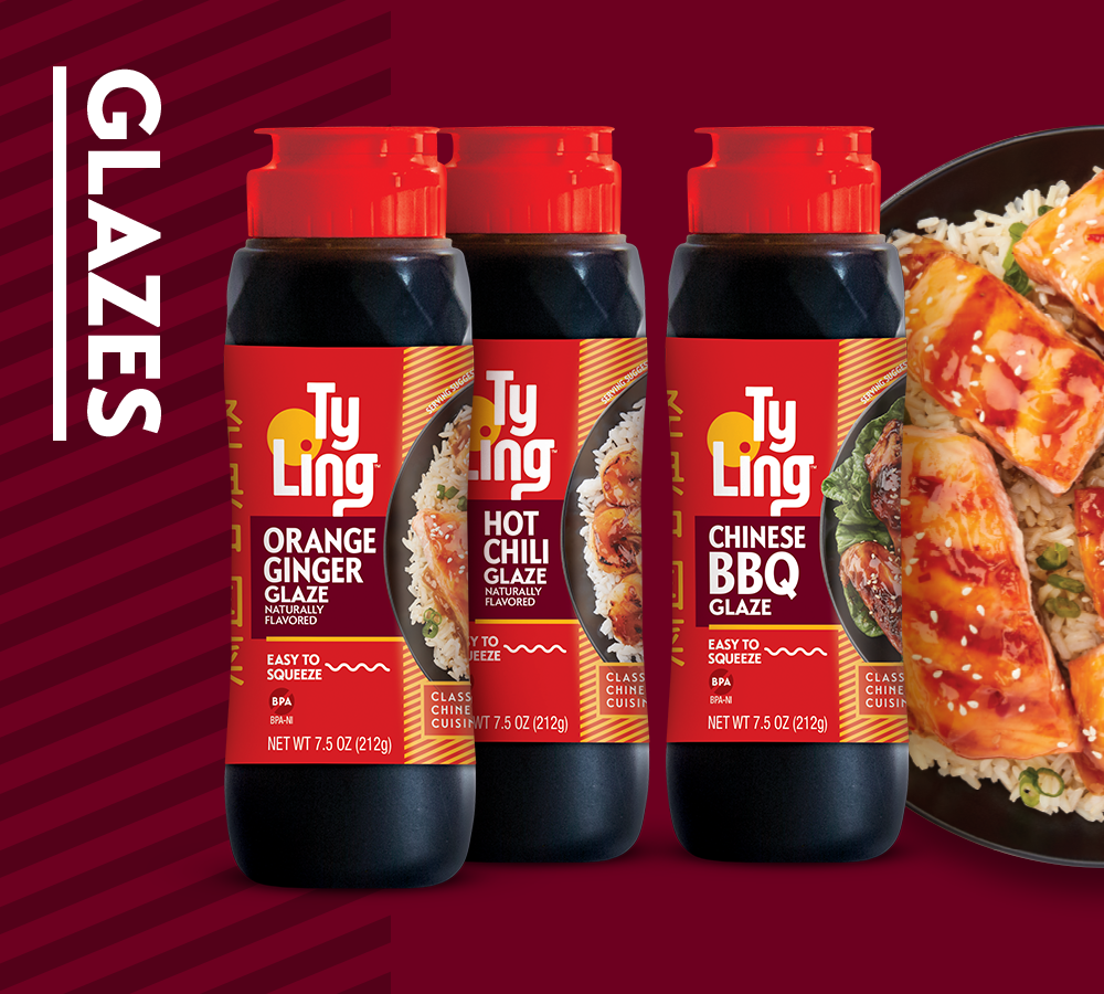
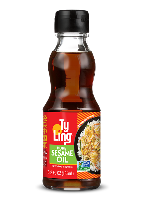
We knew it was important to leverage the current red brand color in order to retain Ty Ling’s point of difference on shelf and to maintain familiarity with current consumers. Influenced by cultural elements, we explored the combination of red and gold to speak to the authenticity of the brand and incorporated pops of complementary colors to bring a fresh aesthetic while also clearly segmenting product types.
The Identity
The new identity needed to make a bold statement on pack to allow the brand to be quickly & easily identified on shelf. By creating simple letterforms with a touch of Chinese inspiration, the classic yet contemporary identity appeals to consumers spanning all generations. The end result was a modern logo with a cultural flair that can be seamlessly applied to all marketing touch-points.
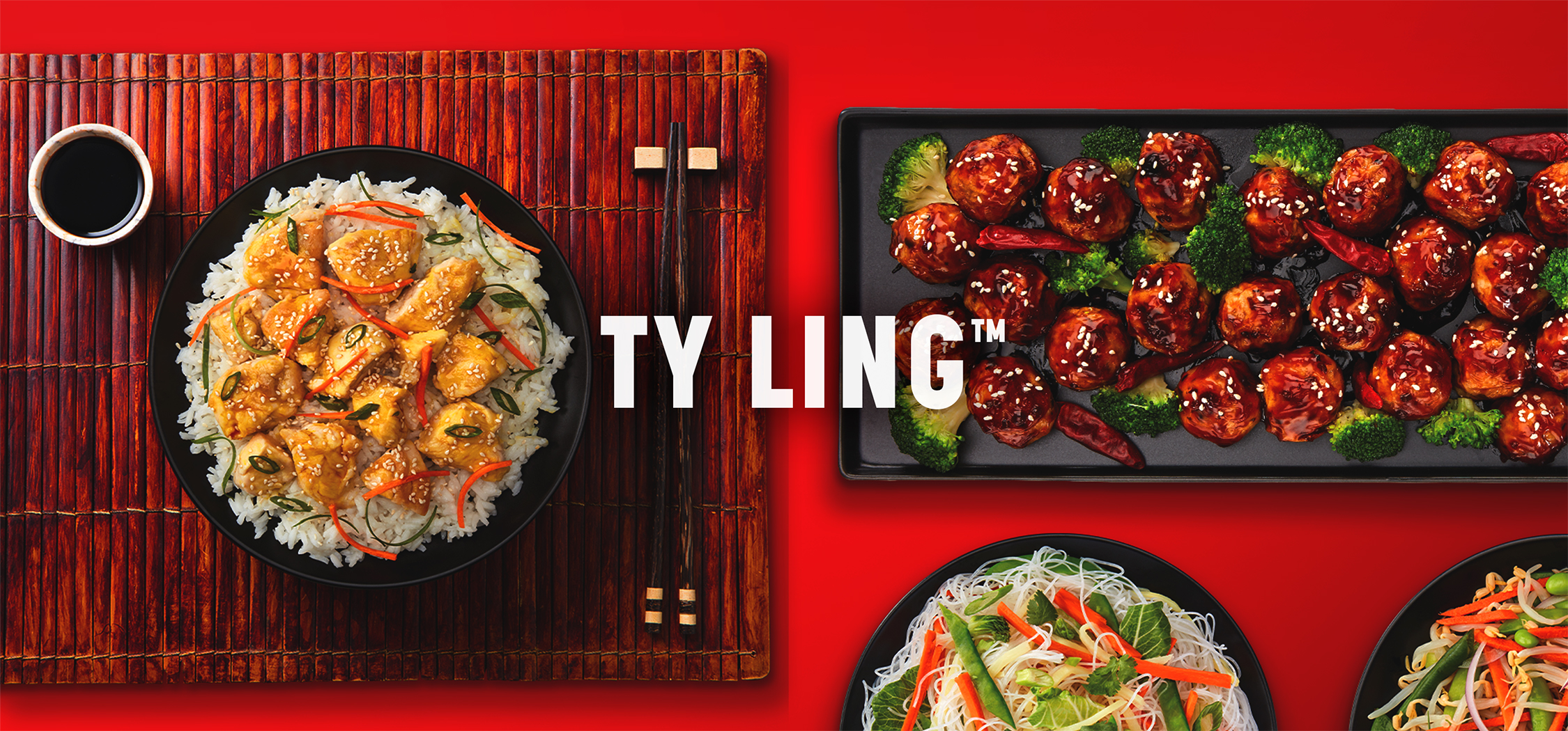
The Imagery
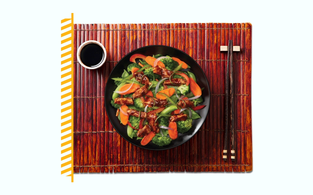
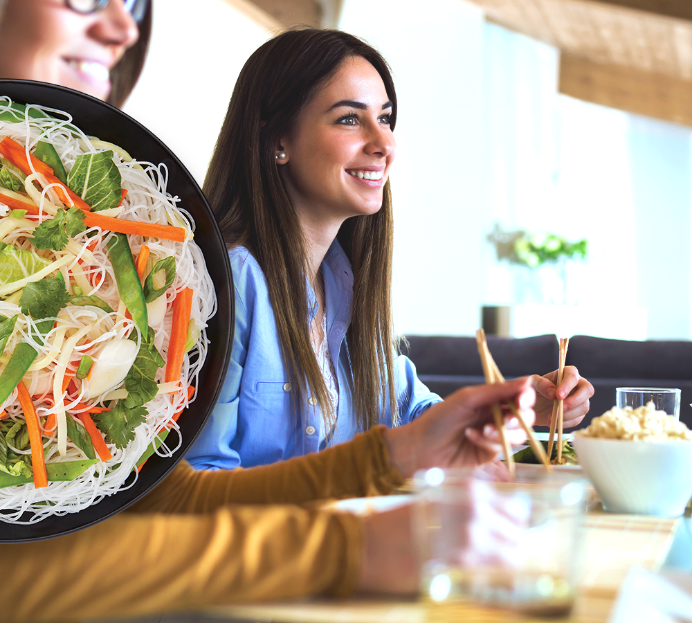
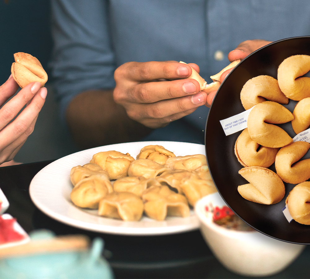
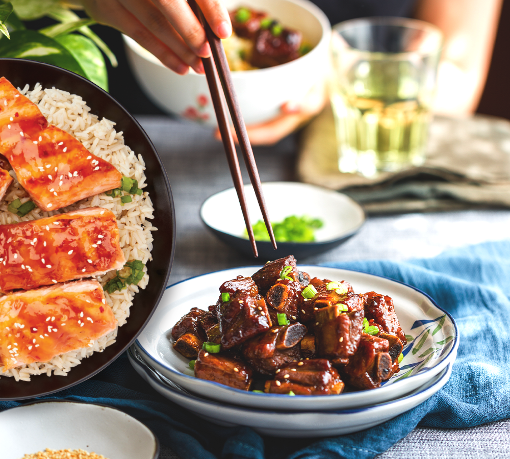
Designing around photography that was appetizing, creative, and current was central to our approach. The concept was largely reliant upon a maximized hero image in order to showcase usage and communicate the culinary nature of the brand, while the architecture needed to be flexible enough to adapt consistently across all pack types. The design included a graphical representation of bamboo placemats and we developed a cohesive cuisine & plating style for the photoshoot to create unique, mouthwatering dishes. With the addition of full recipes on the back panel, the final imagery tied together a full Chinese culinary experience.
The Solution
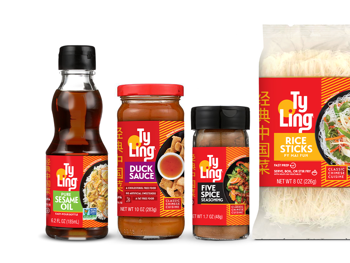
Our ultimate goal was to create an eye-catching design that clearly communicates the product, grabs consumers at shelf, and prompts them to purchase. Through strategic utilization of space, stylized on-pack elements to call out benefits, certifications & usage occasions, and colors inclusive of brand authenticity & modern simplicity, Ty Ling’s new identity and package design culminated in a cohesive brand line that clearly differentiates products both individually and from competitors.
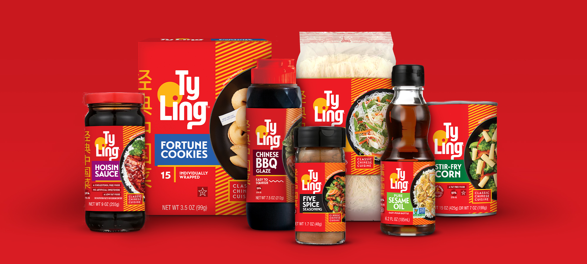
Ty Ling™ Family
By maintaining Ty Ling's authenticity while appealing to a younger demographic with a refreshed and modern look, their new brand identity and package design embodies an aesthetic that inspires premium culinary dishes that satisfy personal food preferences and infuses Chinese cultural flair. Poised to solidify their position as a leading brand in the Asian Food category, the Ty Ling family of products transformed into a cohesive brand with an impactful presence on shelf.
"BrandFirst was a fantastic partner for our Ty Ling package redesign project. The BrandFirst team really listened to our needs, developed a great range of creative and was responsive. We are thrilled with the results and look forward to working with them on future projects!"
IRENE SUHAKA, DIRECTOR OF MARKETING | WORLD FINER FOODS, LLC

Logo Redesign
BEFORE

AFTER
Package Refresh
BEFORE
AFTER