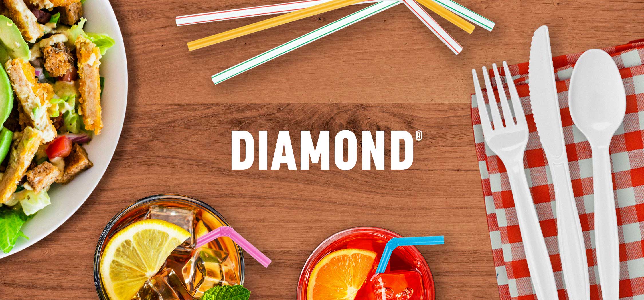
Classic Brand Takes New Angle On Packaging
The DIAMOND® brand has been providing disposable cutlery and straw products for more than 60 years. In a move towards reducing plastic usage, the brand restructured its packaging, removing the window element. This transition was an opportunity for us to reimagine the design, optimizing its presence on shelf while staying true to the brand’s legacy of providing high-quality products.
Agency Services
Packaging Design
Line Extensions
Production
Marketing Materials

Shaping Goals & Objectives
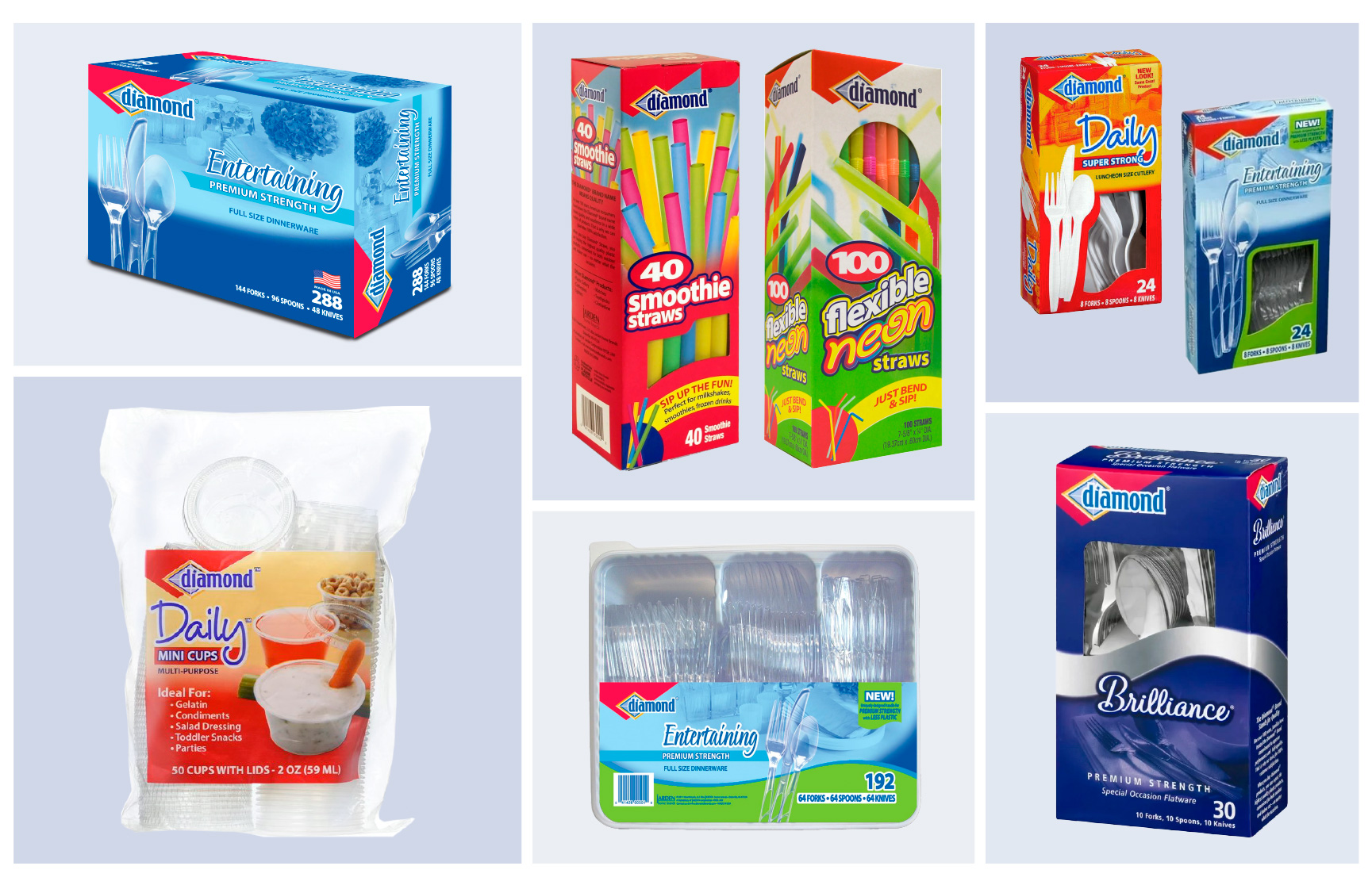
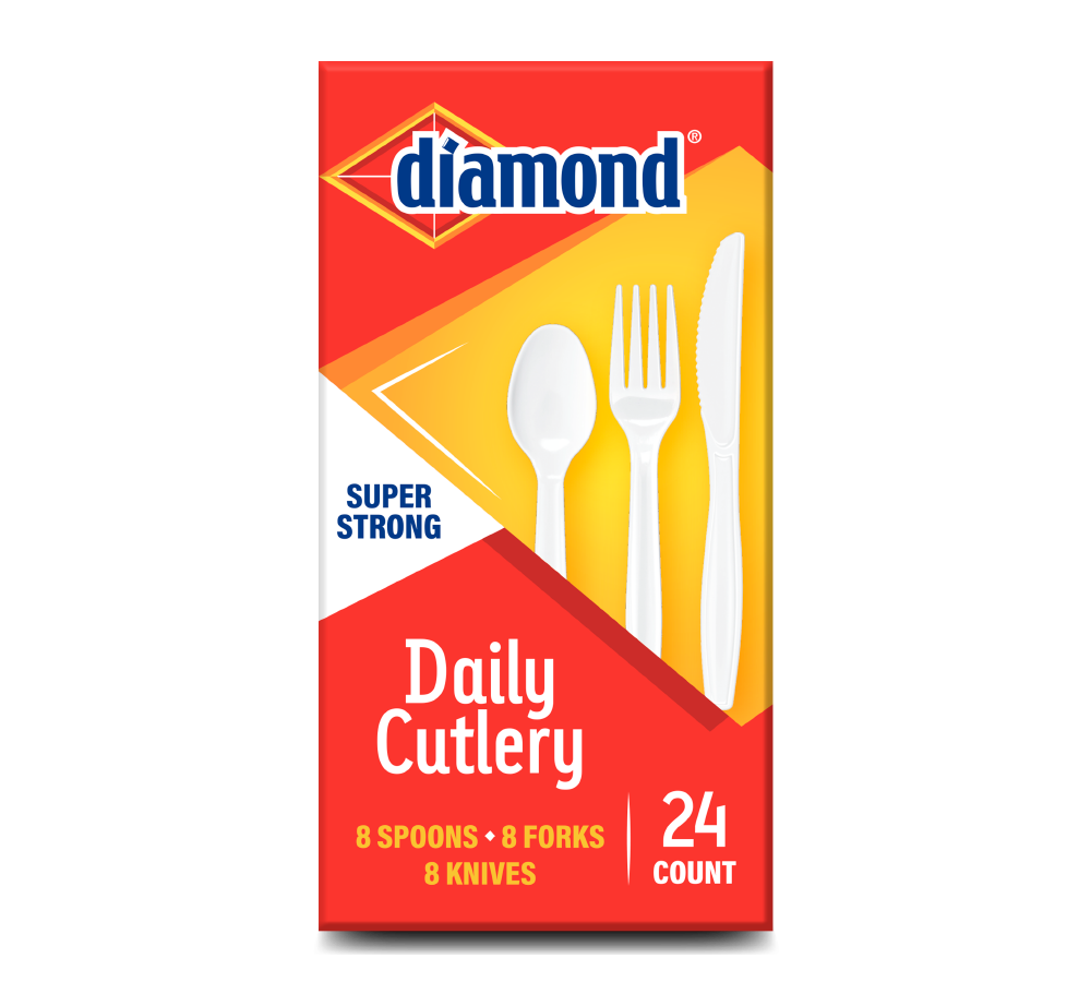
Strategic in our approach to the redesign, we knew we needed to establish graphics that would be flexible enough to seamlessly adapt across 21 SKUs, each with a different dieline, to give the lineup more consistency and brand recognition. By eliminating the window feature, the new DIAMOND® packaging presented more space to explore hierarchy and create a different design structure that was consistent across products. Beyond aesthetics, it was important to communicate product benefits, usage occasions, and certifications to educate consumers at shelf and help them make easier purchasing decisions that meet their needs.
Shining Bright With Purpose And Flexibility
Packaging Architecture
With so many SKUs varying in product type, assortment, and count, we leveraged prominent product photography, clear communication hierarchy, and intentional color blocking to establish differentiation on shelf. The (subtly) enhanced brand logo remained a prominent feature at the top of each package as the integration of different diamond shapes resulted in a visual representation of the brand name. The shapes also created segmentation, ensuring clarity and readability in the design.
Rollout & Extensions
From Daily Cutlery & All Occasion Cutlery to Straws & Mini Cups, we applied the new DIAMOND® design to 21 different dielines. The rollout required acute attention to detail in ensuring the graphics were maintained and accurately adapted, no matter the size or shape of the packaging. Intentionally crafting a design that was adaptable for different products yet consistent for the brand resulted in a cohesive lineup that shines bright on shelf and creates a strong brand presence.


Marketing Materials
Once the redesign was complete, we extended the new graphics and assets to a product brochure and sell sheets. These mediums provided opportunities to reinforce the brand’s refreshed aesthetic while also expanding the communications regarding product features, benefits, and usages.
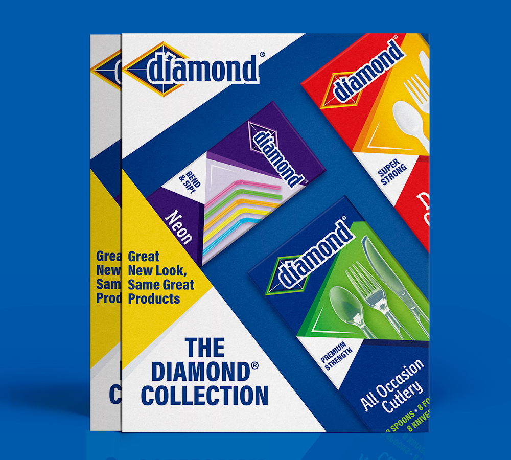
SALES BROCHURE
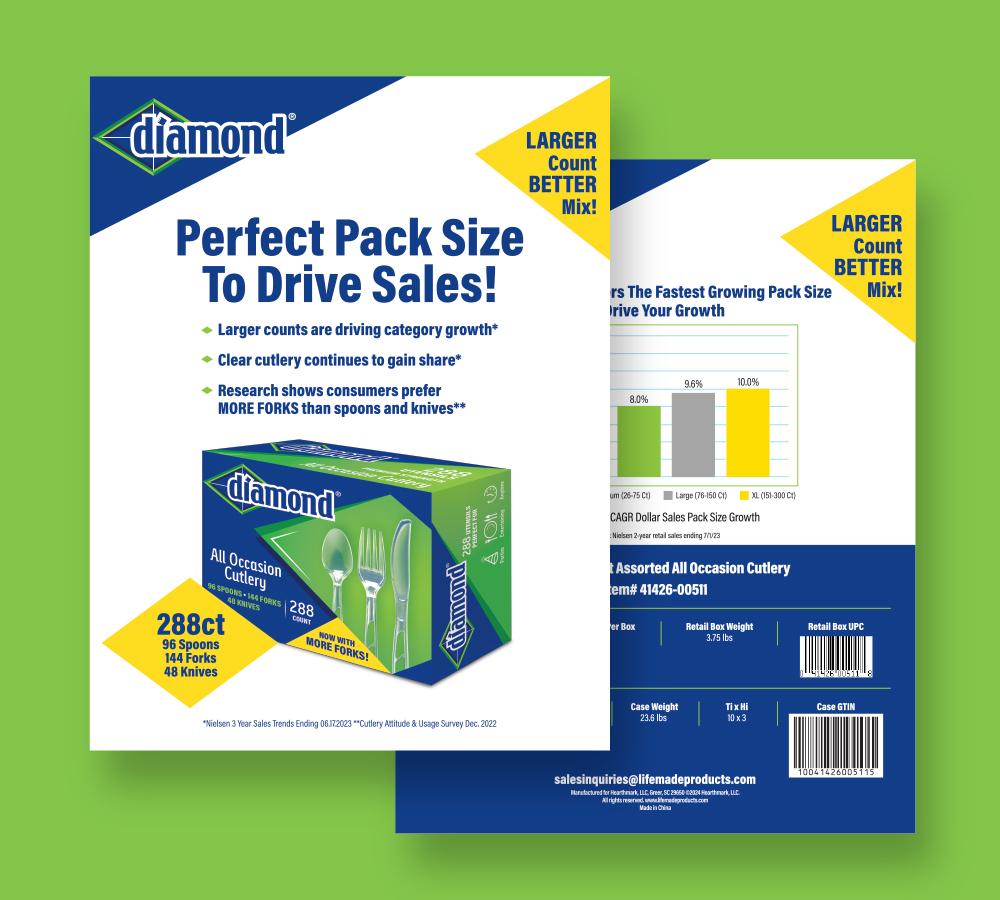
FLYERS / SELL SHEETS