Whole Foods Market
Designers React
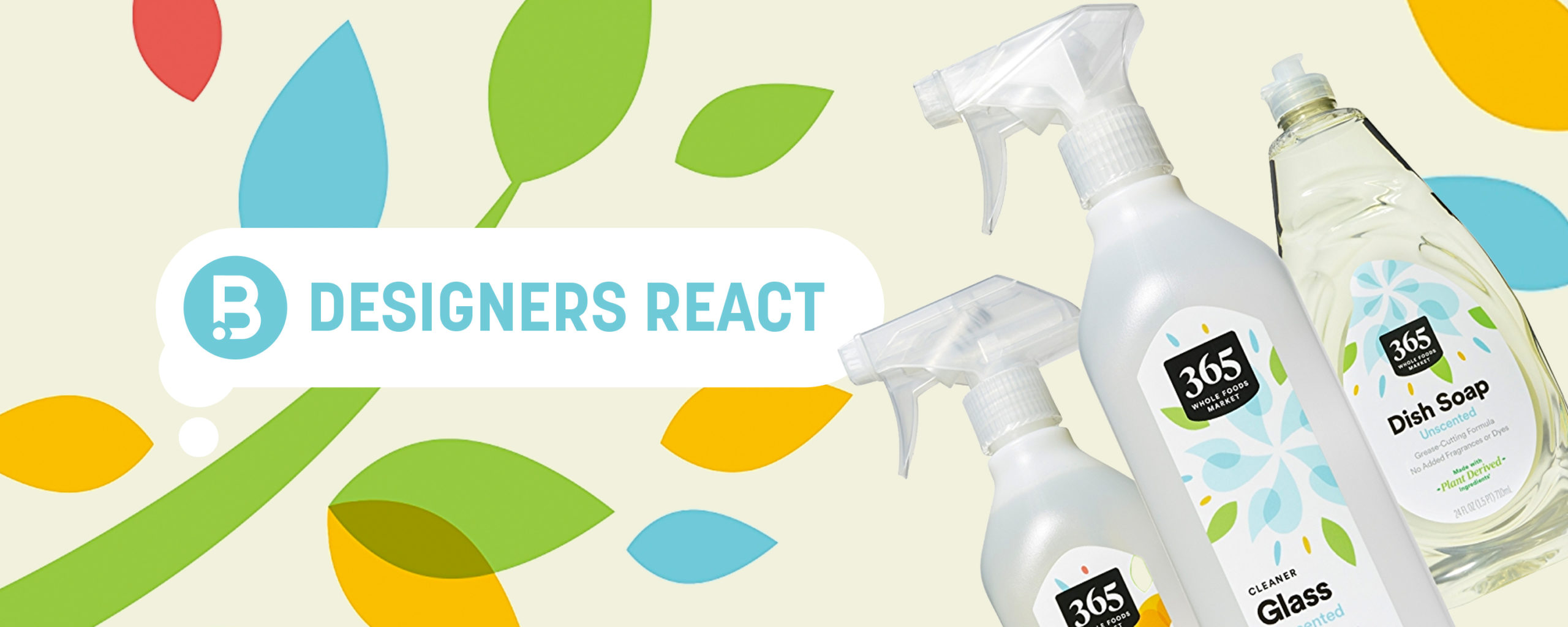
Today, we get our designers’ take on the recent 365 rebrand designed for Whole Foods Market.
A nice detail is when noting a product is Organic, the logo changes from black to green while still keeping the Organic callout lower on the pack. Mainly they took the colors from the squares of the original logo and incorporated them across the rest of the packaging as design asset pieces that do a good job of complementing the products.
Overall I think this is a much needed & good evolution of their brand. It seems like they are focusing on a younger consumer with the bright colors and simplistic shapes, and eliminating the more premium earthy feel that the illustration was originally trying to accomplish.”
I love the use of color and shape throughout to help unify the products and define their new look — whether it’s chips, olive oil, or dish soap you can clearly tell it’s all the same brand. The illustration style is simple, but well done. The color palette is friendly. I like the subtle changes for organic products. Overall, one of the strongest private label designs I’ve seen!”
Designers’ Ratings
Inspired by Under Consideration