Baskin-Robbins
Designers React
Today, we get our designers' take on the recent Baskin-Robbins brand refresh.

IMAGE SOURCE: The Dieline
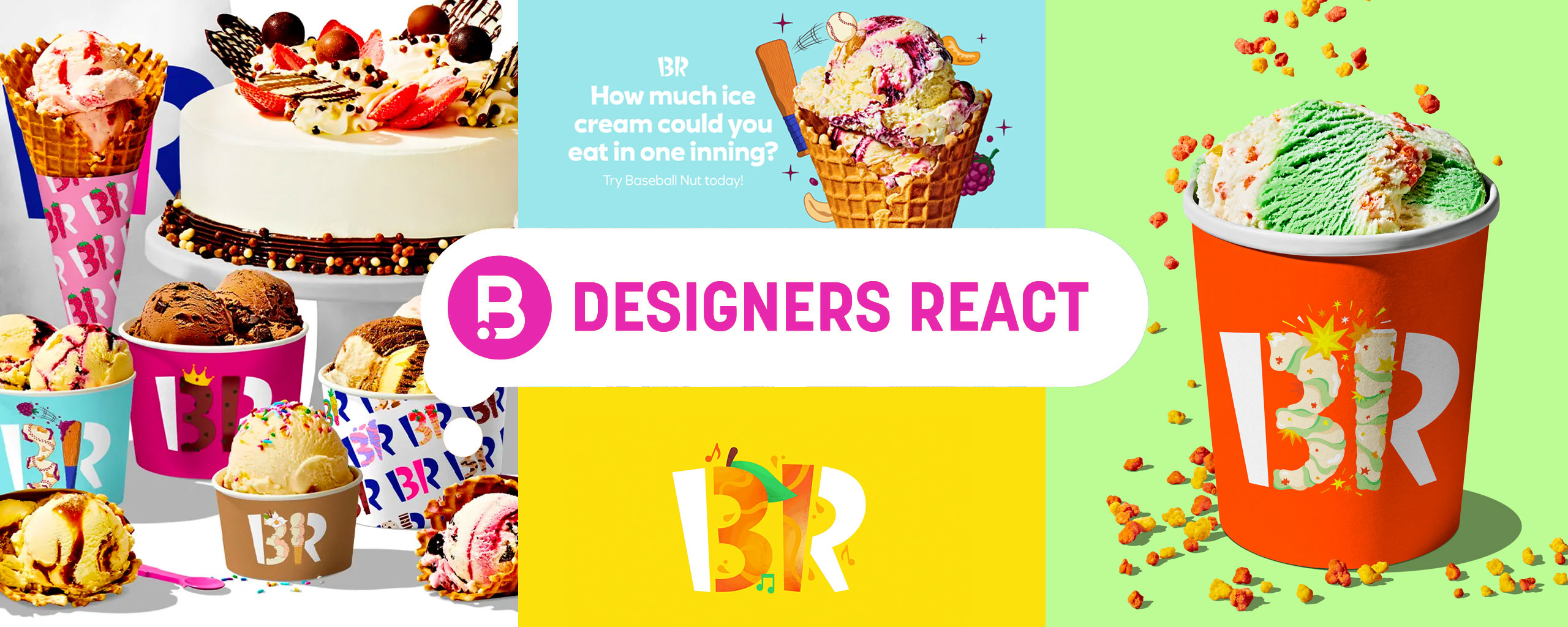
RF: "Baskin-Robbins is one of my favorite and fun logos to share with people when I want them to understand that there is a lot of thought that goes into logo and brand design. To many it is just a quirky BR, until they learn that there is a 31, which emphasizes their famous 31 flavors (each day of the month).
I am happy to see that the logo stayed the same – with obvious alignment and color refinements. I am even more pleased that when they updated their wordmark and typography they didn’t revert to a simple-characterless typeface. They went more legible with adding quirky flavors to the stems & feet of the letterforms. A subtle yet impactful detail.
This is an ice cream company after all, so it’s nice they went full fun with illustrations emphasizing the 31 in ways that highlight each of the flavors. This approach isn’t original but it fits the brand well and helps expand the brand more. With each iteration, it doesn’t hurt the recognizability of knowing that it is Baskin-Robbins. One minor criticism I do have is when you look holistically, the illustration styles tend to differ. But like previously mentioned, this being a FUN ice cream brand and having 31 (and more) flavors, it gives each flavor true uniqueness and flexibility to change and update through time. It allows the concept to grow and evolve without confining the style to just be one way. An example of this is Chobani’s illustration style, a brand that is more elevated and has an older audience, so it works to have a very tight & consistent style.
Side Note: I like the addition of adding the spoon, but would be prefer if the hand was all pink or all blue with the flavor just being on the spoon part. This execution would match what they are doing with the BR logo.
Overall this is a good example to show how you can grow a brand while keeping the personality at the same time."
DN: "Now this is a refresh I can get behind! They have managed to modernize the brand without losing any of its personality. I really like how they tweaked the colors so they pop nicely... it's the equivalent to a fresh coat of paint—it does a world of wonders.
The mix of illustration and photography is fun and playful, but most importantly it works for this brand. However, I do find the spoon illustrations a bit disconnected from the rest of the updated artwork. The custom typeface works really well and complements the branding nicely. It doesn't feel forced, but natural as all good design should! My favorite part is how they've emphasized the '31' in the logo with flavor-driven illustrations! It's simply a great refresh for an old brand."
NT: "I’ve always loved how clever the Baskin-Robbins logo is. I am glad to see that they still maintained their iconic BR (with the 31) while also giving their identity a nice refreshed look. The new typography used in the updated wordmark still has a playfulness to it while also making the brand feel more modern and polished. It’s a nice balance between keeping aspects of the brand that are recognizable and updating to keep their appearance looking current. Emphasizing the 31 with illustrated flavors of ice cream is an idea they should’ve executed years ago! I love how it brings more personality to the branding and shows that each flavor is original and exciting. I would love to see how some of these new ice cream illustrations and flavor patterns could come to life in their stores!"
Designers' Ratings


Inspired by Under Consideration