Bon Viv
Designers React
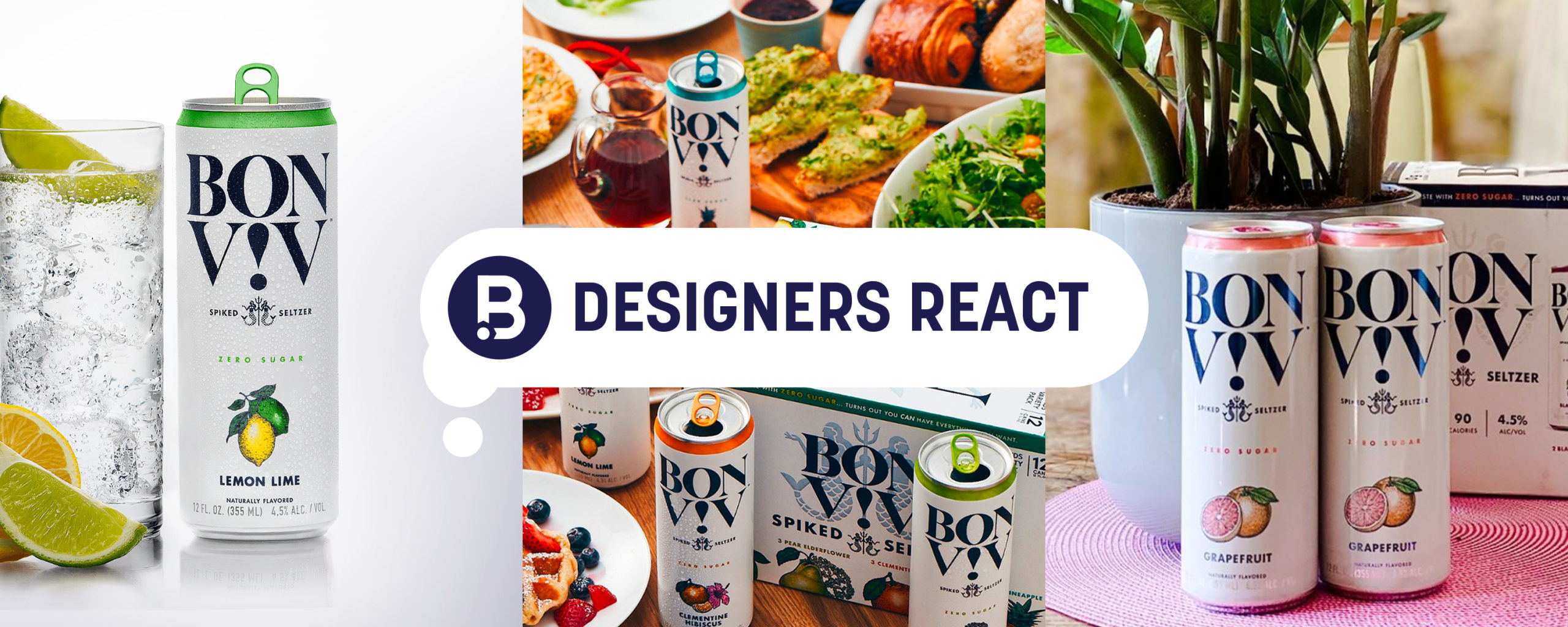
Today, we get our designers' take on the recent Bon Viv rebrand designed by FCB Chicago and Adam&Co.

IMAGE SOURCE: BON VIV
RF: "I’ve seen the previous design within the past year and I liked it. It had personality with the BON & VIV mermaids and the fan favorite “THAT BLUE” incorporated. But it seems like it’s been out for several years. For an update, I could have easily seen the bottom wave update to be the color of the flavor since that’s where it is mentioned, and change the hierarchy to have the name locked up with the mermaids instead of “hard seltzer.”
This ended up being the classic case of the client wanting to change the perspective of a brand.
They went from a sans-serif to a stacked ampersand-less BON VIV; let’s not forget the ‘!’ exclamation mark. They did change the hierarchy but not the way I expected. This does look more elevated with the typography choice and the simplicity in design. But my only concern is that it fits in line with the majority of the hard seltzer brands. White can: Check. Large logo on top: Check. Flavor indicator on bottom: Check. The illustration style in combination with the photography example does save it with me to give the brand something to use and be identifiable moving forward. (Chobani anyone??)
After all is said & done, I still prefer the before. In a category of ages 25-34, we have to wait and see if this change pans out."

DN: "The old branding was fun and skewed for a much younger demographic. While I don't drink seltzers, the previous look and feel would have definitely reeled me in. It was bright and unique in the category space.
The new design feels much more sophisticated and for an older consumer. Maybe this is intentional, but I'm less likely to pick it up or try it. It feels boring and dated. Personally, I think it's the illustration style with the bold serif. They score some points for their lifestyle imagery, but everything else falls flat for me (pun intended!)."

NT: "Wow! This redesign actually makes me feel a little sad. I find myself missing almost every aspect of the previous design. The mermaid illustrations on the previous cans were such an iconic and prominent component of the branding for Bon & Viv, I can’t figure out why they would take that away!? I also liked how the flavor indicators (fruit illustrations) for each beverage were interacting with the mermaid illustrations by placing them above the trident. Now, the redesigned can seems pretty standard and expected to me. The new fruit illustrations are nice, but the placement is just so boring! I like how they are maintaining a symmetrical and balanced feel overall, something that the previous design also did very well. All in all, this is just lackluster to me."
BN: "The old branding was fun and had personality that would definitely draw in a younger demographic. On the shelf next to its competitors, this would definitely reel me in.
For the new design, they definitely went for a cleaner look and targeted towards an older demographic. Maybe that’s what they are going for, but you miss an iconic piece from the previous design, the mermaids. For those to be an iconic piece of their branding, it’s sad that they are smaller and not as noticeable. The overall design just seems expected and standard in the spiked seltzer category. You’ve got the white background, dark text and a splash of color to complement the flavor. I do give them points though on the lifestyle imagery for their flavor indicators. Overall, the design just seems typical."
Inspired by Under Consideration