
IMAGE SOURCE: Mother Design
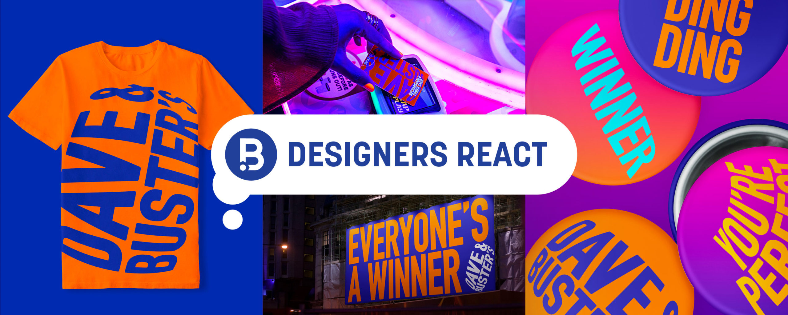
RF: "What’s jarring to me is that the primary logo lives in the more recognizable orange circle, but it is not depicted that way in the applications and usages. If you don't know the brand name, at a quick glance the logo feels unfinished when it is being used with other text. Also, seeing the orange and blue graphics beside the vibrant colored photography does not fit together in any way.
On one hand, if the wordmark becomes the circle, I think the color palette should be tighter and mainly just orange and blue.
On the other hand, the new crazy arcade-like colors (especially in the photography) really bring to life the experience of what the vibe is like at Dave & Buster’s.
MY TAKE: Ditch the orange with the magenta and use a deeper blue. Keep the wordmark in the circle when used with other text (white circle – text knocked out). And when the logo doesn’t have text around it, then remove the circle holding shape.
As it stands, the photo of the girl holding the power card sells it to me."
DN: "Dave & Buster's recent redesign has me confused. They elevated the idea of a place of gaming for adults, but any time I've ever been to D&B it's been full of kids & teenagers with some parents sprinkled in. It feels disjointed with who they are and who they want to be.
NT: "The simplification of the D&B logo and overall identity makes the refresh a nice update for the brand. The dimensional typographic treatment and bold colors can help establish a more ownable look and feel for the arcade. D&B’s previous logo was recognizable, but I can’t say that any of the other supporting brand materials were ever memorable. The fresh take on their photography style (with that fun arcade-like lighting) as well as the use of vibrant gradients and the bold typography gives the brand more elements to elevate in order to create a lasting impression. I also like how the imagery communicates a more mature audience and reinforces the fact that D&B was always intended to be an arcade for adults."
Designers' Ratings


Inspired by Under Consideration