IMPOSSIBLE®
Designers React
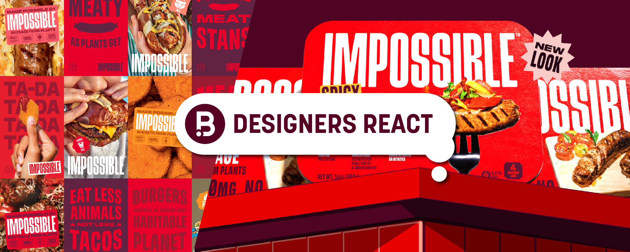
Today, we get our designers’ take on the recent IMPOSSIBLE® redesign.
IMAGE SOURCE: Brand New
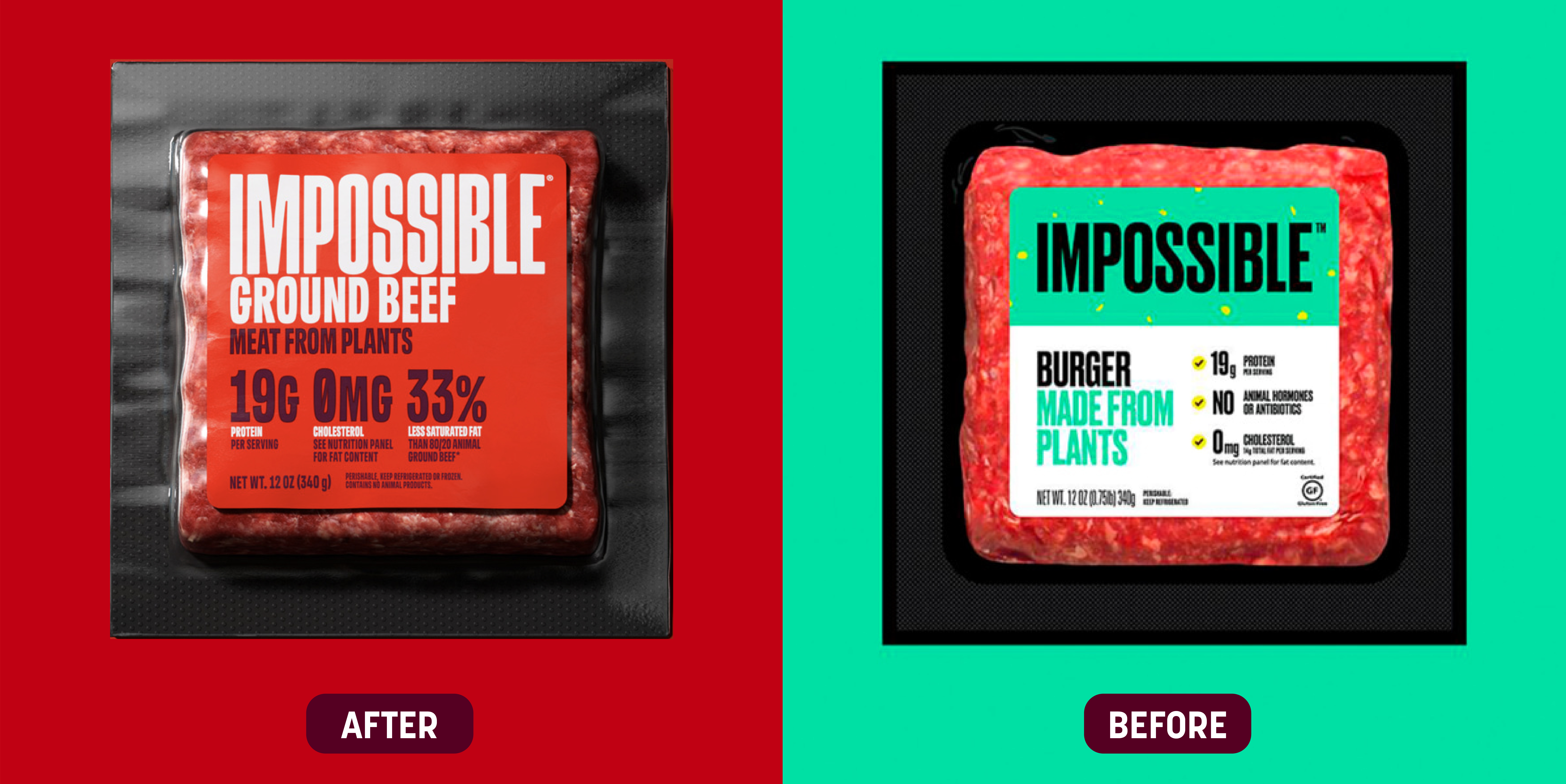
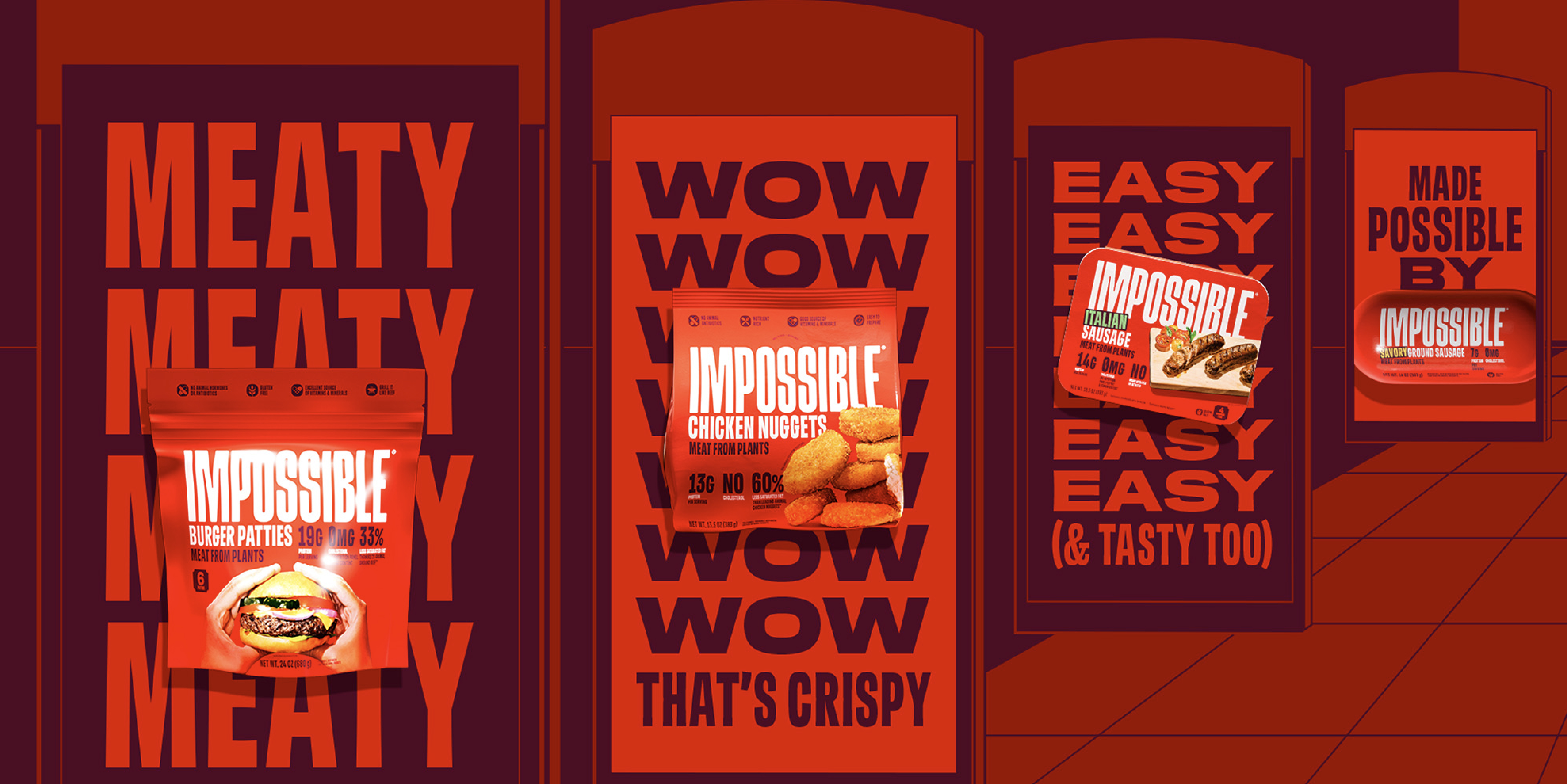
NT: “When IMPOSSIBLE® entered the market with their bright teal packaging, playful messaging and animated imagery, it was obvious they were a plant-based meat company looking to make an impact. The brand intrigued me from the moment I learned of it because it was groundbreaking, disruptive, and drew mass attention to the plant-based industry. IMPOSSIBLE® even convinced me to try their plant-based beef at a time when I had never tried a plant-based product before! In observing their redesign, it’s clear that behind the dramatic color palette shift, bold typography, and appetizing food photography is still the same intent and persuasive invitation to eat plant-based meat, just in a totally different tone.
The drastic visual change IMPOSSIBLE® is implementing appears very intentional, as if it’s a direct response to an opportunity they’ve identified to tap into other audiences beyond the plant-based loyalists like vegans and vegetarians. I love how the brand embraces their new primary color, red, which ironically, is a total contrast to their primary color before. Their meat-focused messaging and butcher- or deli-inspired type treatments also reinforce the brand’s new tone of voice in ways that make total sense to appeal to conventional meat eaters. Being that IMPOSSIBLE’s previous branding brought them so much success, most companies would have held on to some of their origins to maintain recognition and consumer perceptions. But, IMPOSSIBLE® recognized that to be effective, change needed to happen, and their unwavering ability to be disruptive and groundbreaking is still perfectly on brand despite the transformation.
The shift from plant-focused to meat-focused is a noticeable change, and I am inspired by IMPOSSIBLE’s ability to lean into it with total confidence. It was that same confidence that convinced me to try their plant-based beef years ago. While I can’t say I loved their plant-based beef then, this redesign is motivating me to give it a second try and to trust that this experience will be unlike the last. Yet somehow, I would expect it to also be strikingly similar to the experience of eating a traditional ground beef burger or homestyle meatballs, which makes me want to try their products even more and see if they deliver on that message.
With its new positioning, IMPOSSIBLE® is expanding its name and giving it more meaning by making people wonder, “How is it possible that IMPOSSIBLE® could be the meatiest meat on the market?” After facing challenges with growth (plant meat is down by roughly 14% in the last year alone – according to an article published by Fast Company), I’m excited to see if the brand will be successful at upholding its reputation of driving industry change yet again.”
IMAGE SOURCE: Brand New
DN: “The plant-based space can be visually odd sometimes—and that’s how I would have described IMPOSSIBLE’s branding before this redesign. As a brand, IMPOSSIBLE® has become extremely established as a plant-based line so it makes sense that they would now want to shed their funkier branding for something more traditional since they no longer need to stand out for attention.
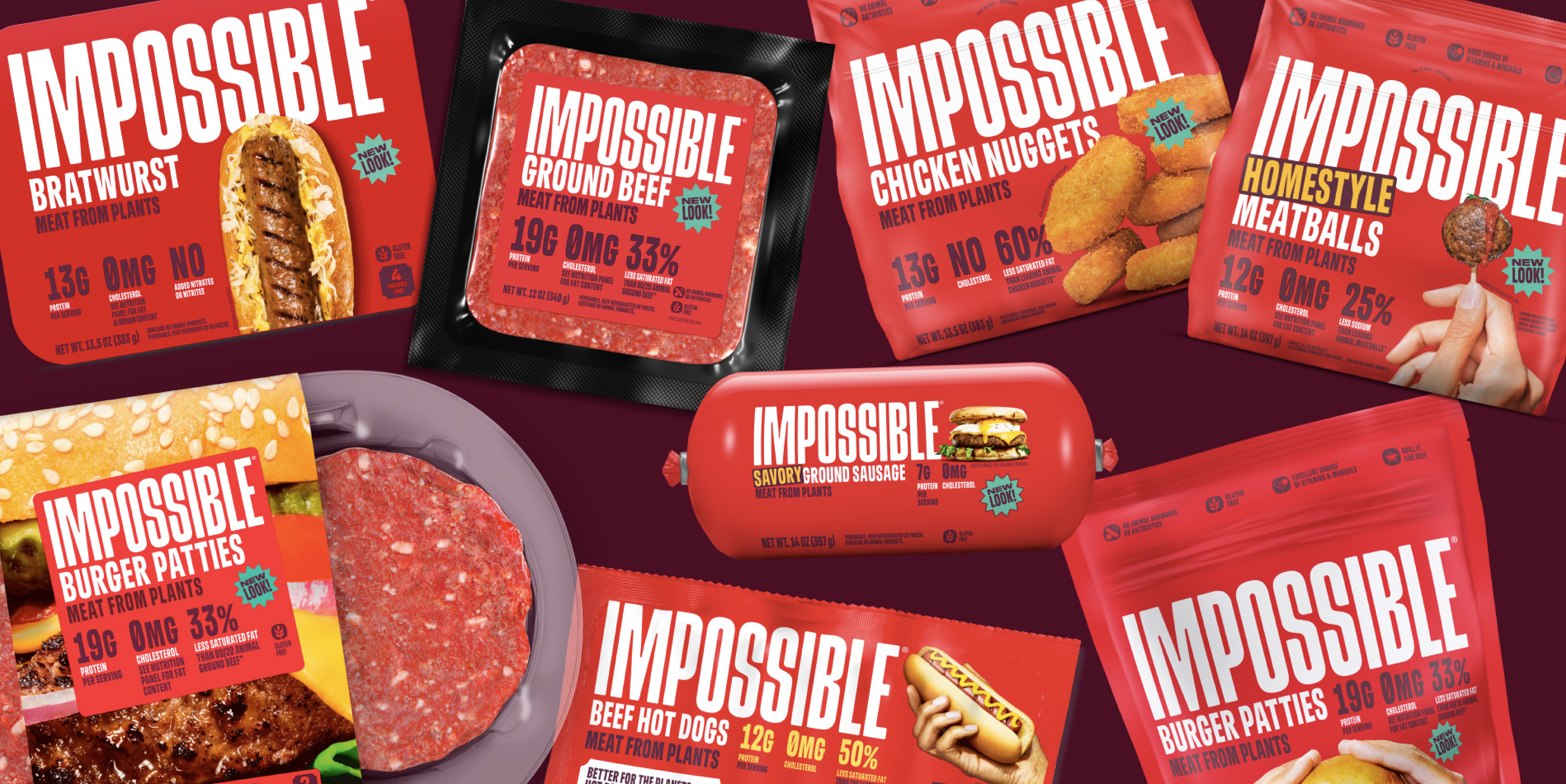
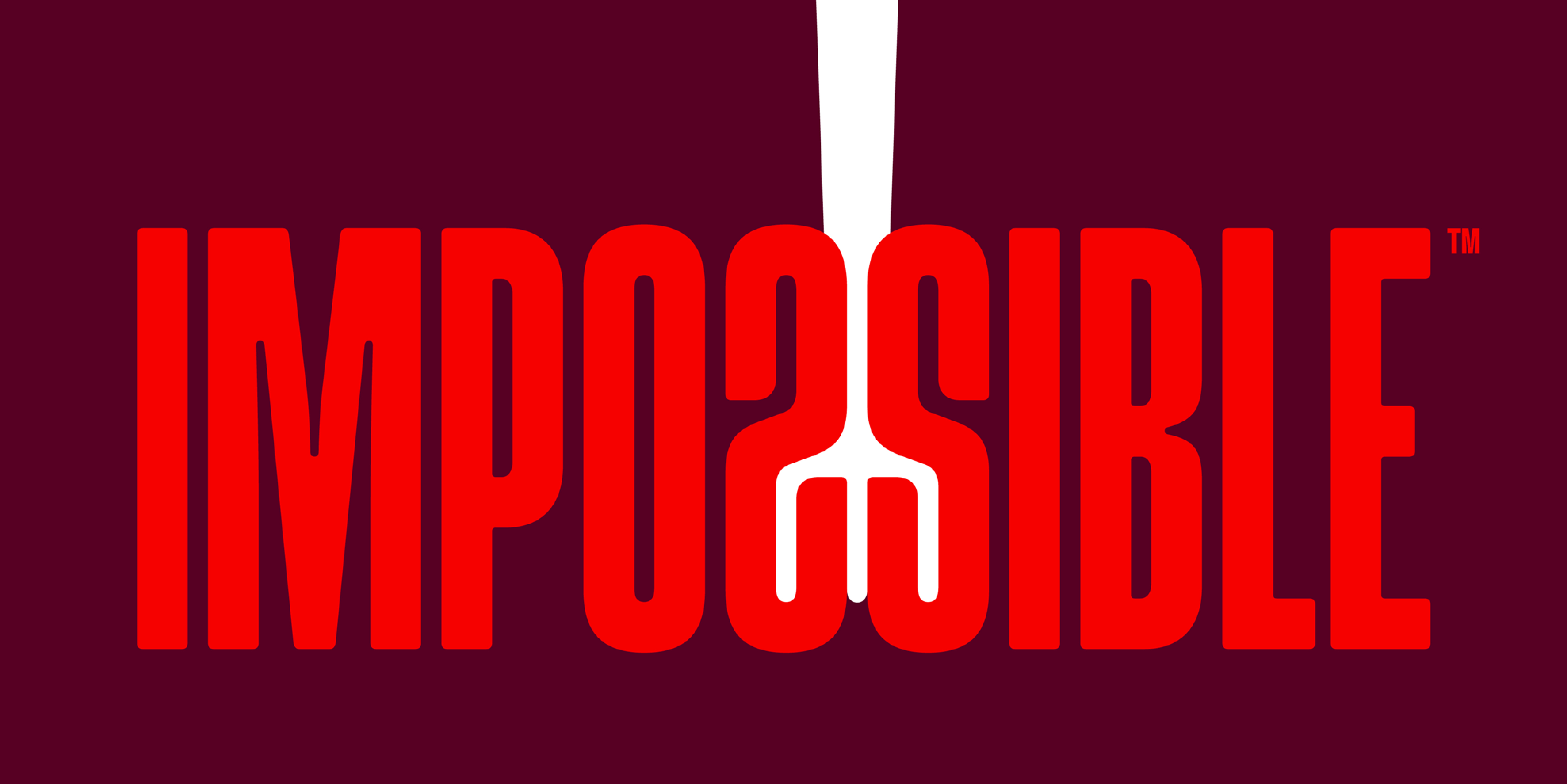
The wordmark is more ownable now, but I feel like flipping the S to create a fork in the negative space is a gimmicky stretch and it feels disconnected as an icon. If the fork was incorporated into the photography more consistently it may have resonated with me more. For example, they used a toothpick on the Homestyle Meatballs package when it could have easily been a fork! They also appear to use different styles of forks (and utensils in general) rather than a consistent style.
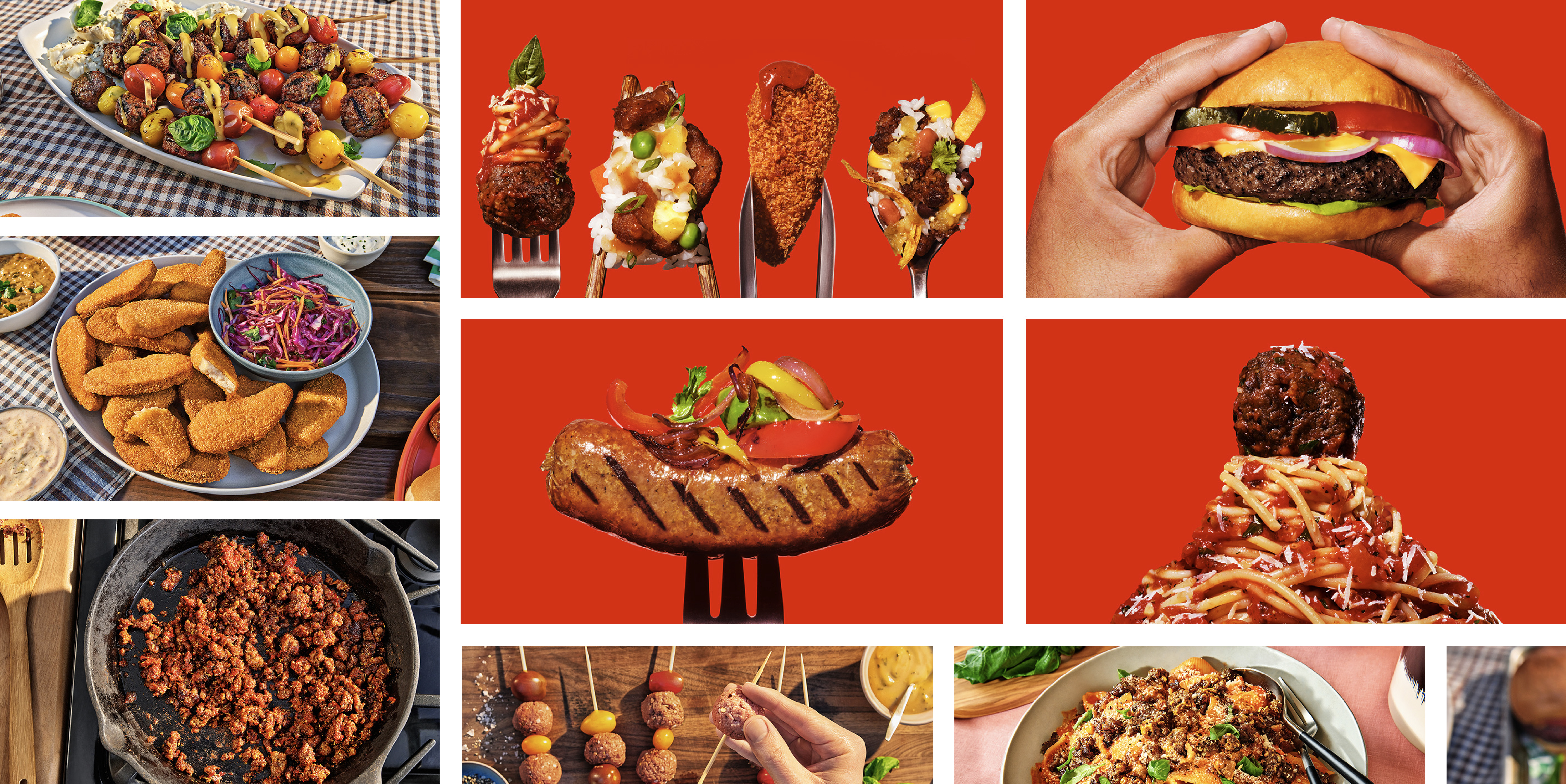
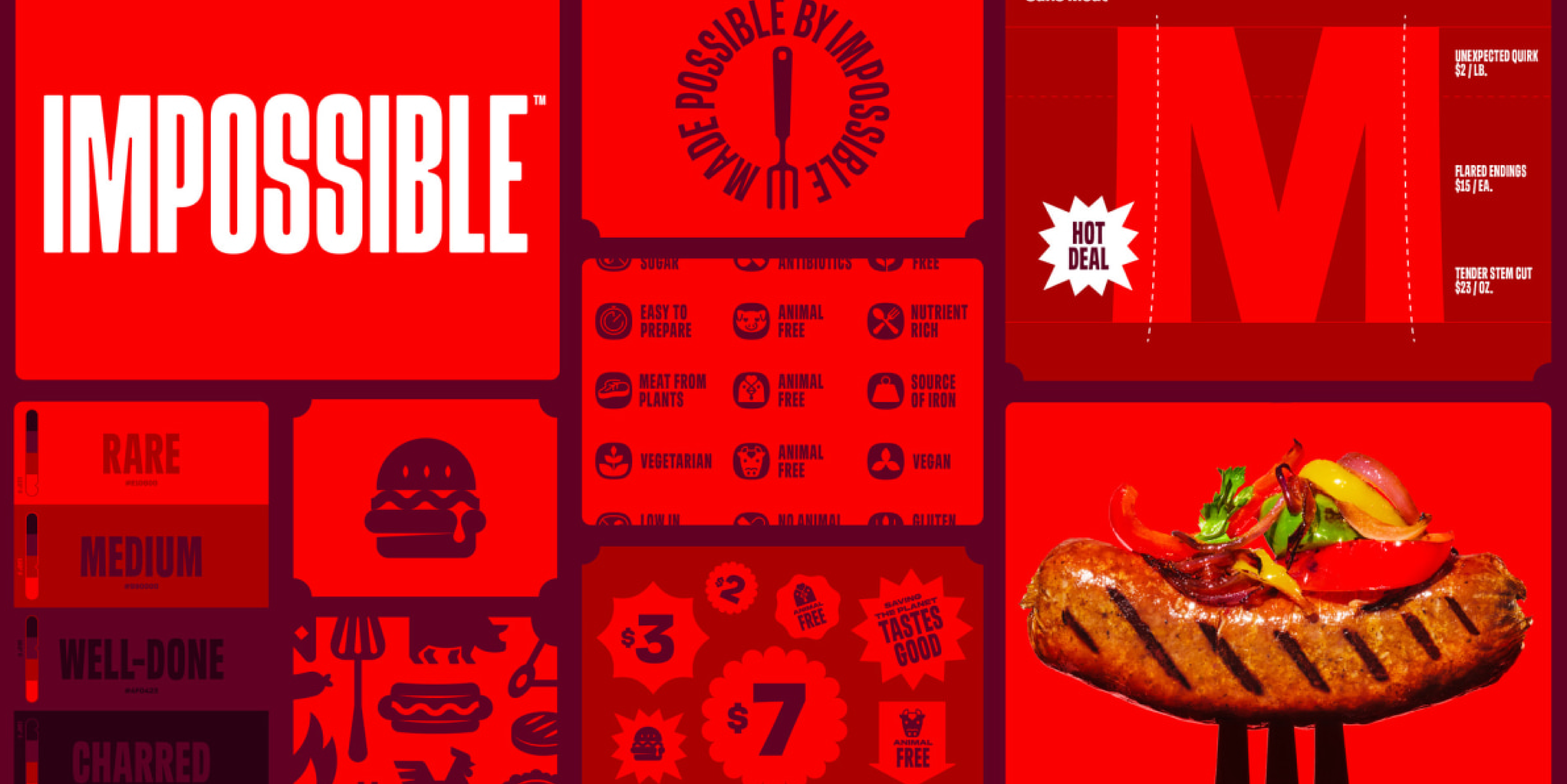
The color palette makes sense, and the packaging application is quite nice. I especially like the use of color, product photography and typography. However, I can’t say that it makes me feel hungry (the common association with the color red). I know their thing is that they “bleed like real meat” but that is not necessarily what I want to be thinking about when I’m shopping. I also think the “sticker” application has been overdone, especially in this category. I will say that I think the supporting lifestyle imagery is successful in terms of appetite appeal, but I think they could have benefitted from more accent colors in their supporting materials—the tone on tone feels overlookable & forgettable.
Overall, I feel like I’ve been quite harsh, but I do feel it’s a nice improvement and evolution of the brand. I just wish that, as established as this brand is, they would have taken more risk and shaken up the category. That’s a redesign I would have been excited to see!“
IMAGE SOURCE: Brand New
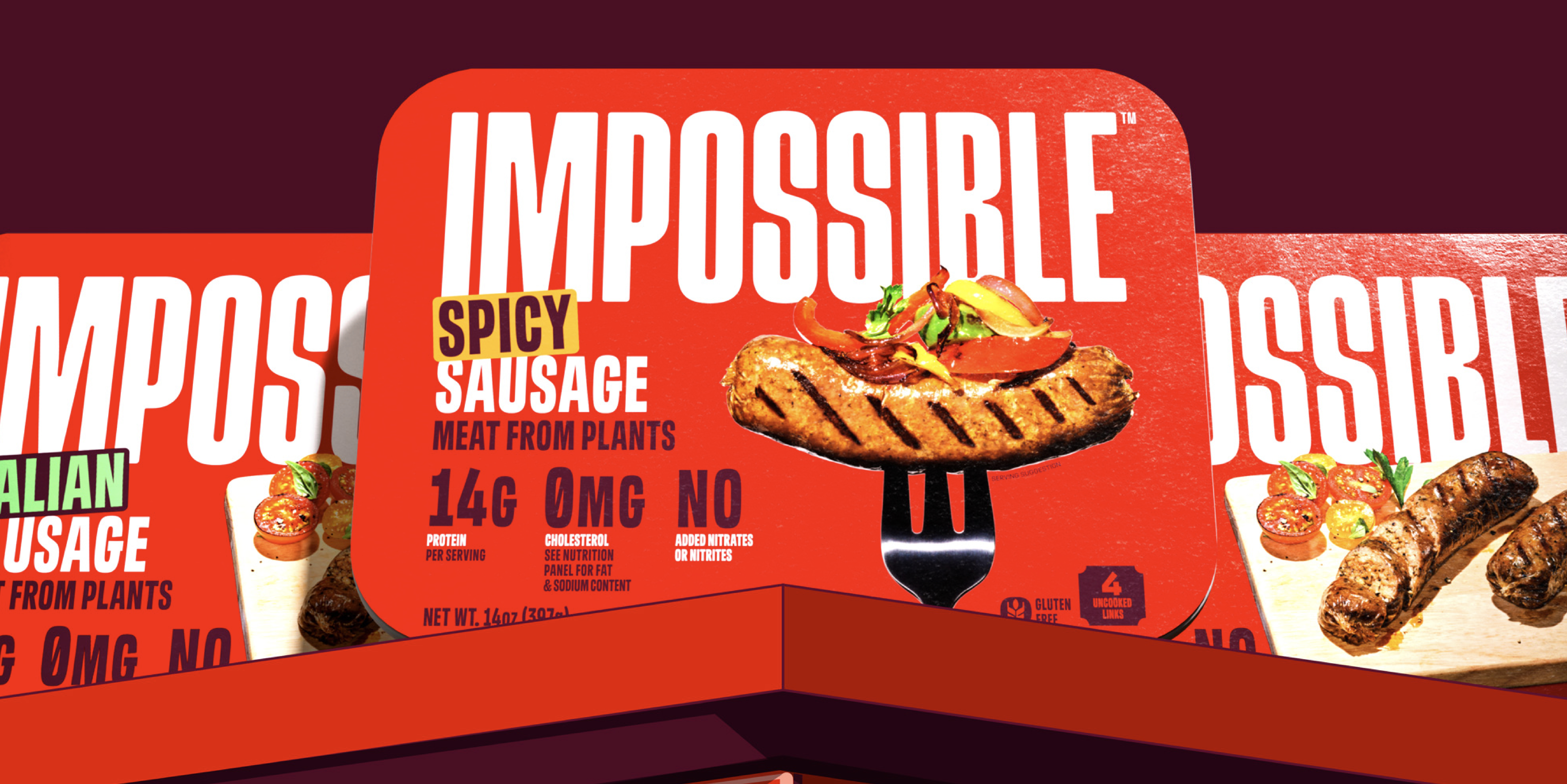
AA: “The first thing I noticed in this rebrand was the drastic shift in color palette. IMPOSSIBLE® went from a cool, pastel primary color to this highly saturated, bold, warm overall look. When I saw the packaging I thought, “Wow this looks like it just might taste good” and I think the shift in color is to credit for that.
Switching the brand color to red was the best choice they could have made when it comes to presenting themselves as a MEAT option (vs this Earth-friendly plant food). Red feels bold, appetizing, actionable, and authentic to real meat. The saturated palette really makes IMPOSSIBLE® feel like they’re confident in their product and like they’re ready to take up space in the meat category. I also find this new look so much more appetizing than the neon teal packaging they had previously. The use of less saturated secondary pops of color is a nice nod to the previous branding.
Overall, I think the new packaging feels more like a true meat product. This new style is going to set IMPOSSIBLE® apart from the plant-based crowd and maybe even push other plant-based brands to be bolder. I think this is going to appeal to meat eaters and convince them to dip their toes in the plant-based world. As an avid meat eater, I am now curious to try their hot dogs! So, I think this new look will bring them success.”
Designers’ Ratings


Inspired by Under Consideration


