
The Challenge
4 Purpose Energy® is an organic energy drink with the mission of making education more accessible to children around the world. They approached us with the challenge of redesigning their can to better compete within the highly competitive energy drink category. We sought to highlight their mission, health benefits, and organic qualities with a dynamic design that would set them apart.
Agency Services
Competitive Analysis
Visual Identity/Logo Design
Packaging Design
Illustration
Line Extensions
Marketing Materials
Production
Awards
Davey Awards: 2018 Gold
The Solution
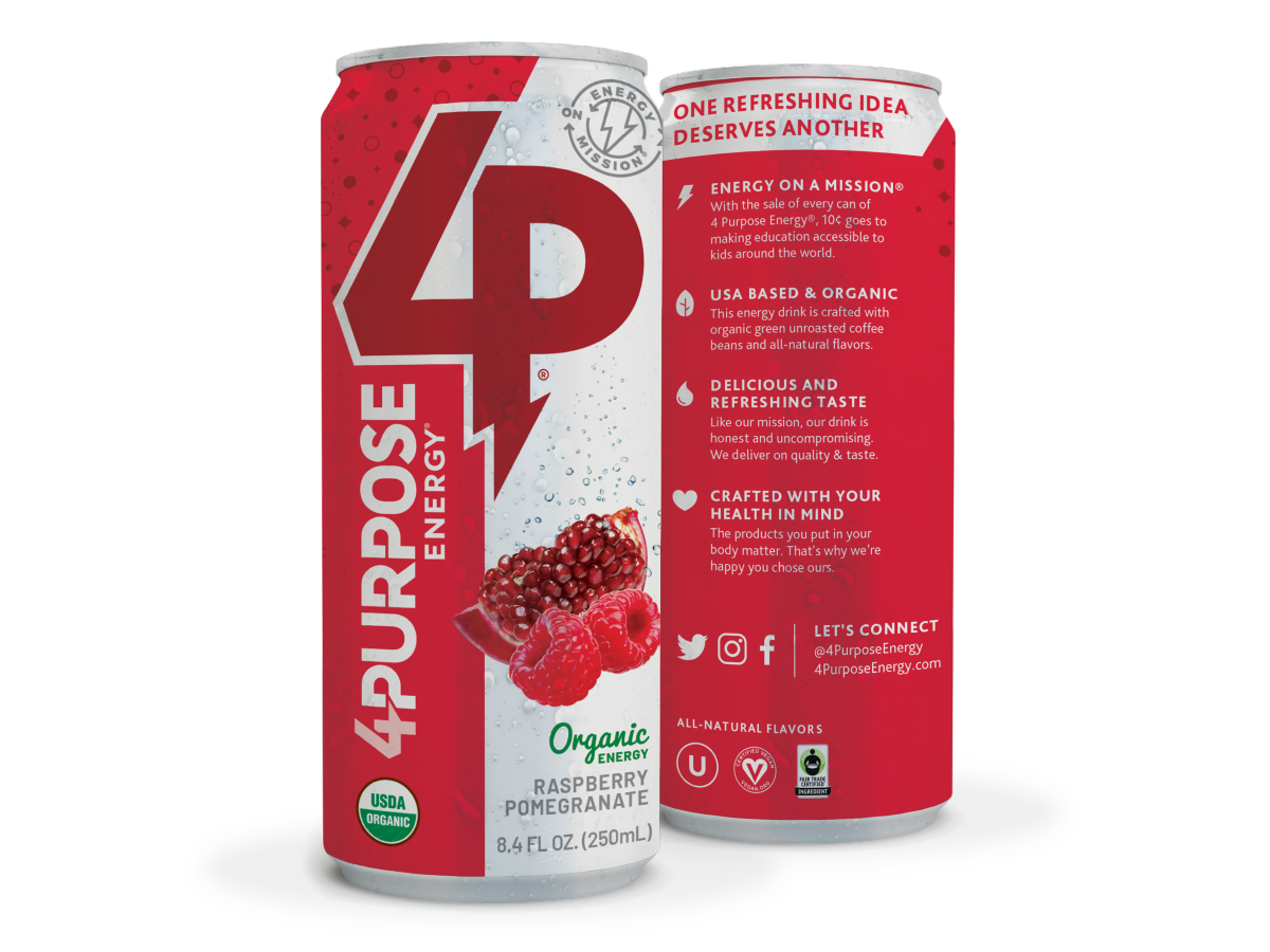
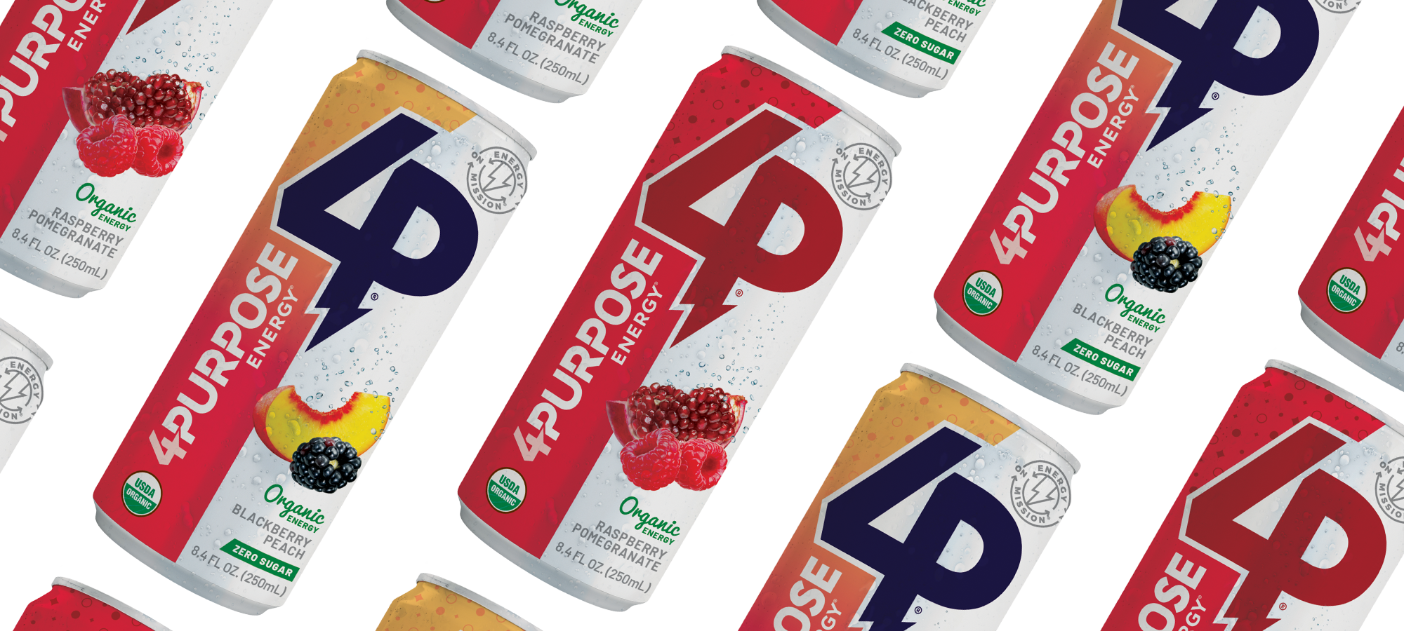
Raspberry Pomegranate
We rebranded 4 Purpose Energy® with a bold new identity and package design. The logo and symbol convey the brand’s dynamic personality, while custom illustrations of fruit and effervescence enhance appetite appeal. We also created messaging and icons that quickly communicate the brand's mission and the benefits of the product.
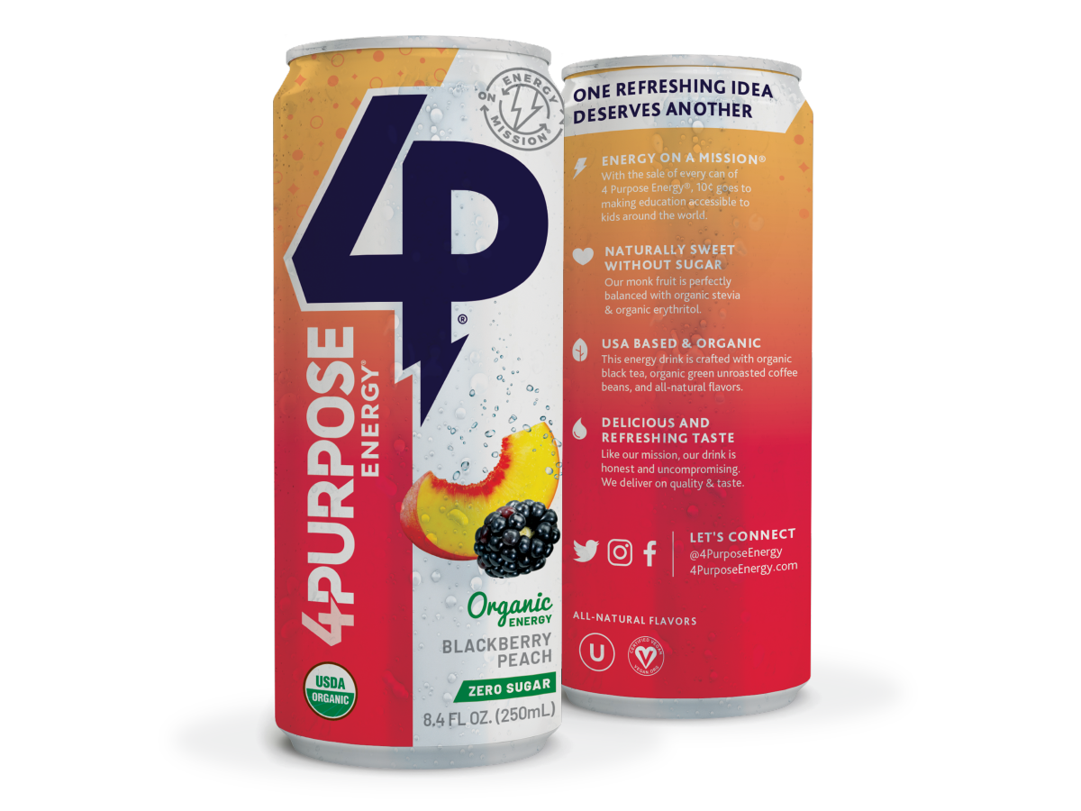
Blackberry Peach
Once the original Pomegranate Raspberry flavor was finalized, we rolled out the design to the new flavor, Blackberry Peach. This flavor has zero sugar, which is unique to the marketplace. It incorporates new ingredients such as monk fruit, organic stevia, organic erythritol, and organic black tea. We created language that communicated these components in a consumer-friendly way.

Brand Assets
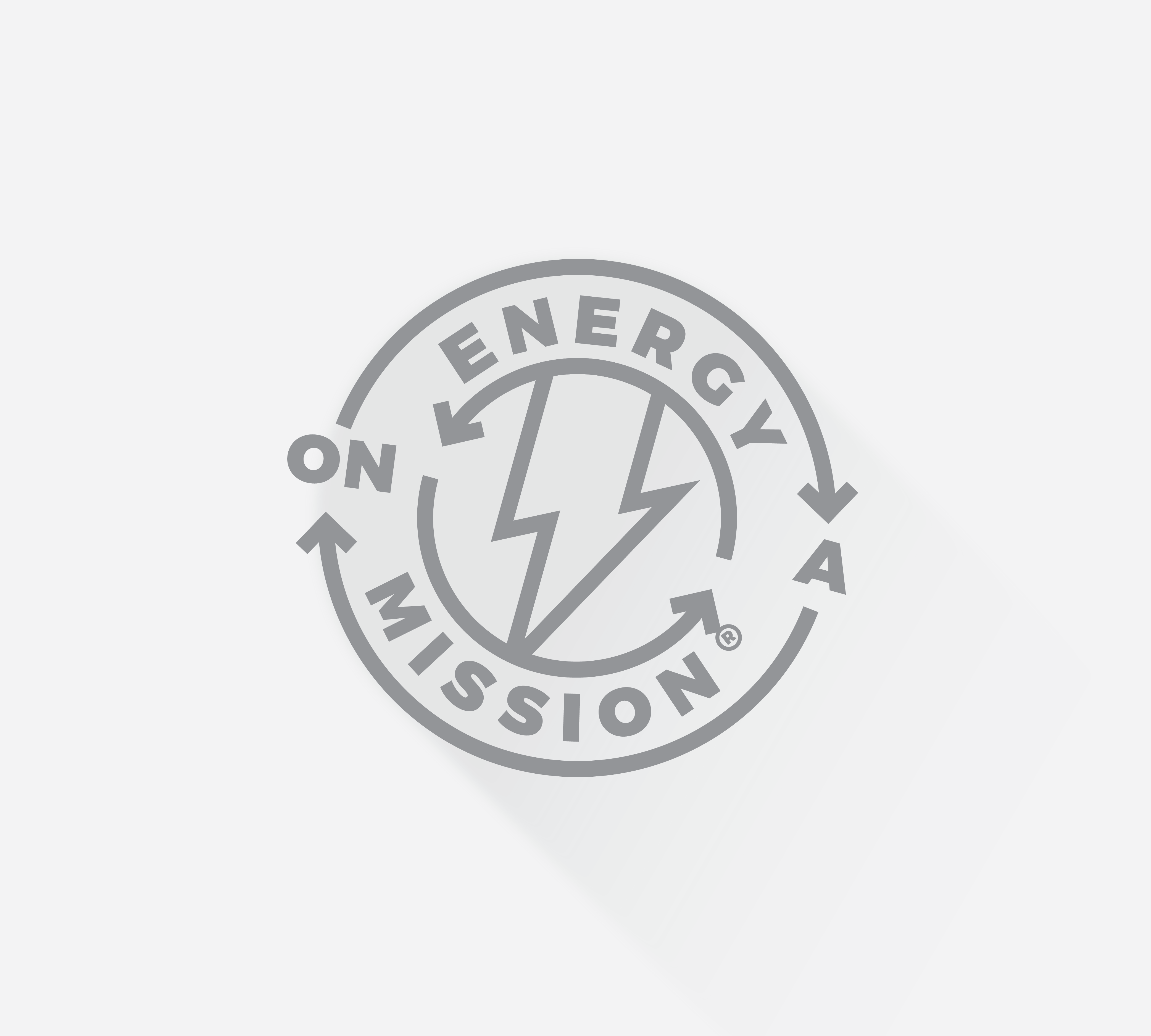
We designed a collection of proprietary brand assets, including custom illustrations, icons, and animations. We also created the “Energy on a Mission” seal to call to the brand’s purpose. With the sale of every can, 10 cents goes to making education accessible to kids around the world. This was an important selling point that we wanted to effectively communicate with an ownable stamp.


"Working with BrandFirst has been hands down one of the best business decisions we have made. They have assembled a very talented team that really takes the time to understand their client's vision and over-delivers on what they promise."
FOUNDER | 4 PURPOSE ENERGY®

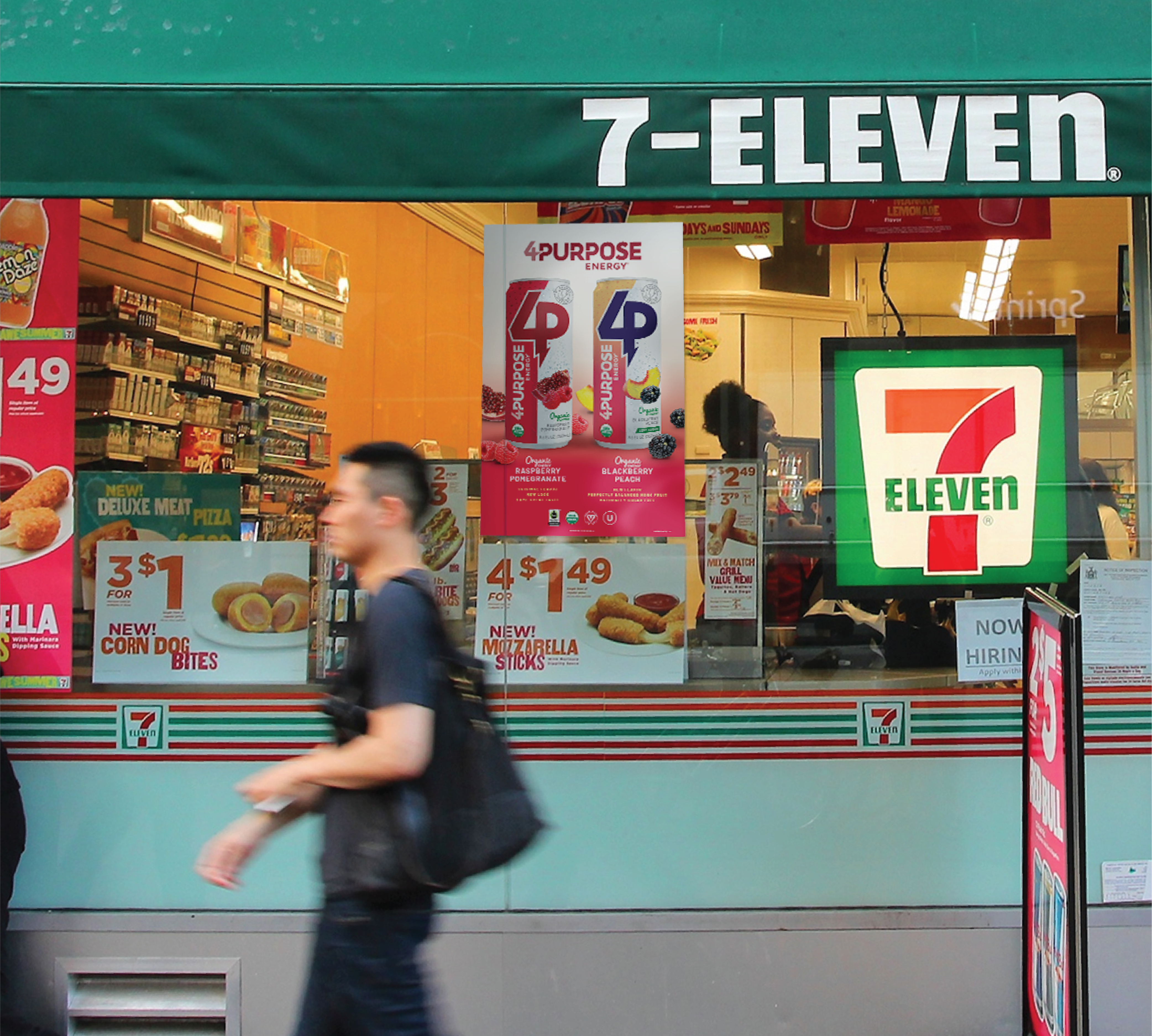
Brand Extension
We have extended 4 Purpose Energy® branding to in-store communications. Posters, cooler clings, and floor decals make a bold statement about the brand's unique qualities and benefits. We also designed a sell sheet for distributors to introduce the new branding as well as both flavors.

Logo Redesign
BEFORE
AFTER
Can Redesign
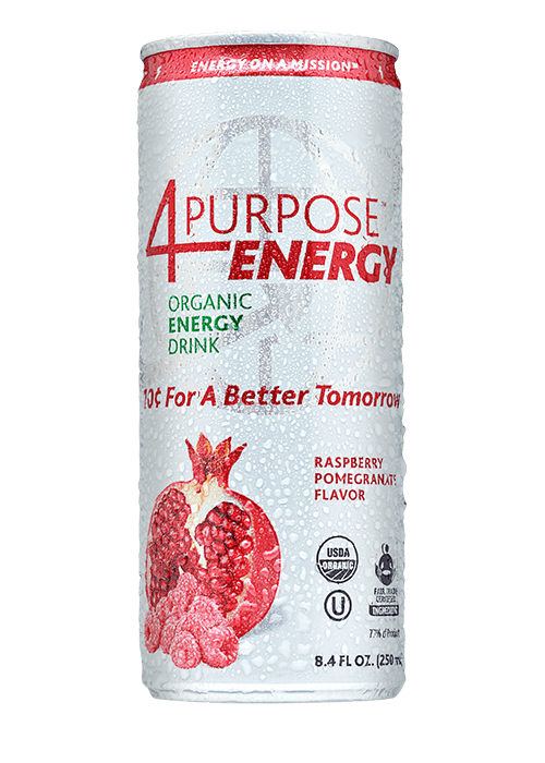
BEFORE
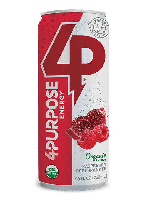
AFTER