The Challenge
With a rich history and a unique landscape in Texas Hill Country, Boerne is an active city that is constantly innovating and growing while remaining true to its roots. The City was seeking a refreshed & revitalized identity package that would embody its image, tell a unique story, and unify its many departments under one cohesive yet flexible brand. The branding also needed to define the City of Boerne from surrounding areas so that its boundaries were unmistakable to both residents & visitors alike.
Agency Services
Strategy & Positioning
Place Branding
Visual Identity/Logo Design
Brand Standards
Brand Story
Brand Extension
Awards
Texas Association of Municipal Information Officers Awards: Best Strategic Plan

Immersion & Discovery
To kick off the project, we uncovered a thorough understanding of the City of Boerne’s culture, socio-economic environment, business climate, and community perceptions through a market research study. Our findings would serve as a basis for the development of the brand moving forward. We interviewed City staff, residents, visitors, and business owners and performed a competitive analysis of surrounding areas to form a holistic understanding of the City’s points of differentiation and its place among comparable cities in the area.
Strategy & Positioning
Leveraging the insights from our research, we moved into developing our strategic framework. Some of this included establishing profiles of the target audiences, defining the City’s attributes and values, and capturing a unique market position. When synthesizing our findings, we discovered that people wanted to see a balance between the City’s many unique and often contrasting characteristics. By aligning on this framework, we ensured that our designs would reflect an authentic position, visually communicate the spirit of Boerne, and unify the City’s various departments.

Concept Development
Using the information outlined in the Strategy phase, we set out to develop a range of logos that captured the dichotomies that make up the City of Boerne. Our goal was to establish a modernized, authentic, and uniform brand that maintained the essence of the City. Each concept and the corresponding copy focused on a different way of telling the City’s story and communicating its attributes & characteristics. It was our goal to create a visually impactful branding solution that would be flexible and adaptable for use in a variety of media. We applied each logo design to a variety of real-life applications to lift the identities out of the realm of theory and into reality to help in the decision-making process.

“The Family Tree”
Nicknamed “the family tree,” the City selected an identity that represents the many individual parts that make Boerne whole. Our inspiration was the live oak tree—a southern symbol of strength that reflects the City’s strong foundation and historic roots. The live oak is abundant throughout Boerne and symbolizes the City’s ongoing growth and development for many generations to come.
-

A Colorful Expression
Color & Appearance
We established a more natural color palette that is approachable and communicates the friendly and genuine characteristics of Boerne.
-
A Close-Knit Community
Originality & Perception
Branches and leaves represent the community of passionate residents, employees & government officials that make Boerne thrive, while the open-ended flourishes symbolize the ongoing growth and development that sustains the City.
-
Coming Together As One
Connection & Integration
The logomark elements come together to form a star shape as a subtle tribute to Texas, excellence and unity.
-
An Upstanding City
Symbolism & Intention
The flourish shape extends to create the trunk of the tree, representing the City’s strong foundation and historic roots.
Brand Extension
We continued to extend the final City concept to eight additional departments. The goal was to adapt the City logo in a way that was unique for each department, yet unifying with a consistent and recognizable brand. Working closely with the City and members from each department, we ensured that the family of logos was aligned with the City’s vision and core values, and effectively communicated all that Boerne has to offer.
Final Brand Guidelines
With the Boerne logo and all of the department identities set, we created Brand Standards that defined usage guidelines. This included messaging, color palettes for each logo, typography, and legal information. We also outlined implementation guidelines for additional internal and external marketing materials, like social media platforms, promotional items, presentation templates, letterheads, and business cards. This provided the City with a complete brand kit to help the new identities gain acceptance and recognition.

“Our community had never done a comprehensive branding, messaging, and design process and it showed. We were clearly a house of brands but not a branded house. After a competitive public proposal process, it became clear BrandFirst had the right balance of large scale design capabilities but also the necessary municipal background needed for our project. They immersed themselves into our community and worked seamlessly with our residents, city staff and elected city officials. They brought a fresh perspective and quickly honed in on our city’s strengths, while noticing an obvious juxtaposition weaved into the very fabric of the Boerne community. From the first creative design review meeting to what ultimately became our City’s logo, brand and story, BrandFirst incorporated our ideas and perspectives while creating a strong symbol of our community that is respectful of our past but can carry us well into the future.”
CHRISTOPHER SHADROCK, COMMUNICATIONS DIRECTOR | CITY OF BOERNE, TX
Logo Redesign
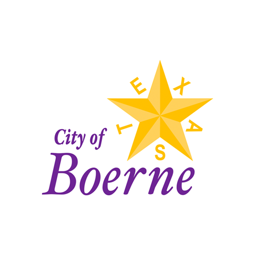
BEFORE
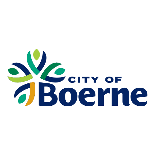
AFTER
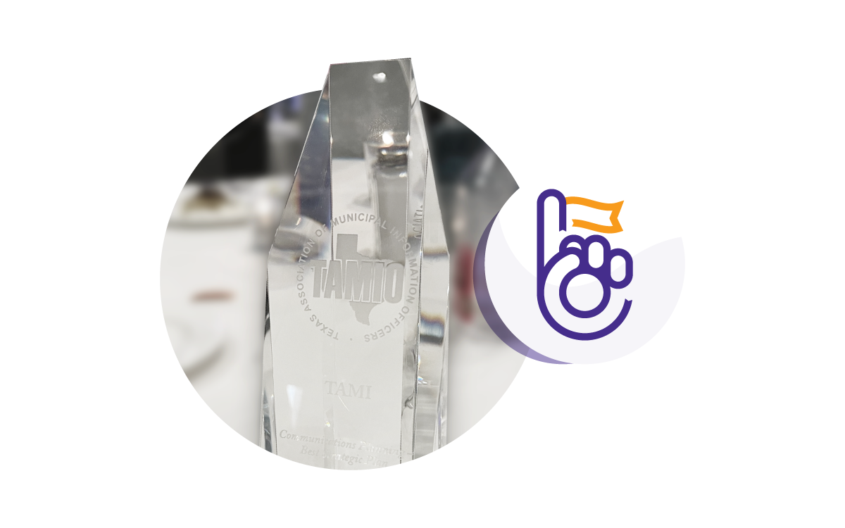
Awarded Best Strategic Plan!
The City of Boerne received first place at the Texas Association of Municipal Information Officers Awards for the Best Strategic Plan in the state, which we helped them define as part of their place branding initiative.