The Challenge
Caramel Creams were introduced to the market in 1918 and were originally known as "Bulls-Eyes." These caramel candies with a cream center have a long history and a loyal following. Oftentimes, a brand that is steeped in such tradition faces consumer pushback when it rebrands itself or even undergoes a refresh, but when Goetze's Candy came to us with that assignment, we eagerly took on the challenge. Our goal was to redesign the packaging in a way that maintained the company's longstanding heritage, but that also gave it a fresh, contemporary look that would appeal to both brand loyalists and new consumers.
Agency Services
Competitive Analysis
Brand Positioning
Visual Identity/Logo Design
Packaging Design
Illustration
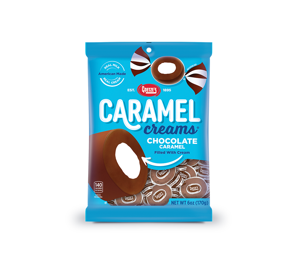
Line Extensions
3d Renderings
Production
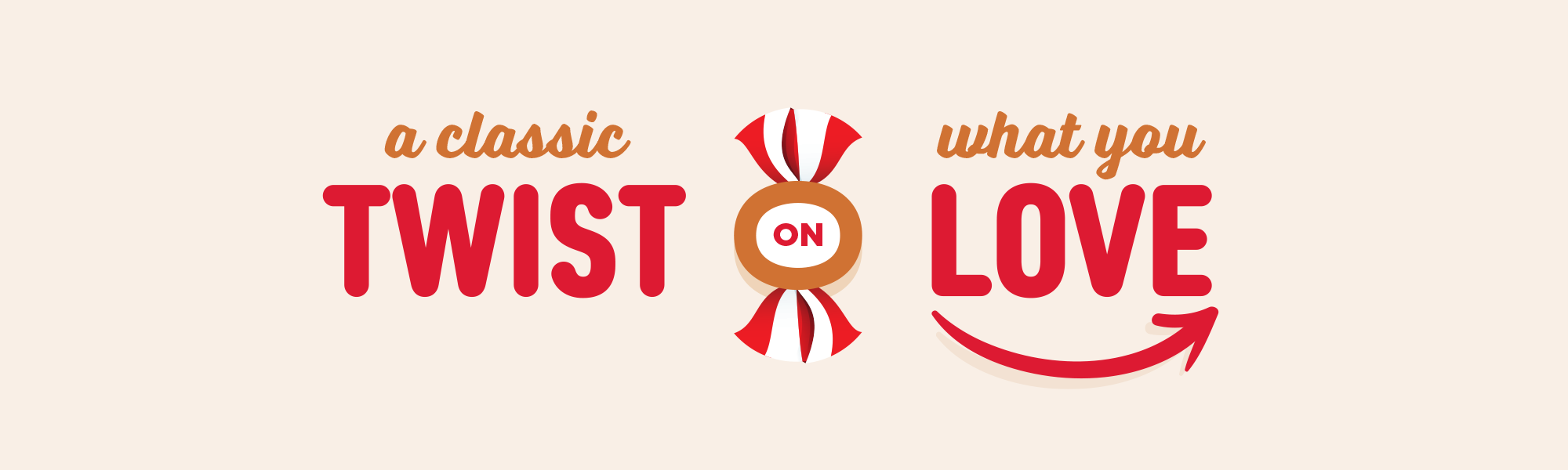
The Solution
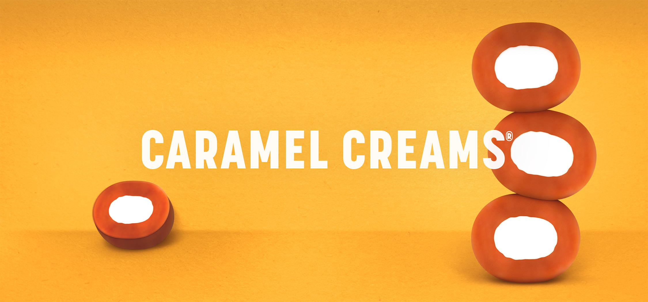
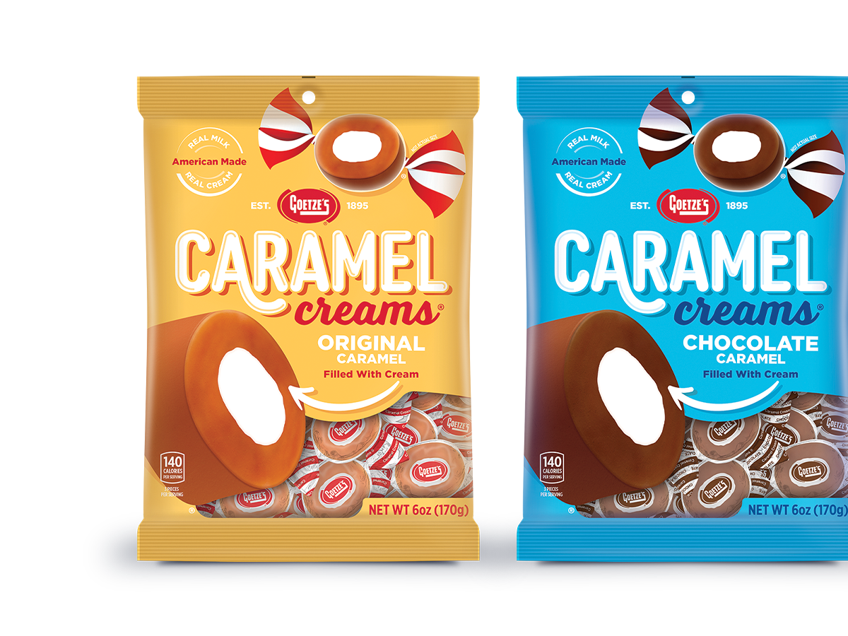
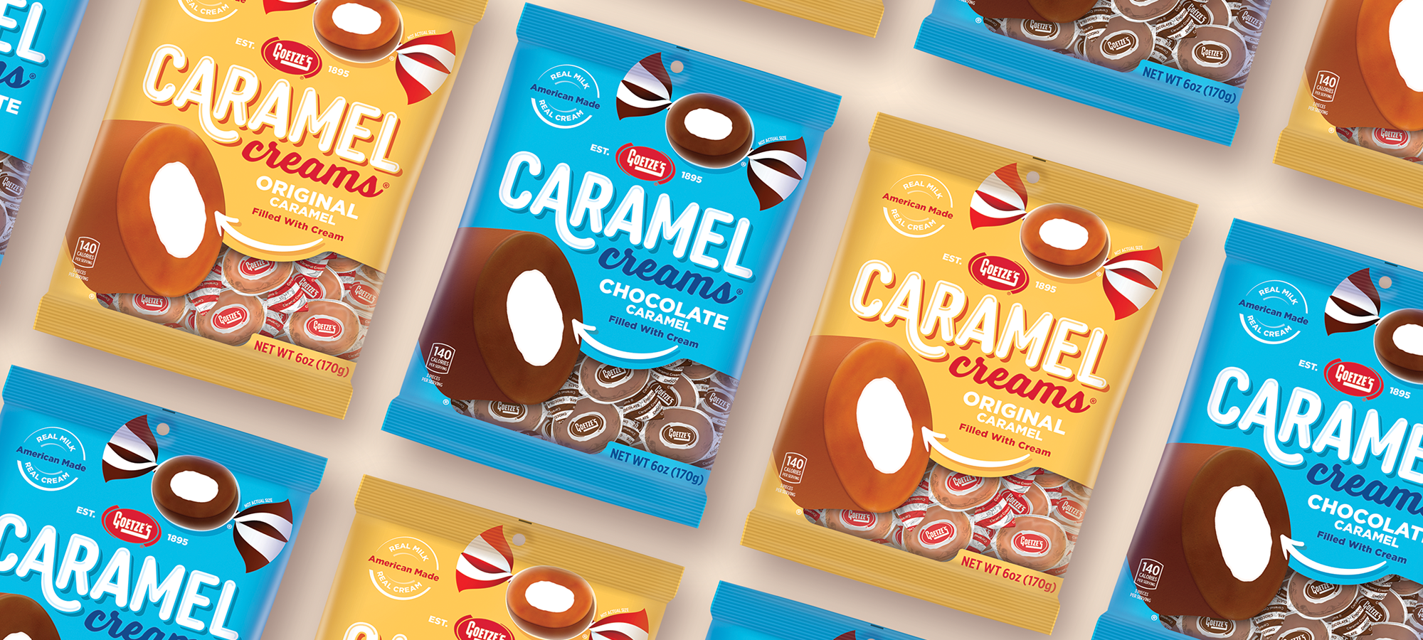
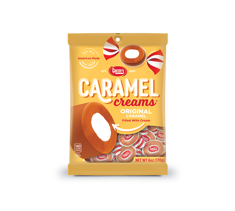
The final design showcases the Caramel Creams iconic candy piece as the hero of the package. Featuring both an unwrapped and wrapped version, the two pieces illustrated on the front of the pack capture the candy's well-known shape and instantly recognizable red and white striped wrapper. The new Caramel Creams logo is fresh yet nostalgic, and the arrow pointing to the piece adds a bit of whimsy to the mix.
Brand Assets
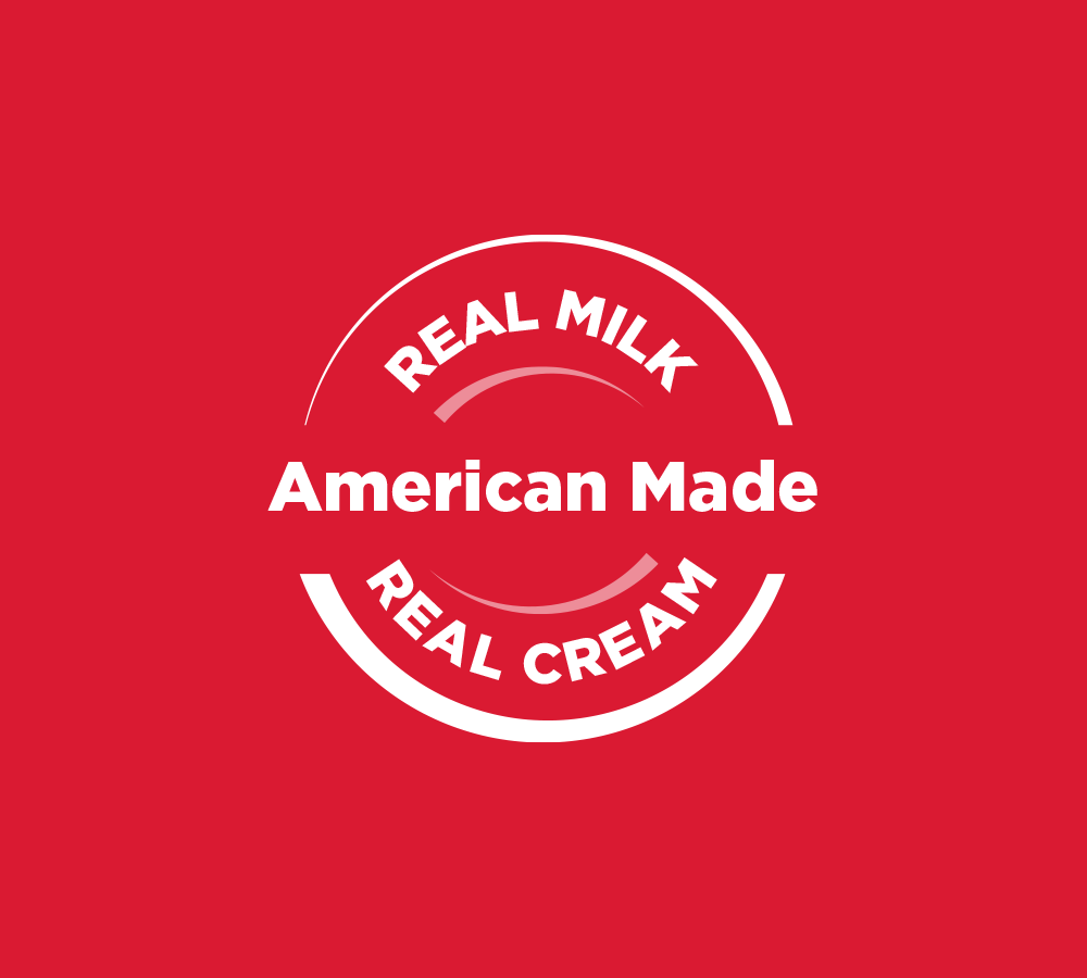
We originally photographed the candy pieces and then retouched them with an illustrative style that enhances appetite appeal and gives the pieces texture. The "American Made with Real Milk" seal calls back to the product's original recipe, which is still in production. We also created a Made in USA icon that reinforces the candy's patriotic roots.
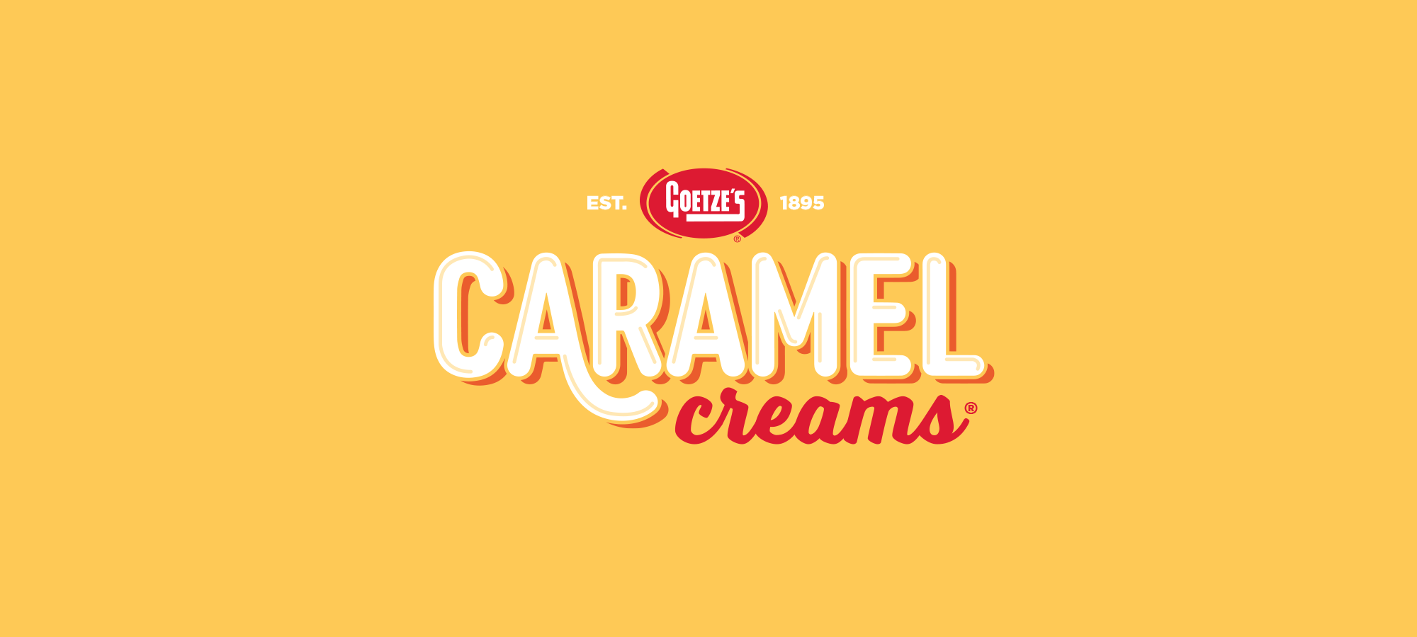

Logo Redesign
BEFORE
AFTER
Package Redesign
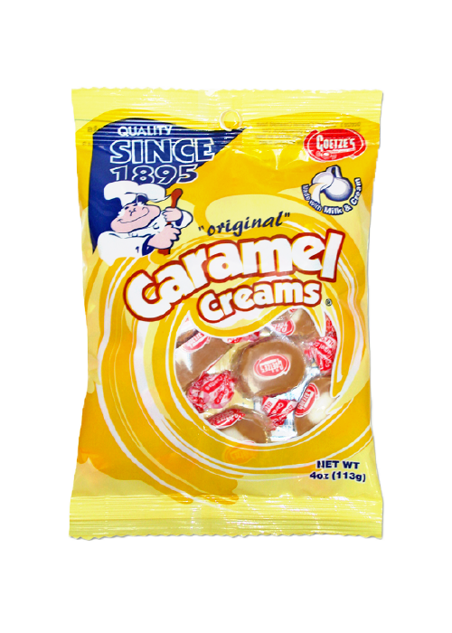
BEFORE
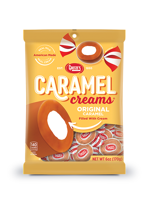
AFTER