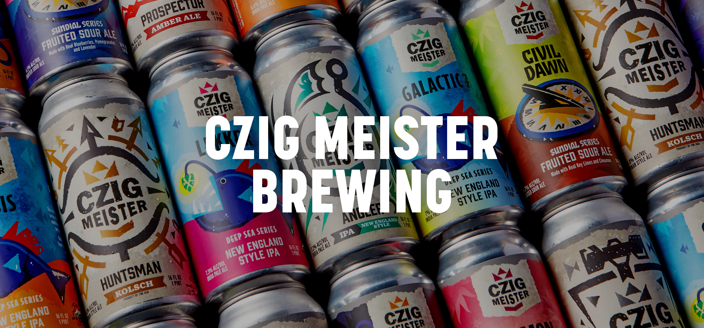
New Look For Old-World Style Craft Brewery
When Czig Meister Brewing Co., a family-owned craft brewery located in our hometown of Hackettstown, NJ, reached out seeking a refreshed label design, we were buzzing with excitement! They wanted to take a strategic approach to segmenting their products and flavors in a consumer-friendly way while simultaneously revitalizing their portfolio’s aesthetic.
Agency Services
Strategy & Positioning
Packaging Design
Illustration
Copywriting
Line Extensions
Production
Strategy & Positioning
Since the craft beer landscape is a tight-knit and competitive market, we analyzed industry & category trends to clearly distinguish Czig’s target customers and identify the brewery’s key differentiators. Defining this strategic foundation helped to inform the direction for design, messaging, and all future communications.

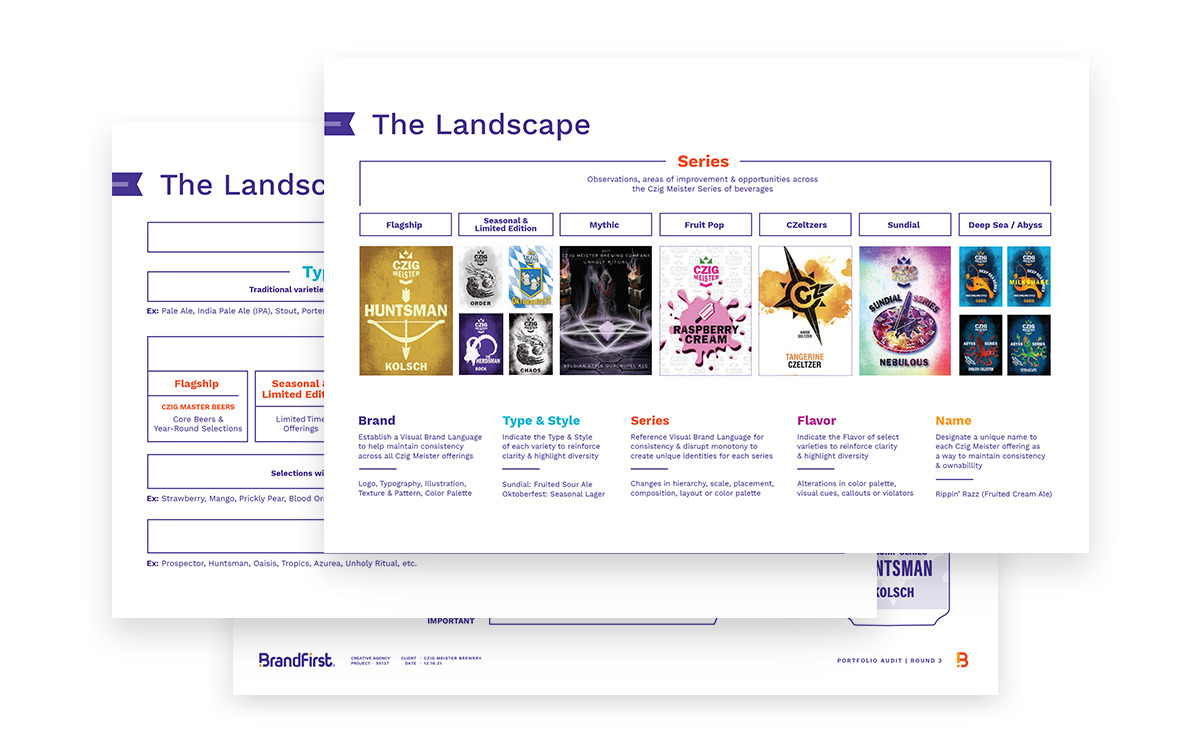
Portfolio Audit
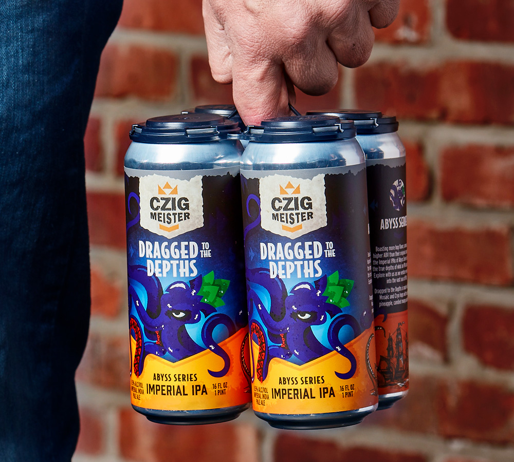
Our comprehensive audit of Czig’s offerings encompassed a holistic review of their beer types & styles, series lineups, flavors, and names. We arranged their spectrum of craft beer in a way that created consistency in structure and communication hierarchy on pack across each series. We also segmented the products and flavors in a way that was simple for the customer to understand, recognize, and remember.

Mood Boards
Once the portfolio was organized, we created mood boards for each of the seven series. Showcasing elements like typography, photography & illustration styles, color palettes, patterns, and iconography, the mood boards were specific to each individual series and visualized how each line would be differentiated while also maintaining certain brand features. Compiling these inspirational and aspirational pieces established the tone and aesthetic for future design work, and ensured we were aligned with the Czig Meister team on the visual direction before starting on the concepts for their Flagship Series.

Concept Development
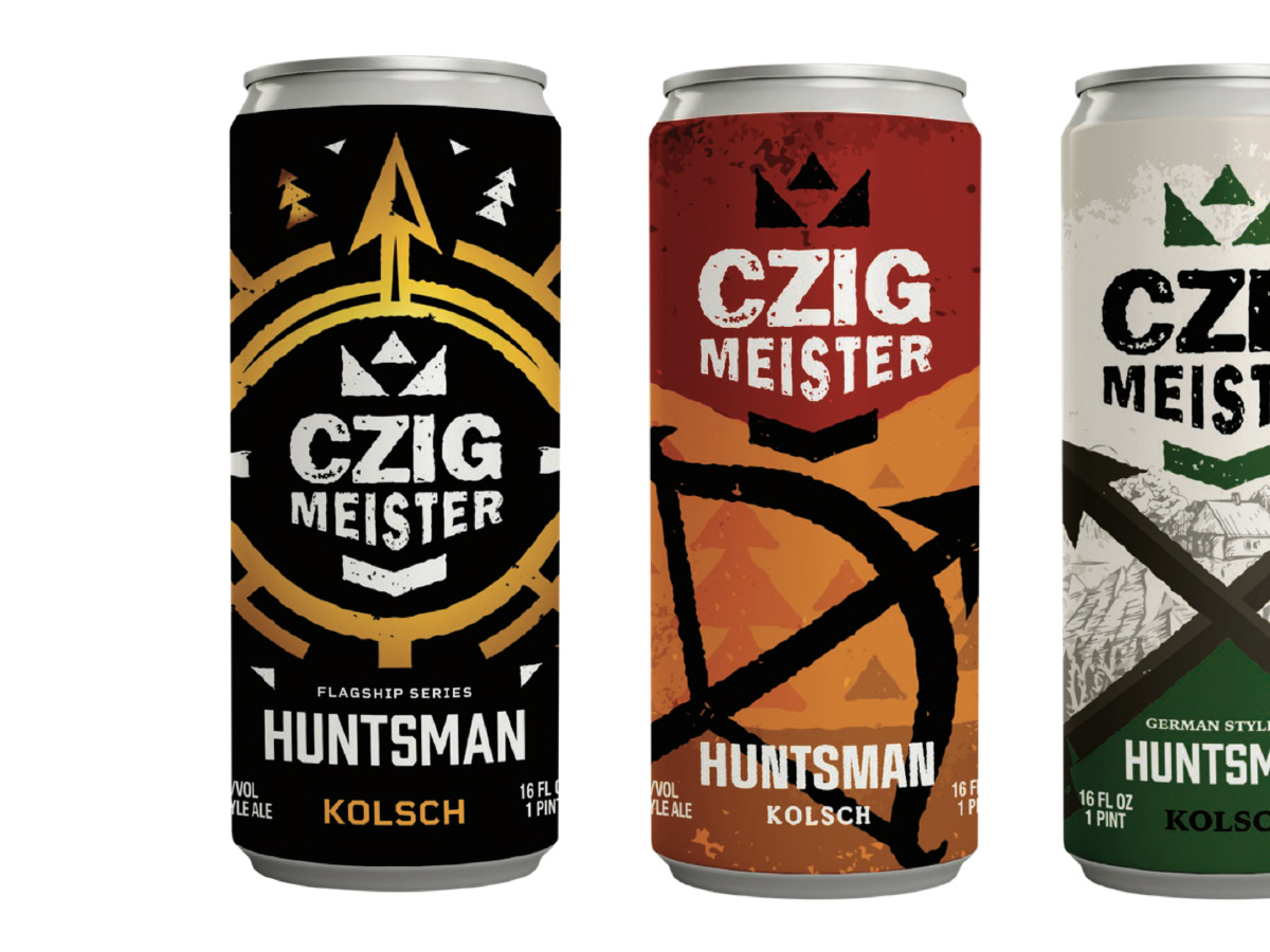
The design concepts communicated that every beer is created with meaning & intention and is given a unique name & flavor profile. The designs also leveraged the Czig Meister branding for ownability and recognition. We developed three concepts for two of the beers in the Flagship Series, each of which utilized unique color palettes, illustrations, and graphic elements.

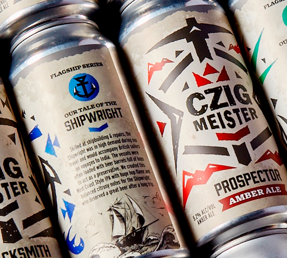
The Solution
The end result was a label design that put focus equally on the Czig Meister brand and the Old Word craft or trade that each beer was named after. With a textured background color consistent across the lineup, the pops of secondary colors and large custom front panel illustrations were utilized as differentiators between each beer. Each design and corresponding story within the Flagship Series spoke to the heart of who Czig Meister is and what continues to inspire their passion for crafting the perfect beer for every palate.

-
It’s All In The Details
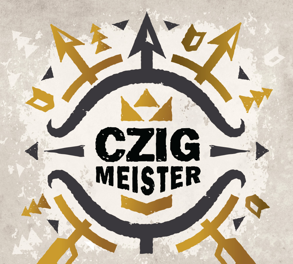
The roughened texture, chevron shapes, and typography style complemented the brand’s existing logo and became a visual representation of the inspiration behind each beer to communicate the quality, complexity, and artistry of the Flagship Series. With the Czig Meister branding front and center, the hierarchy was clear and consistent across the lineup.

-
It’s All In The Details
We crafted tailored copy for each variety that elevated and embraced the Old World trade that was its muse. Each story combined history lessons with flavor notes, so consumers could learn while sipping at the same time.
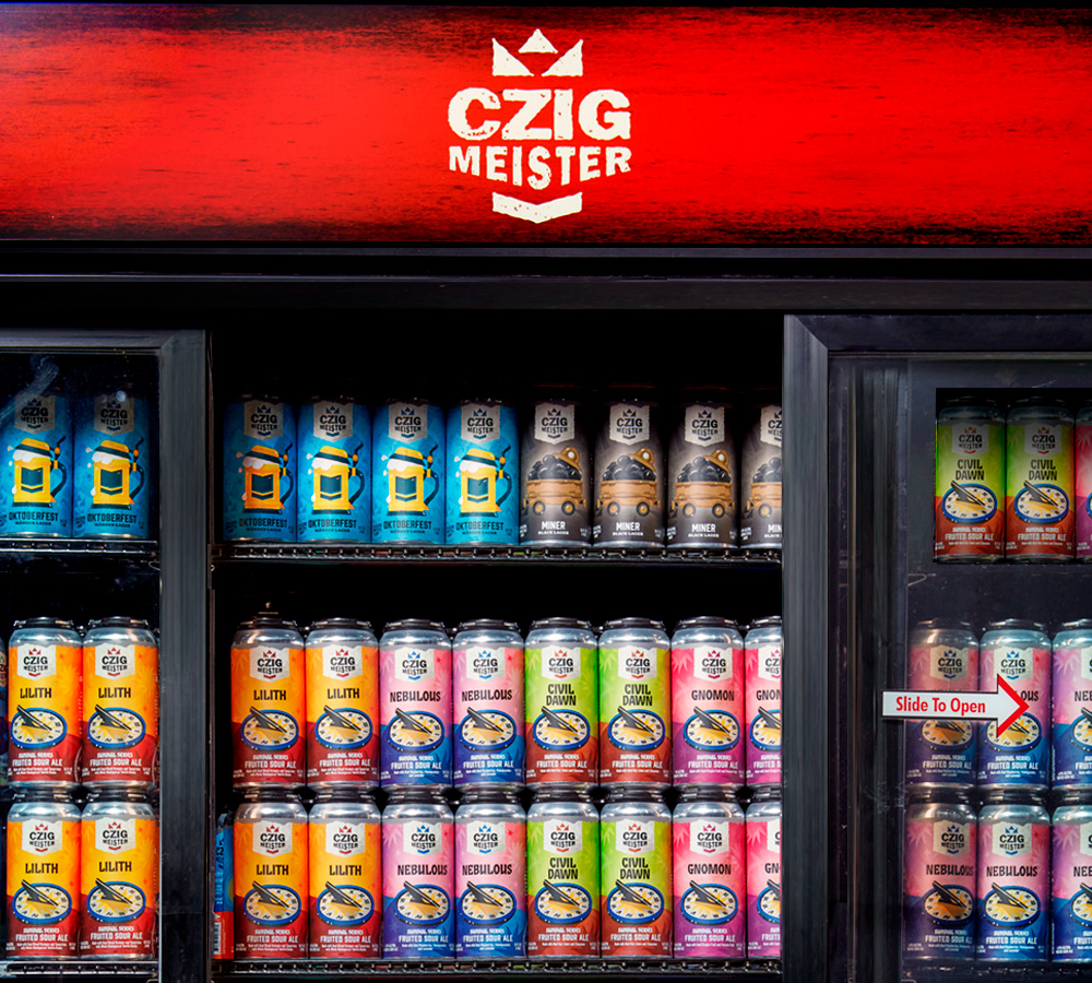
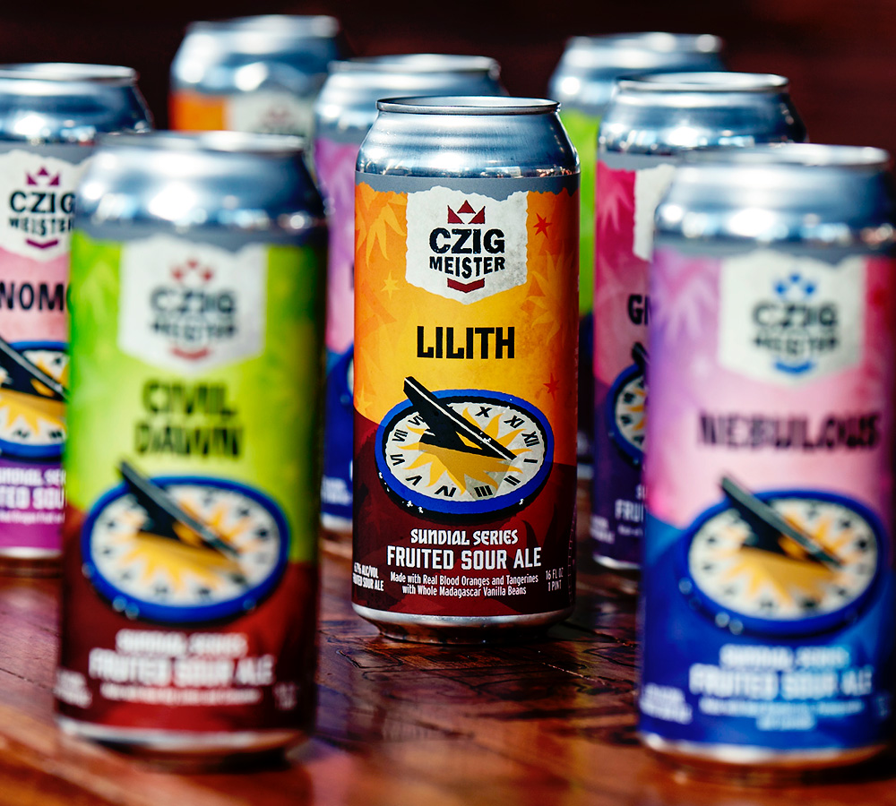
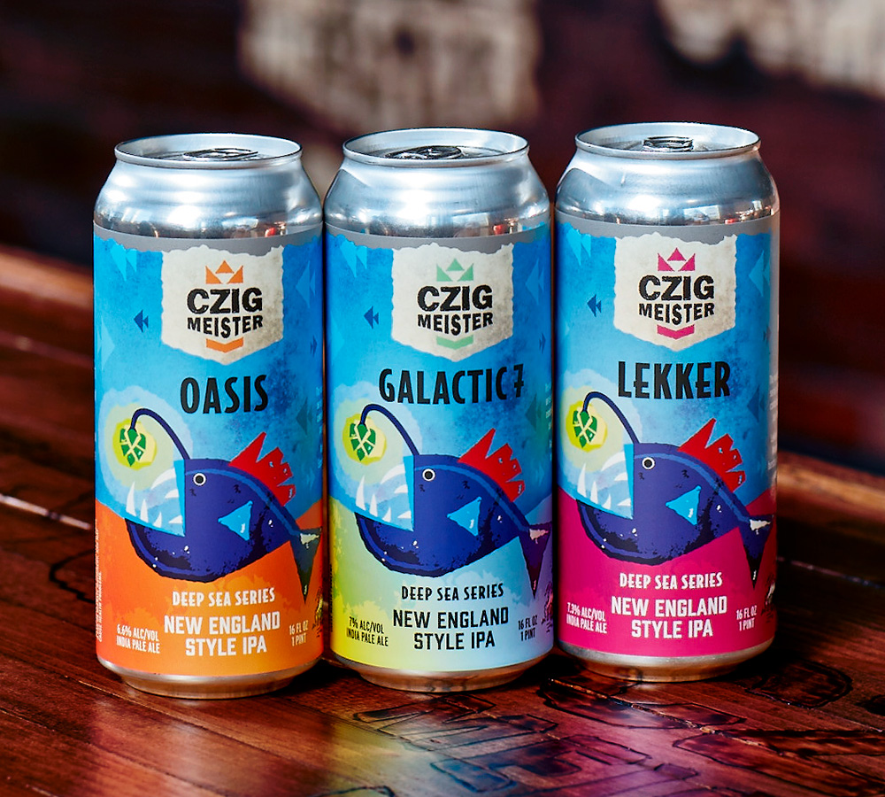
The Extensions
We continued to leverage the Portfolio Audit and Mood Boards to refresh the labels for four additional series. These designs focused heavily on color for flavor and SKU differentiation. We also added subtle details within each lineup. For the Sundial Series, the shadow changed on the Sundial illustration to reflect the number of flavors utilized in each specific variety. In the Deep Sea Series, the bulb on the fish was designed as a hop as a nod to the star ingredient in these New England Style IPAs.


Before and After
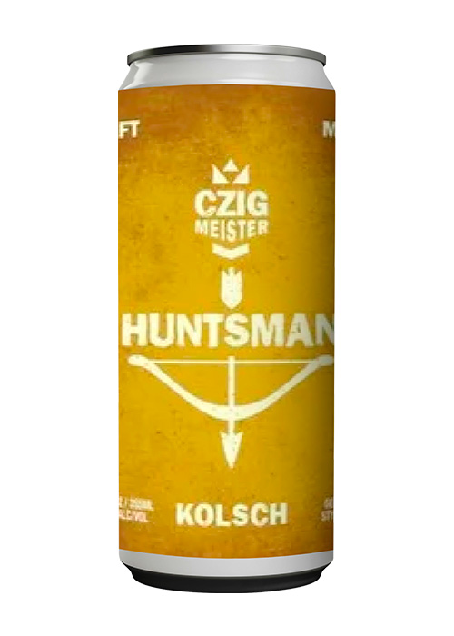
BEFORE
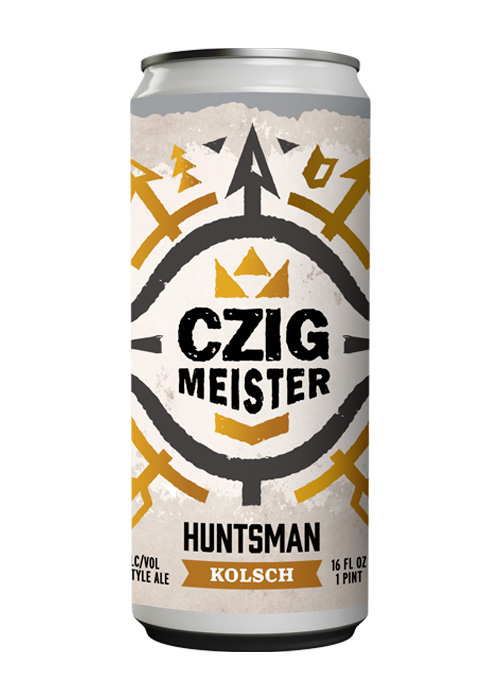
AFTER
“BrandFirst is the best choice for any brewery or business that wants to rebrand and stand out from the crowd. They transformed our vision into reality with their detailed brand stories, creative ideas, and professional expertise. They delivered an amazing finished product that we are proud of. We will always be loyal customers of BrandFirst and we highly recommend them to anyone who needs stunning designs and direction for their brand.”
BRIE DEVLIN, MARKETING MANAGER | CZIG MEISTER BREWING