The Challenge
The Ronkin Group was seeking to create an ownable brand for a line of premium yet affordable all-natural supplements. As the supplement industry is a very crowded space, we wanted to connect with younger consumers who are looking for high quality on a budget. Our goal was to find the right combination of relatability and quality, to communicate the benefits of the products, and to differentiate the brand so that it would effectively compete both on shelf and online.
Agency Services
Strategy & Positioning
Industry & Category Trends
Naming
Tagline Development
Brand Story
Visual Identity/Logo Design
Packaging Design
Illustration
Line Extensions
Production

Our Approach
Category Immersion
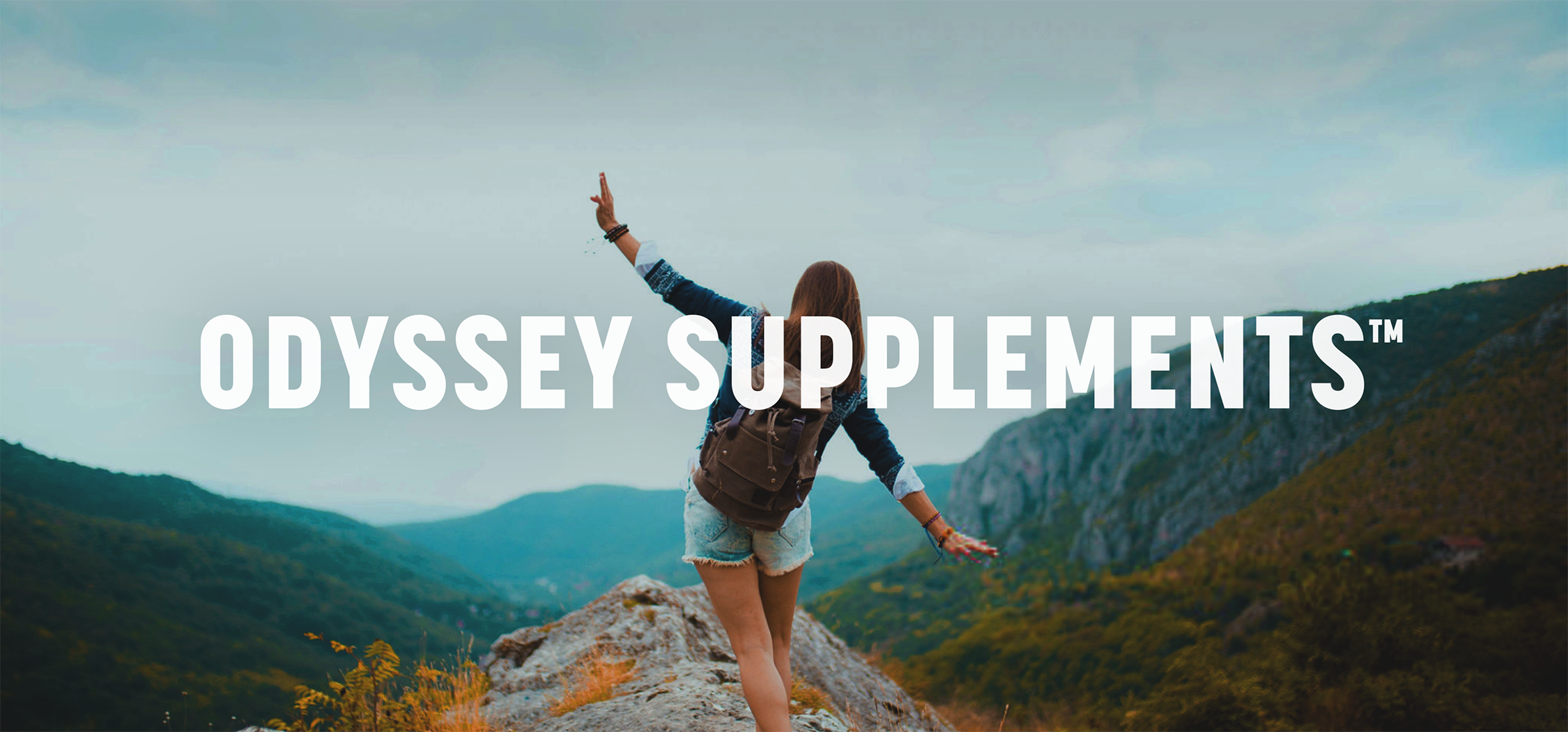
First we immersed ourselves within the All-Natural Supplements Category and developed a Brand Strategy, where we uncovered the values of the brand and the attitudes, motivations, and behavior of our target consumers. Once we had a strategy in place, the next step was to define an ownable name for the brand. We identified three areas of focus and created mood boards to help the client visualize the context for a range of names. Ultimately, a name was chosen that speaks to the consumer's desire for and journey towards better health: Odyssey.
The Identity
The next step was building out the message in order to educate consumers about the product and its benefits. We developed a Brand Story and outlined the key benefits in simplified, consumer-friendly language. We also created a number of icons that quickly communicated various benefits of the different products in a visually impactful way.
The Solution
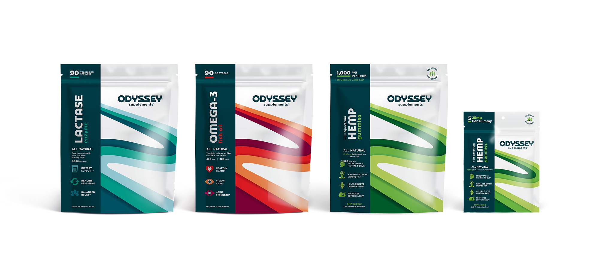
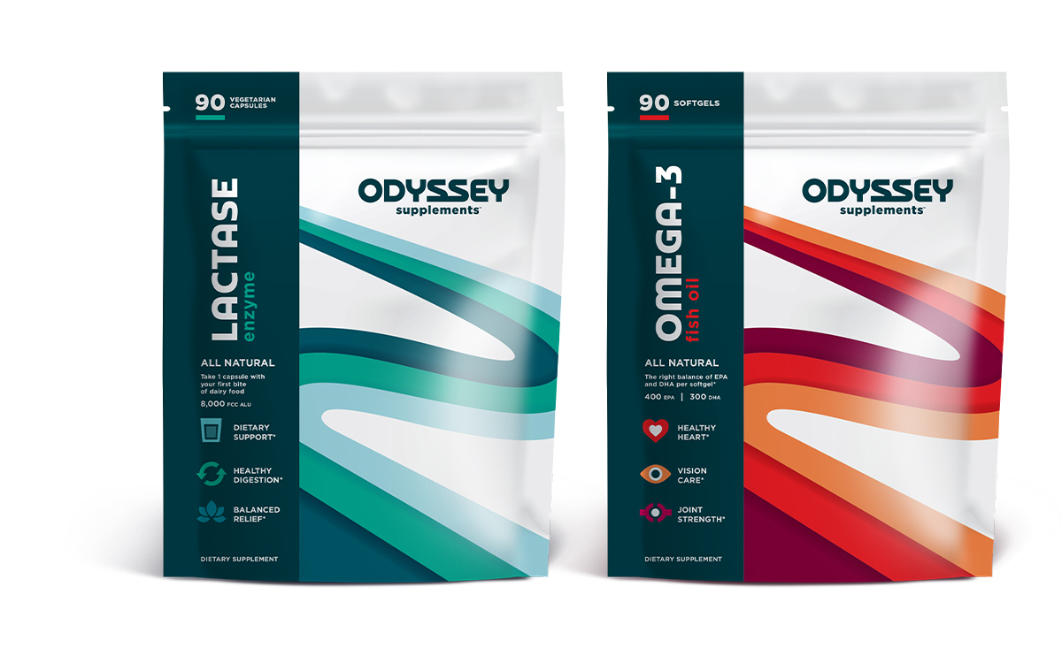
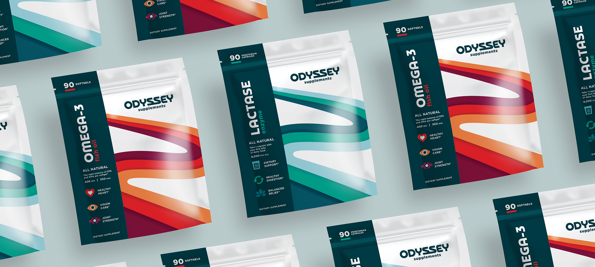
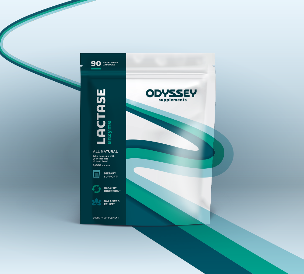
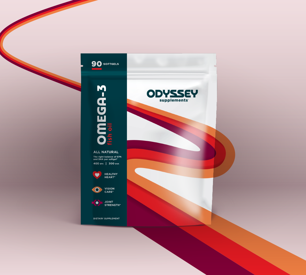
Finally, we developed the Package Design. For the structure, we presented the concept of designing for a pouch instead of the typical supplement bottle. This created an immediate and noticeable difference on shelf, and it also increased our real estate for branding while allowing us to incorporate key messaging on pack to help distinguish Odyssey from the competition.
The final package design was clean and simple. The white background is a stark contrast from the abstract graphic of a path, which symbolically represents one's journey towards lifelong wellness. The color of the path changes for each supplement type, creating a dynamic presence on shelf.
Brand Assets
We created the tagline “The Journey is Long, the Mission is Simple” to speak to the Brand Story and overall positioning, as these supplements are meant to allow you to live your life the healthiest way possible without breaking the bank. We also developed an icon from two intertwined S’s taken from the Odyssey name, which represents an infinity style symbol and subliminally contains two heart shapes.


"Working with BrandFirst has been hands down one of the best business decisions we have made. They have assembled a very talented team that really takes the time to understand their client's vision and over-delivers on what they promise."
FOUNDER | ODYSSEY SUPPLEMENTS®

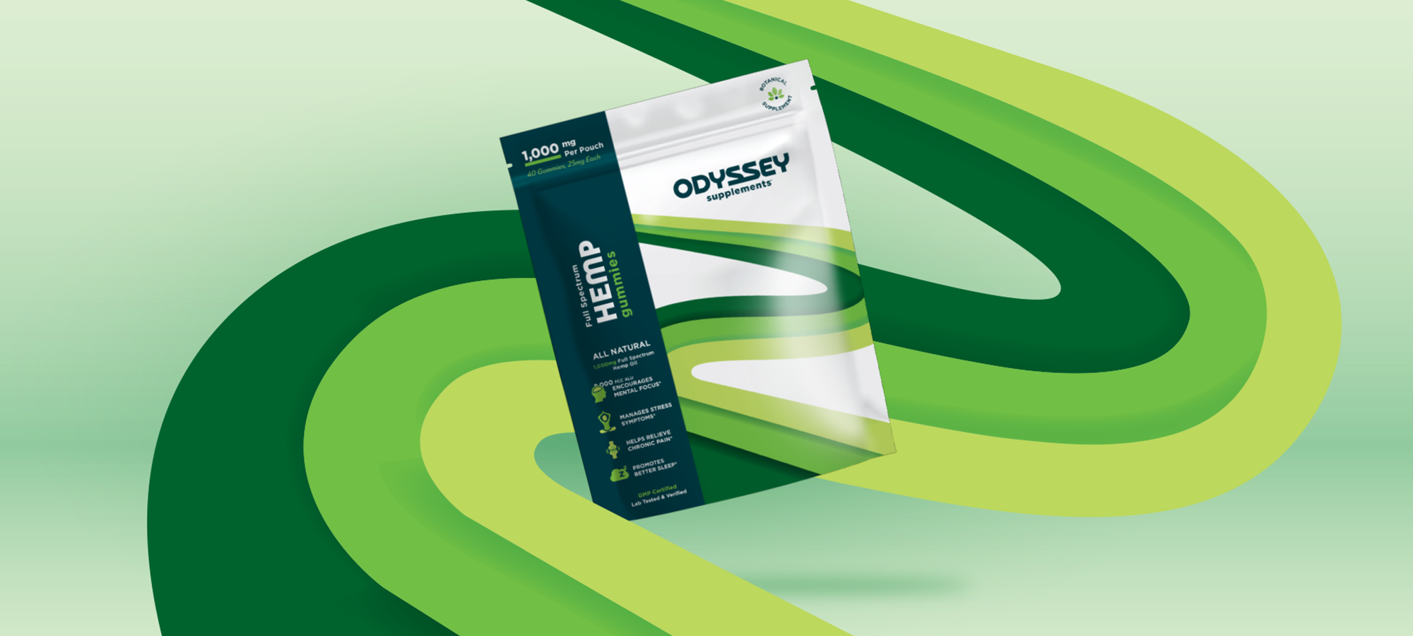
CBD Extension
Once the package design was established for the original supplement SKU's, we extended it to include a recent addition to the lineup: CBD Gummies. As this product is also sold on Amazon, we had to utilize Amazon's acceptable verbiage of "Full Spectrum Hemp" gummies. These supplements are third party tested to ensure a higher overall potency than other competitive products. To distinguish this product from the core line of supplements, we created a Botanical Supplement seal to separate it and allow for other possible Botanical SKU’s.


Brand Line Up