The Challenge
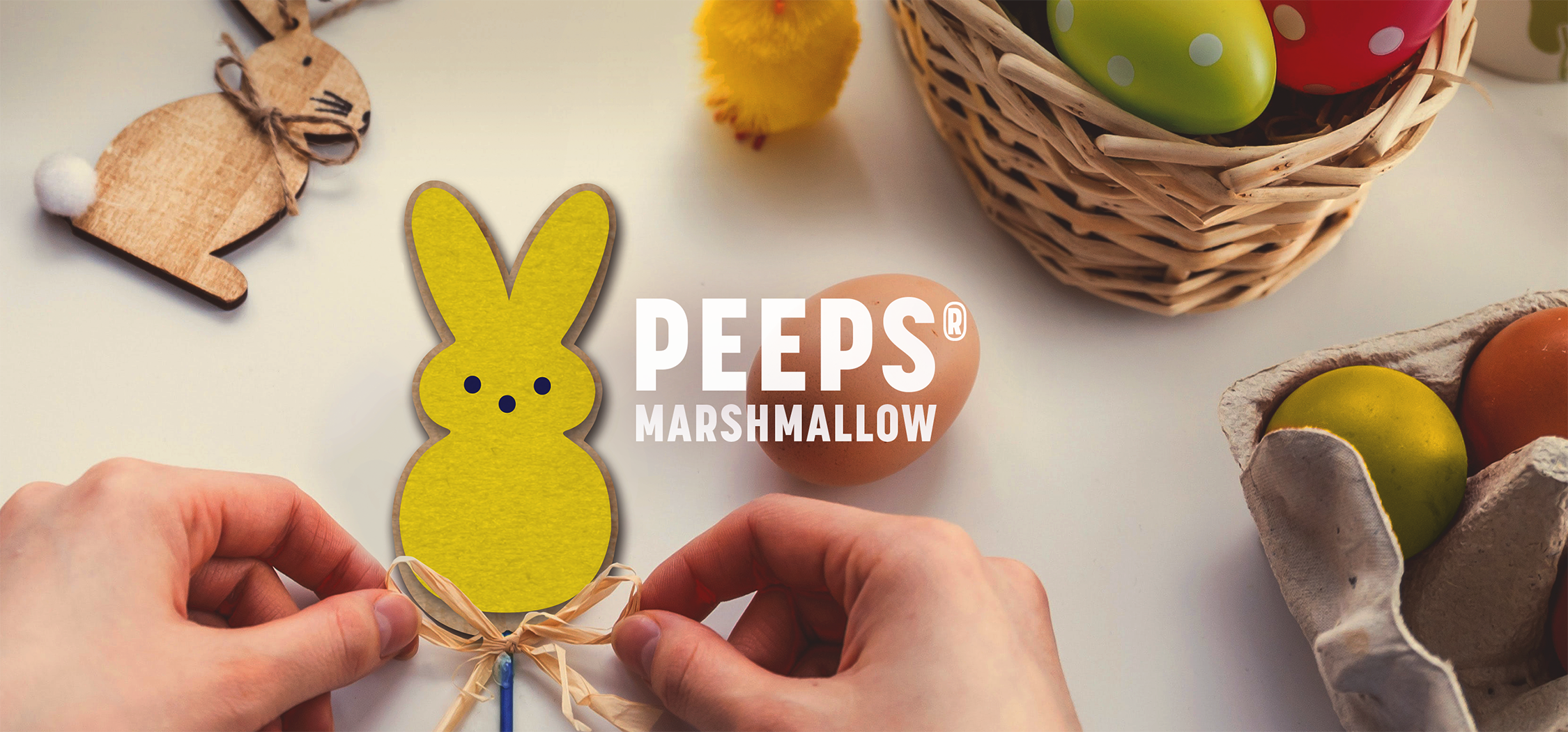
The PEEPS® Brand has been a part of American tradition for years, especially during the Easter season, and it remains a longtime favorite brand that transcends generations. Introduced by Just Born Quality Confections in 1953, PEEPS® is steeped in heritage and has a mass of loyal followers. The brand wanted to evolve and become more contemporary without alienating their existing fans or losing the childhood love that consumers have for it. It was our goal to redesign their packaging in a way that captures the nostalgia of the brand while bringing it into a new era.
Agency Services
Competitive Analysis
Brand Positioning
Packaging Design
Illustration
Brand Standards
Line Extensions
Production

Our Approach
The Character
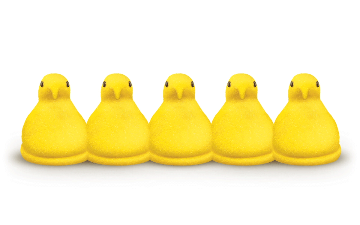
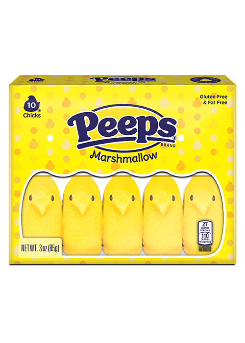
The first step was to identify what elements of the brand held equity for consumers. The shapes themselves are a vital brand asset, and we wanted to ensure that our design would highlight the characters front and center. We also thought about how people enjoy PEEPS® and what experience they encounter upon opening a package. There are always rows of marshmallows, whether it be 5 chicks, 4 bunnies, or another shape. We wanted to embrace that and showcase those characters at all times through the use of the window. EMBRACE THE CHARACTER was our motto!

The Pattern
Still focusing on the unwrapping experience, we analyzed other favorite elements that people recalled when thinking about opening a package of PEEPS®. The nostalgic "Swiss Dot" pattern came to mind and we wanted to create an ownable branded pattern to emulate this in a new way. In designing the pattern, we made sure to maintain the iconic PEEPS® colors, and we sought to visually represent the texture of the actual PEEPS® marshmallow. Consumers associated PEEPS® marshmallows with sugar and speckles, so our goal was to incorporate that feeling into the pattern. We explored different tones of color to suggest highlights and sparkles. The end result was an ownable pattern that maintained the playfulness of the brand and furthered the idea that PEEPS® add happiness and fun to our lives and events.
The Identity
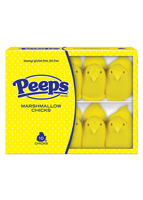
Lastly, the PEEPS® Brand is iconic so we wanted to make the identity the focus. We increased the size of the logo and centered it across all packaging formats. Additionally, because the PEEPS® Brand lives across a variety of consumer touch-points, we took the identity a step further and created a system to "lock up" the different product applications with the logo. This hierarchy update allows the PEEPS® Brand to more cohesively use their logo across numerous applications.

The Solution
The final package design is an effective combination of contemporary and nostalgic. Consumers can still physically see the characters they know and love, and the pattern gives a nice modern pop to the package. It's a balance that will resonate with existing consumers while attracting new consumers. As parents continue to pass PEEPS® down to their children, another generation will begin to associate it as a favorite childhood brand that they enjoy as a seasonal staple year after year.

Brand Assets
Once the design was finalized, we created brand guidelines to ensure consistency across the PEEPS® portfolio. This included details about the new packaging and a breakdown of all assets that were created for the brand refresh.


"BrandFirst has been a preferred creative agency for the PEEPS® Brand for many years. They recently helped modernize our iconic PEEPS® Easter packaging while maintaining the classic Brand Identity. They always deliver against our needs, and we are proud partners!"
CAITLIN SERVIAN, BRAND MANAGER | JUST BORN QUALITY CONFECTIONS


Package Refresh
BEFORE
AFTER