Seafood Supplier Dives Into Retail With New Brand
As a dynamic seafood supplier, 3 Fish Inc. specializes in freshly cut products, sustainable sourcing, and quality ingredients. When they created their own retail brand and expanded their ready-made line to include new proteins and a larger variety of prepared meal choices, we were there to establish a brand name, identity, brand story, and new packaging.
Agency Services
Strategy & Positioning
Branding & Design
Copywriting
Brand Extension
Production

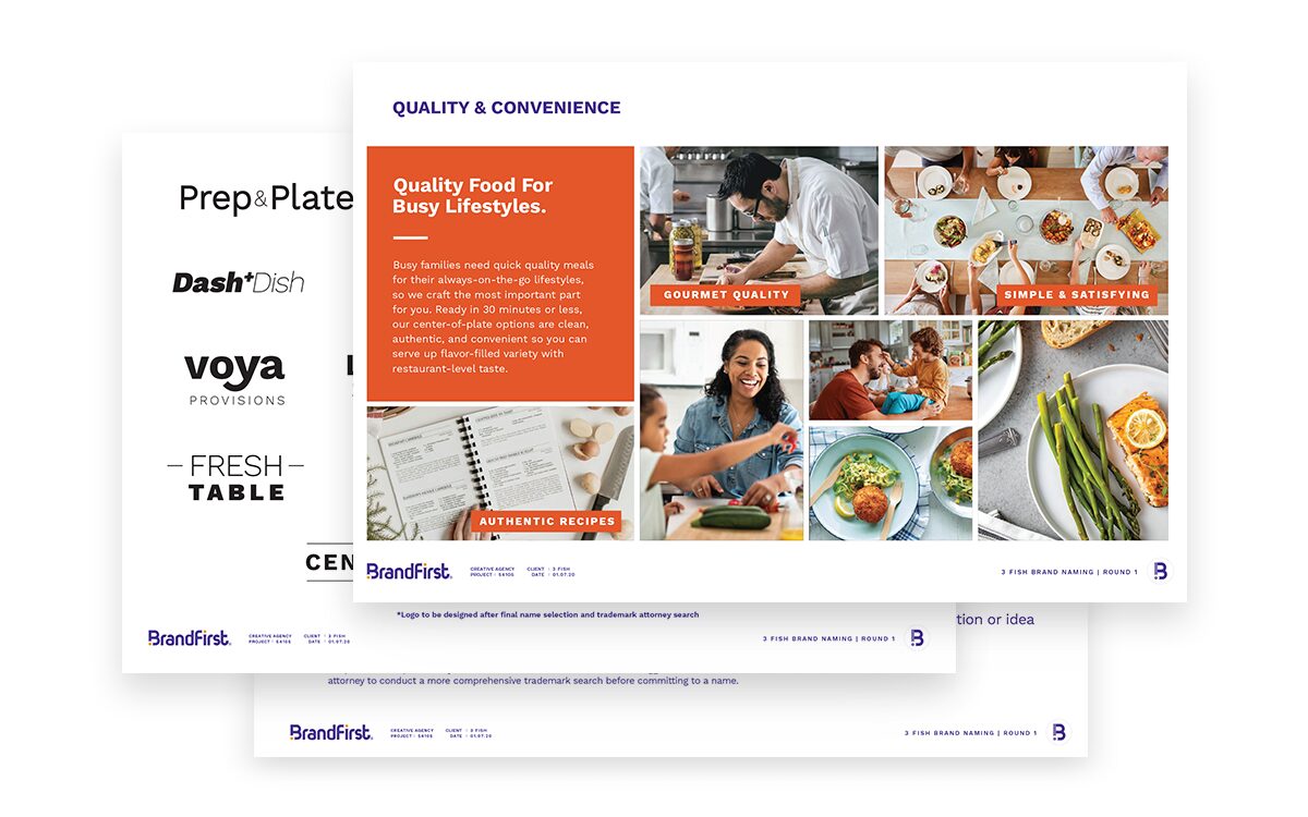
Naming Exploration
We brainstormed names against three themes, including quality & convenience, sustainability, and homemade taste. Each theme embodied the simple, exceptional, and satisfying essence of the product.
Tria™ was the name selected, representing the three areas of innovation the brand encompassed.
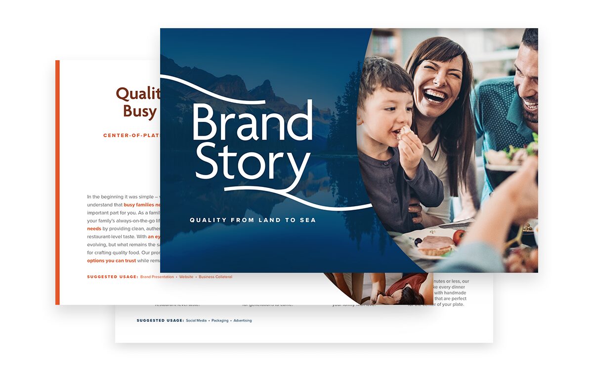
Brand Story
Once we were aligned on the strategy, name, and direction for the new brand, we created a full brand story. This messaging combined key brand attributes with functional product details and emotional benefits to resonate with consumers.
The copy was flexible for use across various touchpoints, including packaging, web, social, and business collateral.
Logo Design
Leveraging the shape of the fish icon from the company’s logo, we created a symbol to represent the three core elements of the brand – quality, land, and sea. It also creates a “T” shape that serves as an ownable and recognizable icon for Tria. In the wordmark, the leg of the R complements the icon with a similar rounded shape, while the base of some letterforms are joined to communicate the interconnectedness of land and sea.
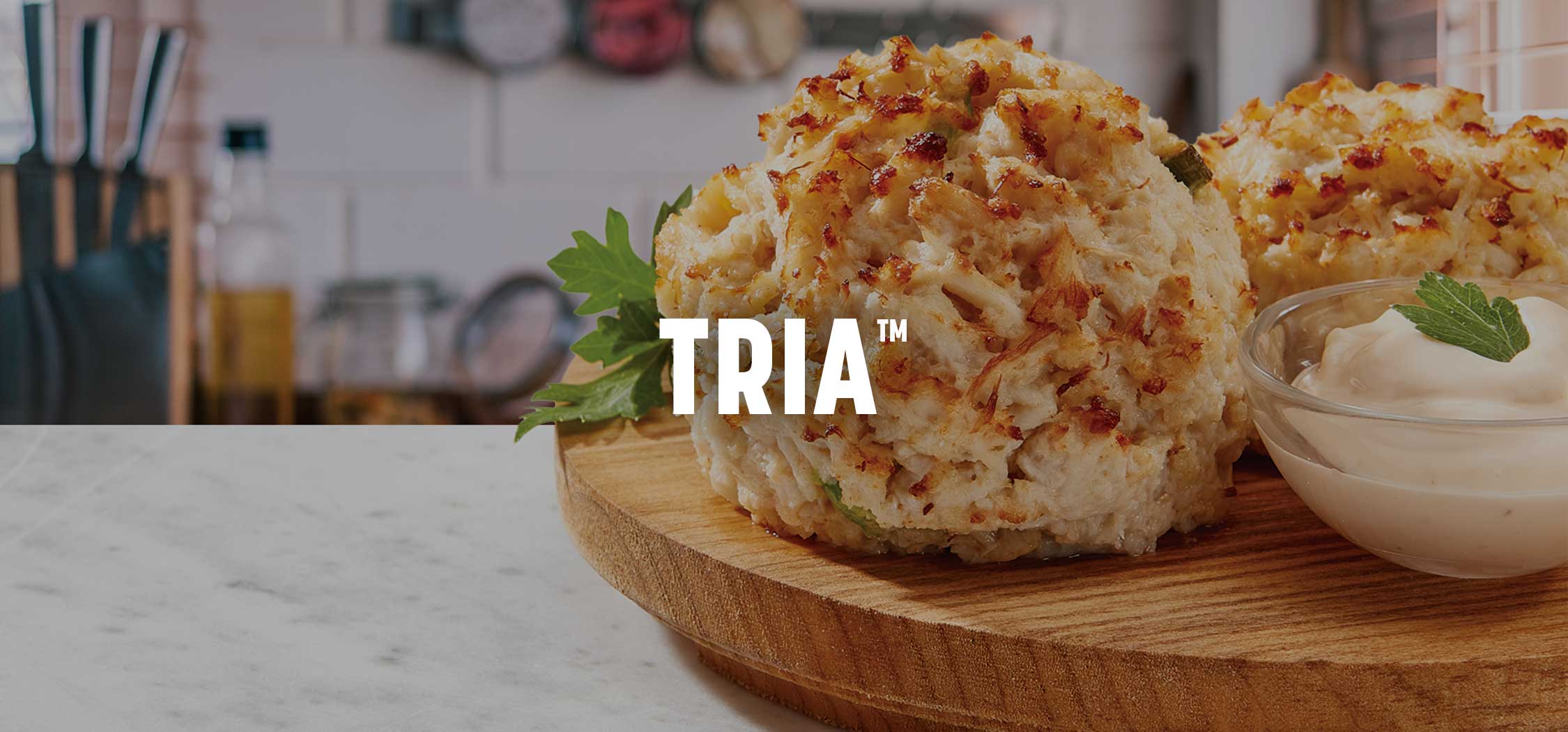
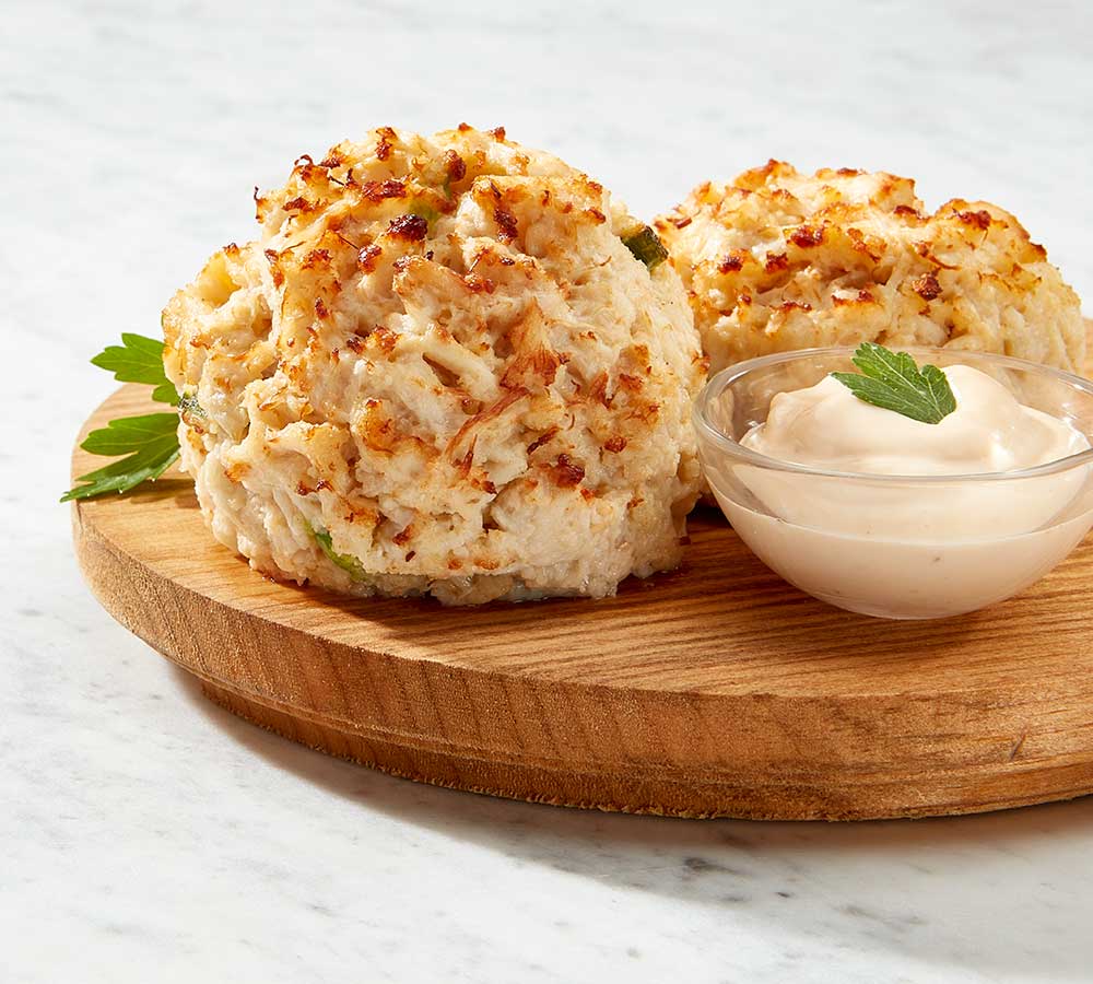
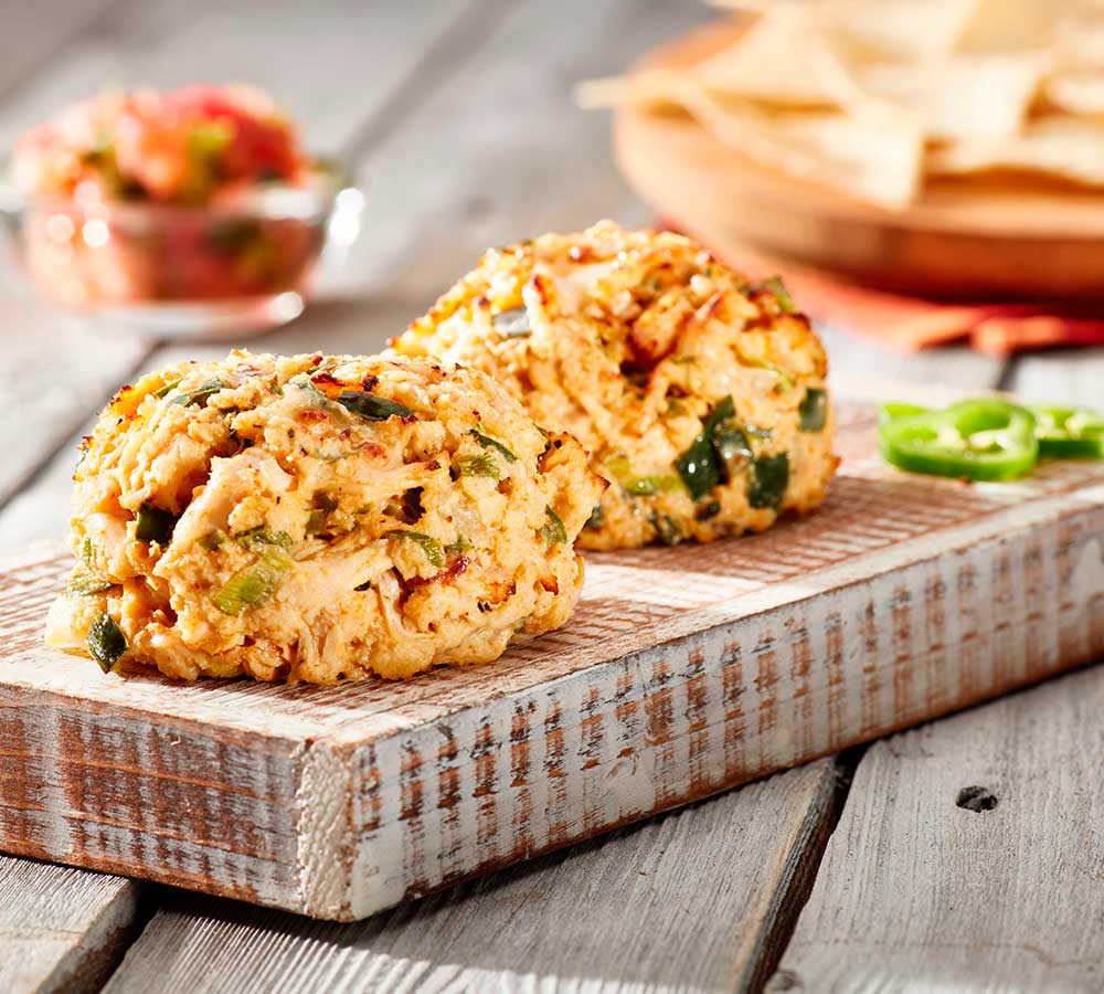
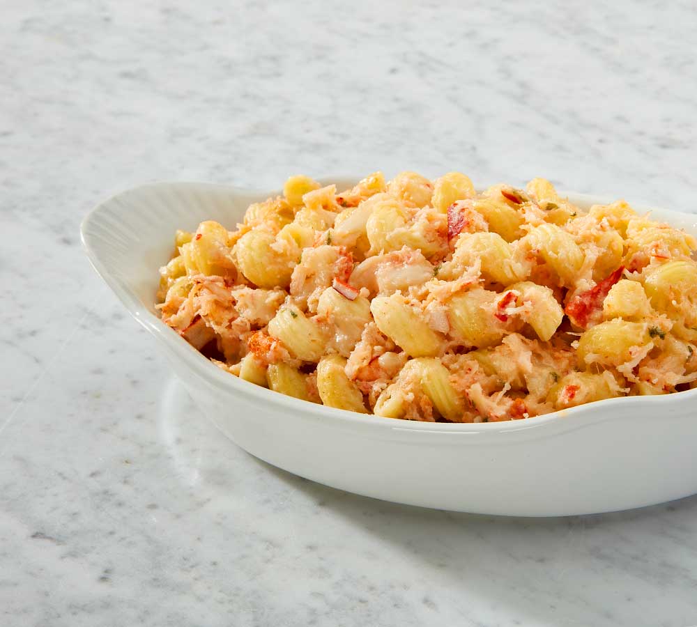
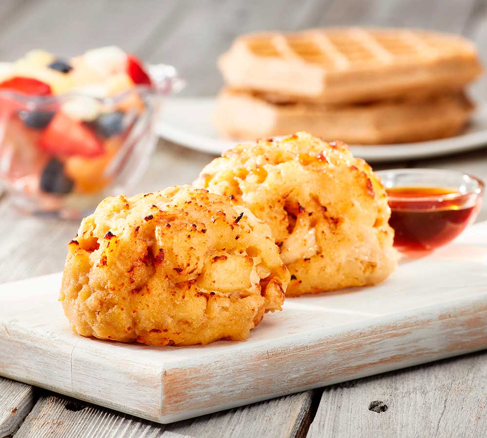
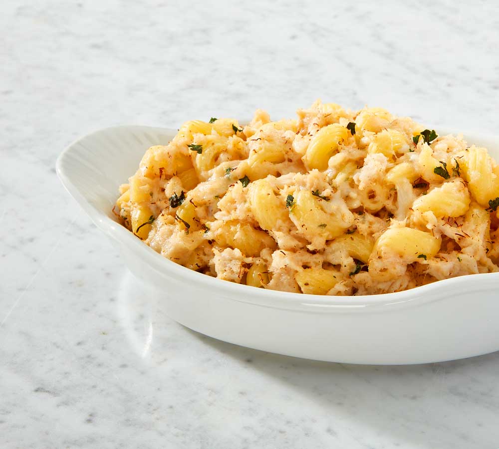
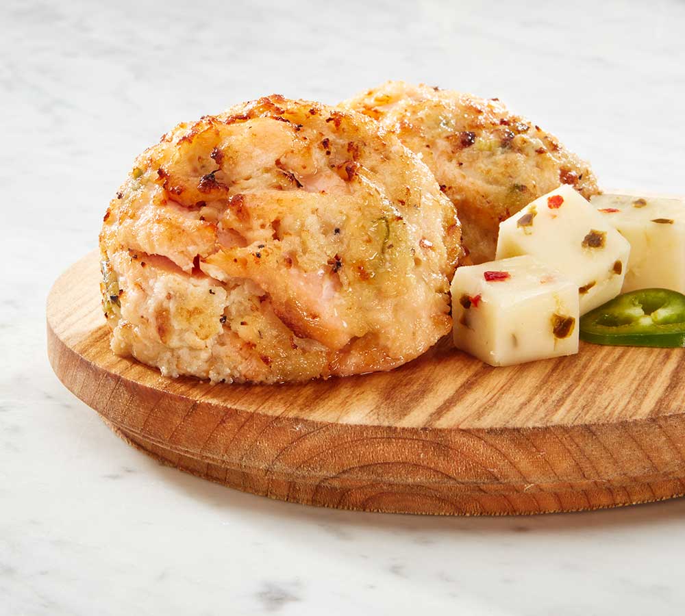
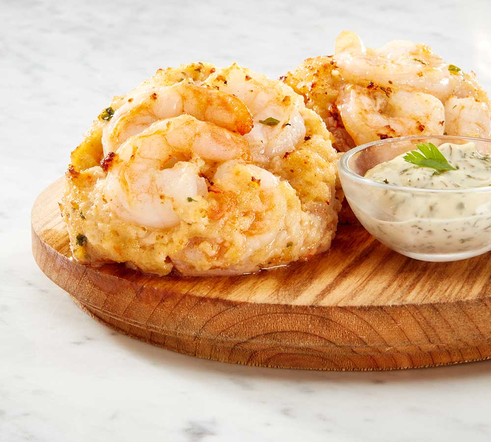
Photo Shoot
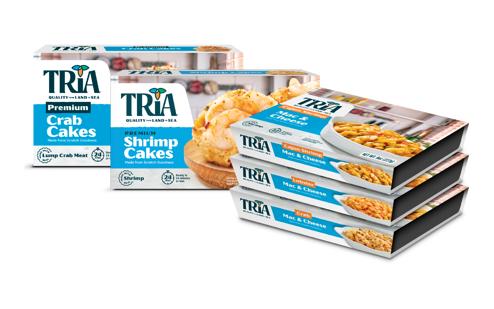
As a new brand, our vision was for the packaging to leverage highly stylized product images with modern lifestyle accents that created appetite appeal and showcased the quality ingredients on shelf. So we went behind the scenes to consult with the photographer and food stylist for the product images that would be front and center on Tria’s newly-designed packaging.


Packaging Design
While the packaging relied heavily on product photography in a lifestyle setting to visually communicate the quality and ingredients of each item, we leveraged a color band to help differentiate SKUs and call attention to the product name. The end result allowed for long-term adaptation and flexibility across additional products, flavors, and pack types.
Front & Back Panels


Extensions