The Challenge
After designing the packaging for their new and existing brands, Gourmet Nut was ready for us to redesign their website. They wanted the home page and overall website to focus on Power Up®, their most popular brand, while the additional Gourmet Nut brands would be featured with their own dedicated brand pages. The challenge was to create a completely customized & responsive site with an emphasis on consumer engagement, increased brand awareness, celebrity & team endorsements, and an improved user experience. We were ready for the task!
Agency Services
Strategy & Positioning
Website Design
Illustration
Copywriting
Search Engine Optimization
Social Media Content Creation
VIEW PAGE
Site Mapping
Our first steps were to discuss with the client their vision and desired content on the website. From there, we created a site map, which broke down the navigation and established a framework for the best user-friendly experience. We captured all of the pages that were going to be included on the site, as well as an information hierarchy.

Wireframing
Once we were aligned on the site map, we developed a detailed home page wireframe template to establish the most important elements and key functionalities that would be showcased. We built the wireframes for both the desktop layout and the mobile layout to ensure the design would be responsive & seamless across devices. Dynamic movement was a key deliverable, so we worked collaboratively to ensure that we included details on where possible interactive and/or animated components would be incorporated. Following alignment on the homepage wireframe and design, we created wireframes for the remaining website page templates.

StyleSnapshot
Moodboards
Before beginning the design of the website, we started with mood boards to explore a range of directions that reflected the attributes and personality of the Power Up® brand. The chosen direction gave us a foundation from which to move forward.

Color Palette
On the home page, we maximized the Power Up® brand colors of black and white, which would later be subtly infused throughout all of the brand pages in order to maintain a cohesive look across the site. To incorporate color on the home page, we selected the vibrant colors that are utilized on packaging and correspond with each specific trail mix flavor.
Typography
When it came to typography, the challenge again was to find one that could seamlessly span all of the brand pages in order to maintain consistency. We wanted to take the current Power Up® look & feel and elevate it with a clean, bold san serif font that was optimized for web. We used a more condensed bold option for headlines, while applying a simpler alternative for body text to make for a quick and easy read on desktop and mobile.
Solution
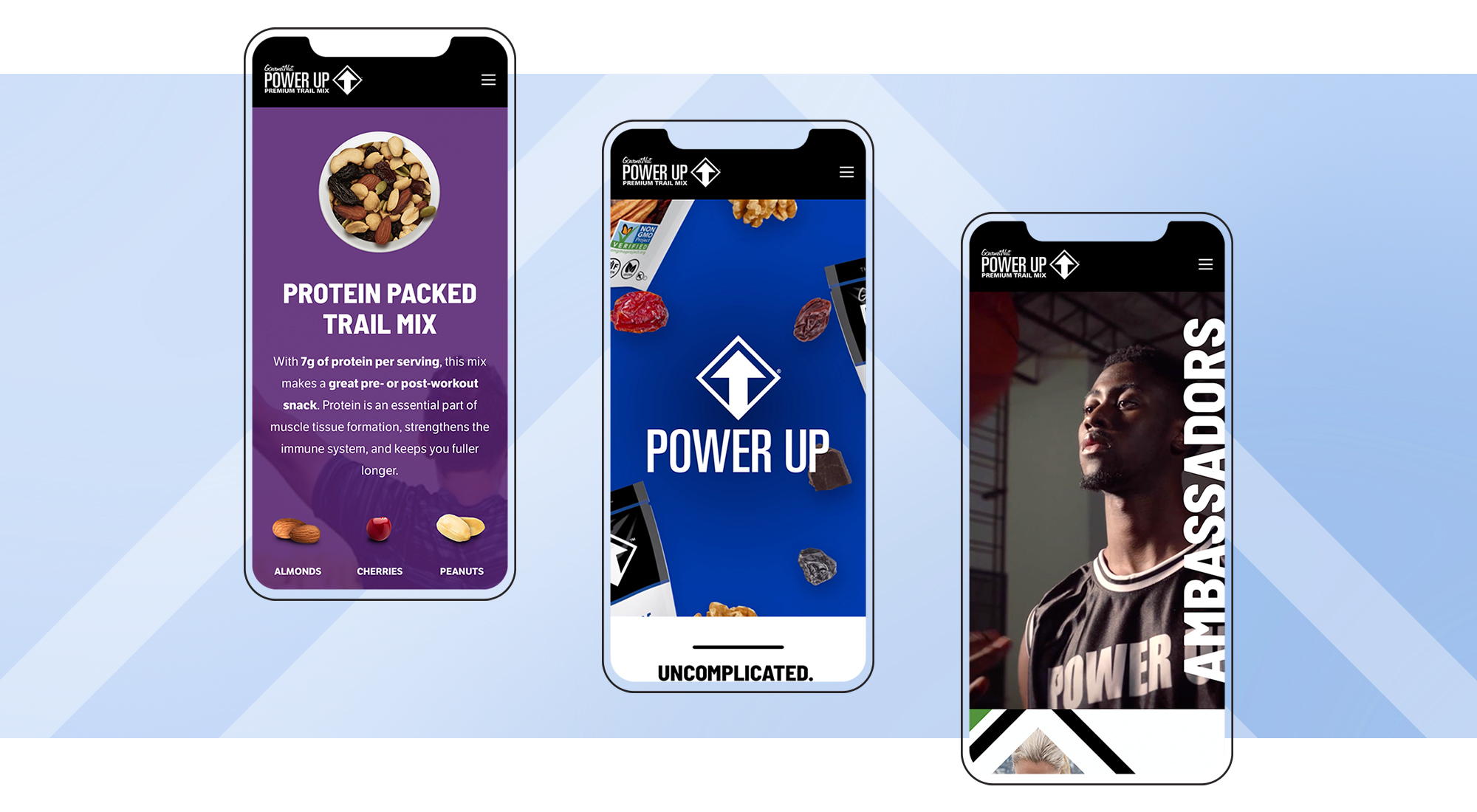
The end result was a custom website with a bold design that was engaging, dynamic, and user-friendly. We created an aesthetic that targeted consumers who lead a healthy, active lifestyle by using relatable imagery and highlighting featured trail mixes, ingredients & recipes to increase appetite appeal. By utilizing icons, we quickly communicated usage occasions and product benefits to emphasize the better-for-you nature of the brands. The creation of these icons also resulted in additional animated elements that grab users’ attention as they scroll. Sprinkled throughout were celebrity ambassador imagery & testimonials, call-to-action buttons, and social media feeds.


Brand Page
To continue highlighting the Power Up® and newly-launched Power Up® KIDS brands, we created separate pages. This allowed us to customize the design and content to maximize product awareness and education. Both pages followed the same structure, starting with a featured-flavor & ingredient-focused animated billboard. The pages also incorporated gifs using the icons we created to communicate product benefits, plus a special interactive magic hover feature that allows users to engage with the elements on their own as they scroll across the graphics. Additionally, these brands included page designs for each individual product within the lineup. These product pages were ingredient-focused, featured a BUY NOW button so consumers could purchase directly from Amazon, and were easily accessible from the SHOP tab in the navigation.
Responsive Design
Knowing that a majority of consumers shop from their phones or tablets, it was crucial to have a responsive website that resized and scaled properly on desktop and mobile devices. In addition, the site was designed and built with speed, accessibility, reliability, SEO and browser support as priorities. From a design perspective, the imagery, videos and animations were adapted for mobile while maintaining the look & feel from the desktop version.
Brand Page + Package Design
For the additional brand landing pages, we designed a template that could be modified for each product line, including Gourmet Nut™ Premium Nuts, Simple Slices™, Perfect Pairings™, and Better Than Popcorn™. Tying back to the Power Up® home page, we maintained a simple & clean look utilizing black and white in the navigation, body copy & background, and added customization with the respective brand elements & color palettes. We wanted to highlight the recently designed packaging for these brands, so each header graphic included a package rendering coupled with product photography and/or illustration for appetite appeal. We also wrote headlines and body copy to engage consumers and generate excitement for these premium healthy snacks.

Assorted Nuts Redesign

Simple Slices™ Case Study

Perfect Pairings™ Design

Better Than Popcorn Design
Animation & Iconography
We wanted this site to make a big impression, so we incorporated the use of dynamic imagery, video, rollovers & movement throughout. For Power Up®, we created storyboards and then animated the billboard graphics to highlight the premium quality ingredients. We also cut videos to highlight the brand’s celebrity ambassadors. For Power Up® KIDS, we utilized brand assets from the packaging, such as icons and the emoji illustrations, to create gifs for areas of fun & subtle movement.
