Designers React: Chef Boyardee
Today, the designers share their thoughts on the Chef Boyardee packaging redesign.
DEVON:
This is a huge improvement in my opinion! While I’m not the target audience, I can appreciate that this redesign has been tailored to a new generation.
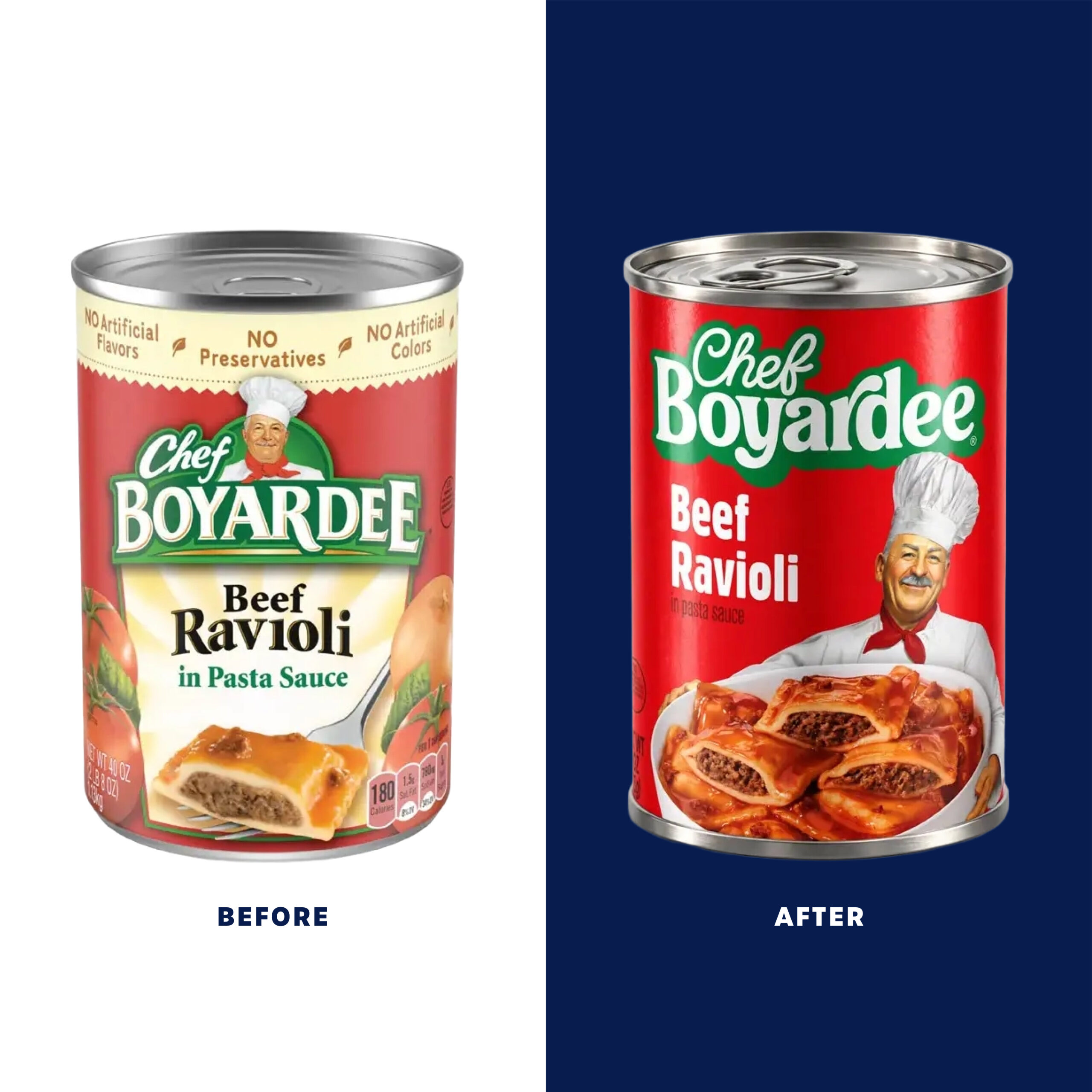
The logo keeps the vibe of the previous iteration but in a much more contemporary style, which feels on trend. I like the chunky green stroke as it helps make the logo more graphic and certainly helps with legibility.
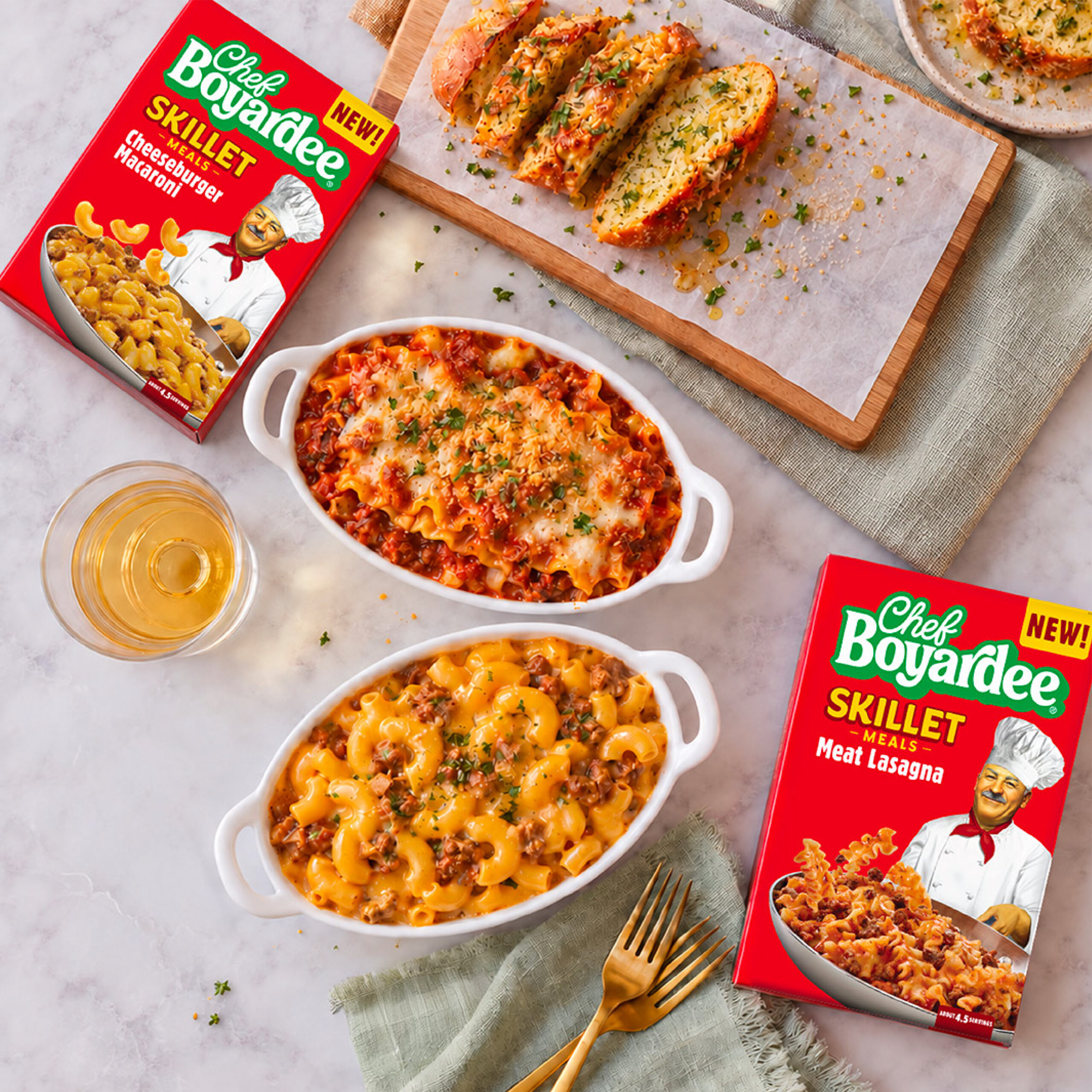
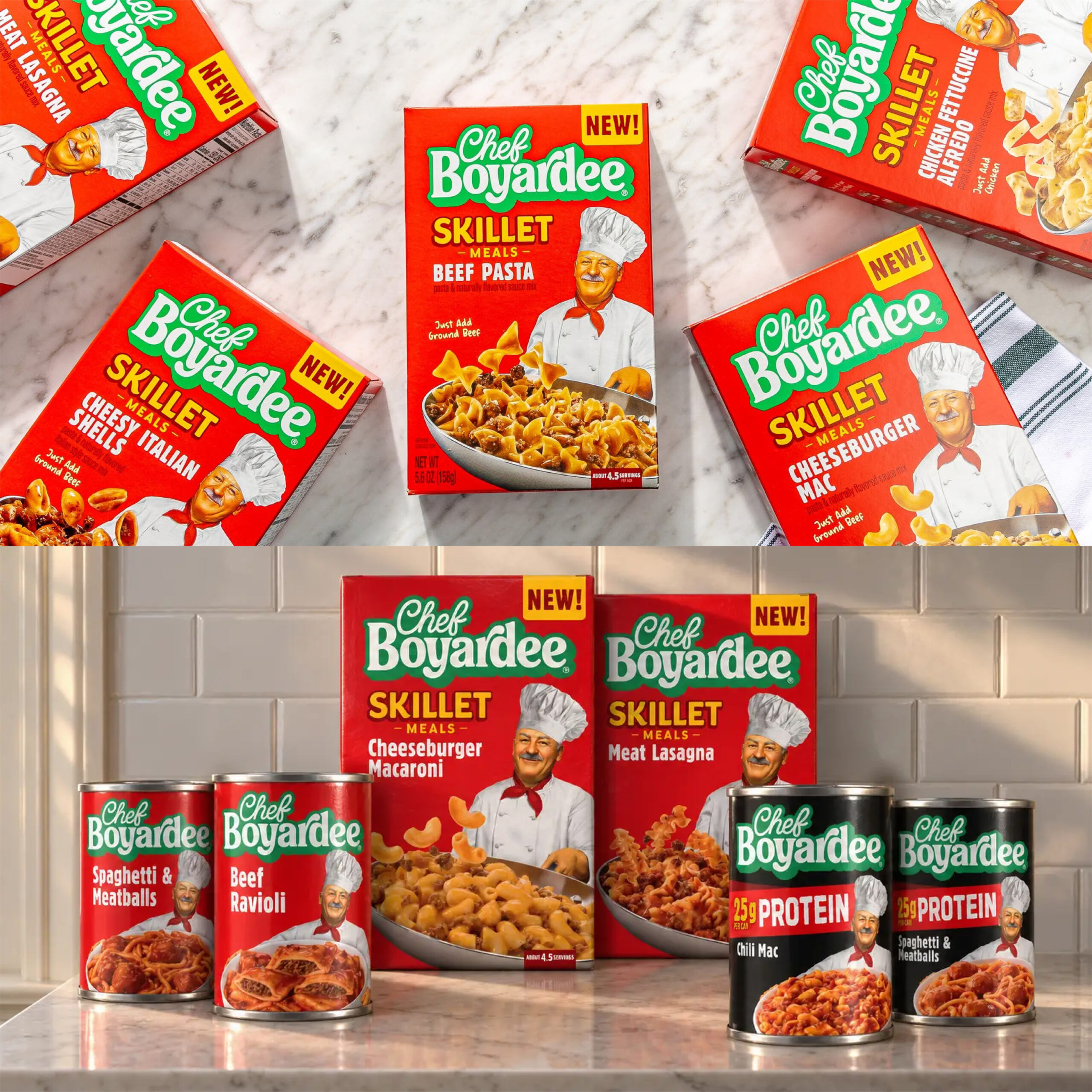
The packaging is pretty clean, but I think how they’re using the chef character works well across the different SKUs. In this case, I think the simplicity makes a lot of sense. The only real miss for me is the protein line. The heavy use of black feels very disconnected and isn’t really that appealing.
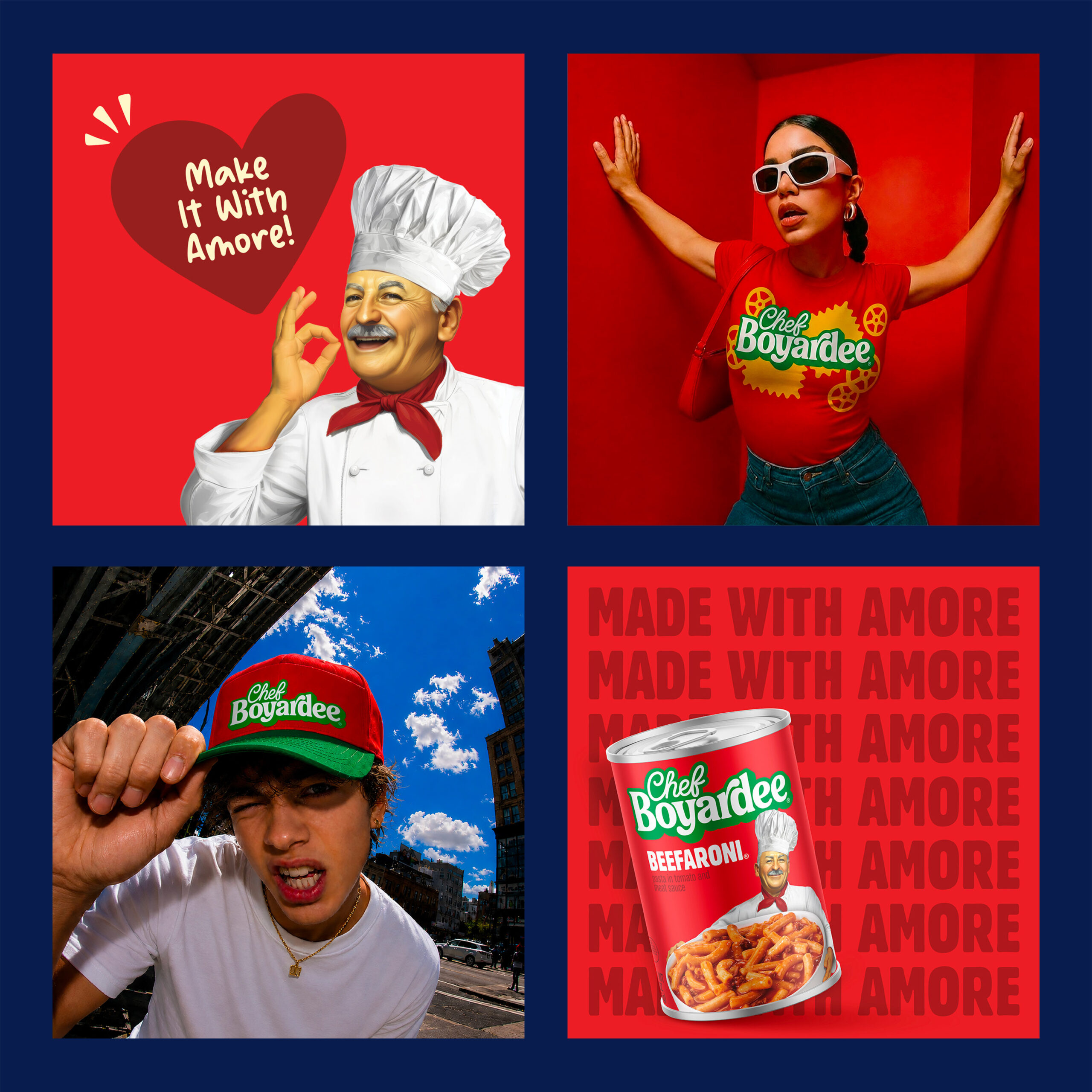
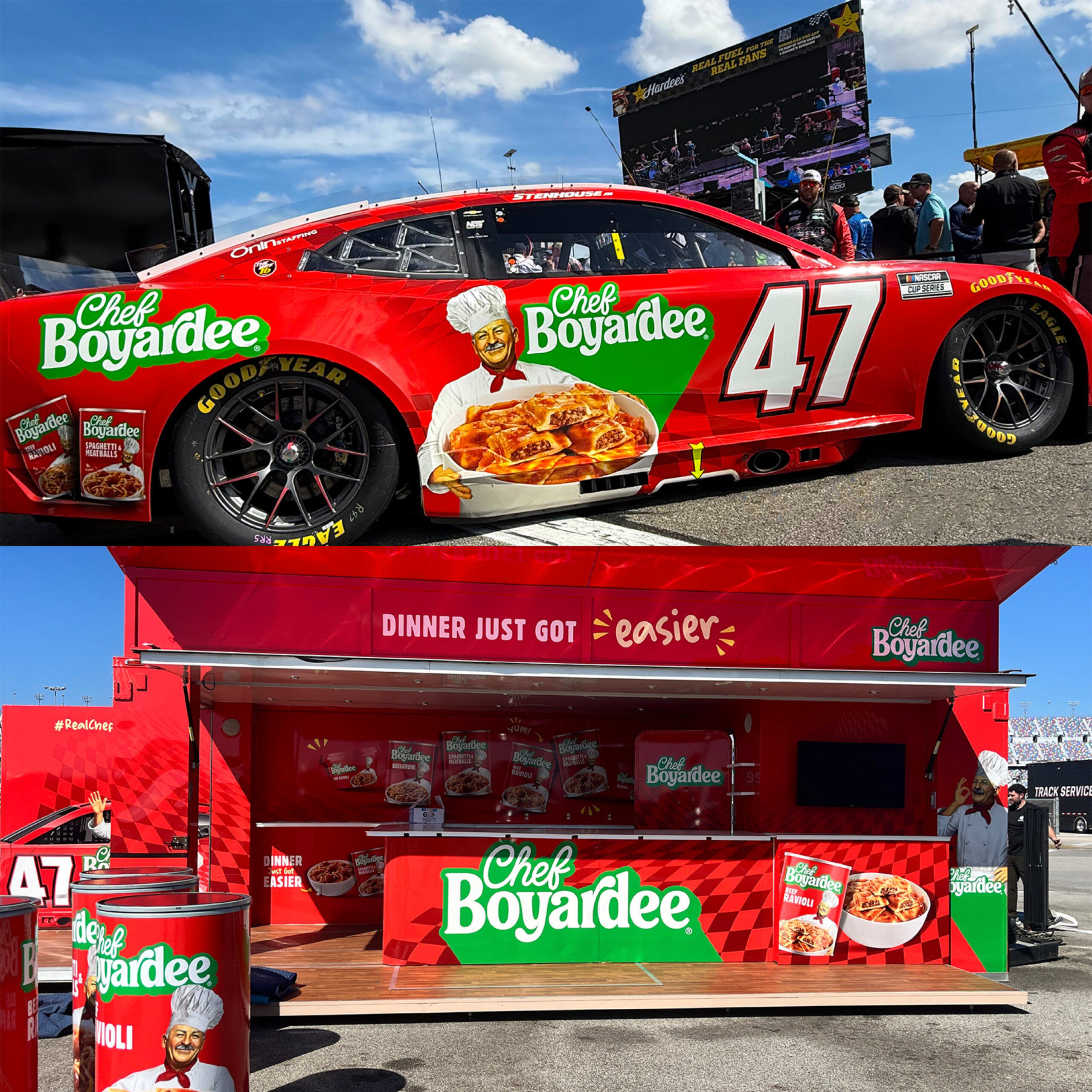
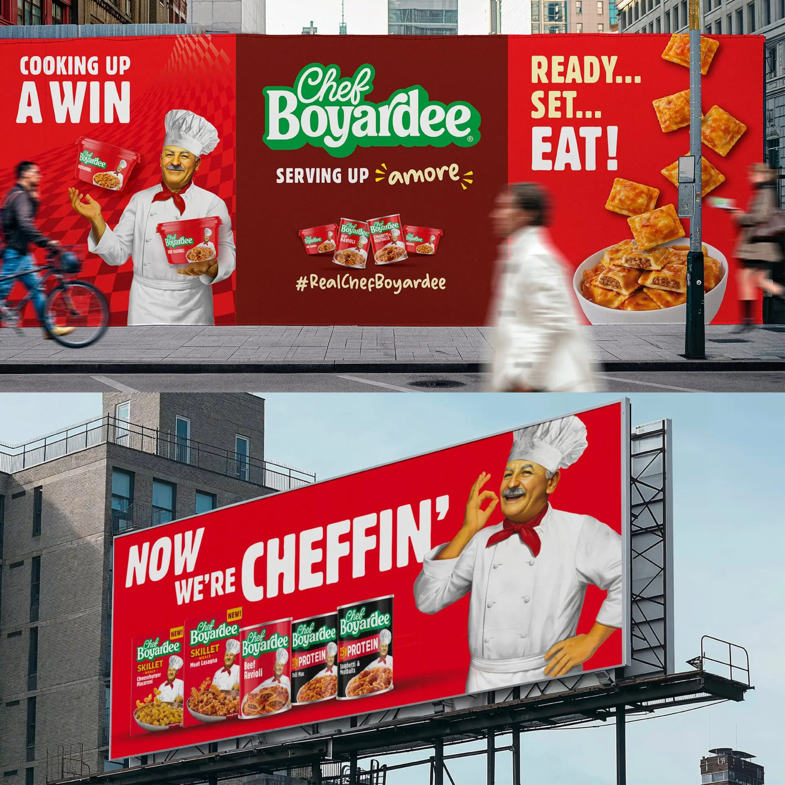
As a whole, the new advertising is simple and effective. The “Amore”-inspired copy works well, and they did a great job enhancing their product photography—it feels much more modern and approachable. The refreshed branding also works very well in the extensions, especially the NASCAR activation! The swag is fun and clearly caters to a Gen Z customer.
Overall, I think this rebrand is a success, and it will be interesting to see how they continue to evolve.
MEGAN:
Chef Boyardee has always been a product that emphasizes convenience and consistency over quality and authenticity. This is a distinctly American canned meal that, just like the brand’s namesake, Chef Boiardi, is an acculturated distortion of its Italian roots, so this evolution of the brand is appropriate.
It embraces the simplicity of their product and translates that into their new packaging, with a bold, red background; no-fuss, rounded sans serif fonts; and a retro, chunky, tightly kerned logo that doesn’t pretend to embrace any specific culture or heritage. It’s a clean, modern facelift that placed its iconic mascot front and center serving up “amore” in the form of rich food photography with uncharacteristic flavor appeal.
In an era when mascots have been phased out of the packaging zeitgeist either through cultural shifts or consumer demand, it’s nice to see the chef at the forefront in his shiny, slightly jaundiced new skin. He looks friendly, albeit uncannily realistic, but it leaves no question for new consumers who the character is. The chef carries the rebrand on his shoulders with pride as an illustration that is a departure from the flat, corporate Memphis style that has dominated the mascot scene for a while.
Their new product, high-protein canned meals, utilizes a black background and red banner for category distinction effectively. It’s undeniably a variant, but the key assets make it recognizably Chef Boyardee. I think this extension falls into the masculine, aggro-aesthetic of protein products a lot of brands have chosen to embrace.
Overall, I believe this was a successful evolution to appeal to a new generation of busy families and after-school snackers with zero pretense or fluff. So, to that I say, “Yes, CHEF!”
RENEE:
The first thing I love about the new Chef Boyardee redesign is that it doesn’t try to erase what makes the brand recognizable! It modernizes the design while keeping the warmth and familiarity that people associate with the packaging.
After reading about the brand’s goal of creating a respectful evolution while still feeling like something people can genuinely enjoy today, not just remember from their childhood, I think the refresh successfully achieves that. It’s still red, bold, warm, and unmistakably Chef Boyardee!
The logo immediately stands out to me on the new packaging. I love that they chose to keep the recognizable green and white brand colors while completely reimagining the logo into something that feels much more modern and ownable!
Keeping the chef front and center was also a smart decision. Instead of removing something that could feel outdated, they refreshed him and made him feel relevant again. It gives the brand the right amount of nostalgia without making the packaging feel stuck in the past.
My one critique is that the illustration of the chef is almost too realistic, to the point where it can start to feel slightly artificial. I wonder if the illustration could be pushed a little further into something more fun and playful while still maintaining his recognizable character.
Overall, though, Chef Boyardee seems to have found a great balance between heritage and reinvention. They’re not trying to make Chef Boyardee look like a new pasta brand, they’re making Chef Boyardee feel relevant again!
Images sources for this article: Facebook.com • LittleBigBrands.com • theDieline.com

DEVON PETRIE

MEGAN ROSARIO