Designers React: Wheat Thins
Today, the designers share their thoughts on the Wheat Thins packaging redesign.
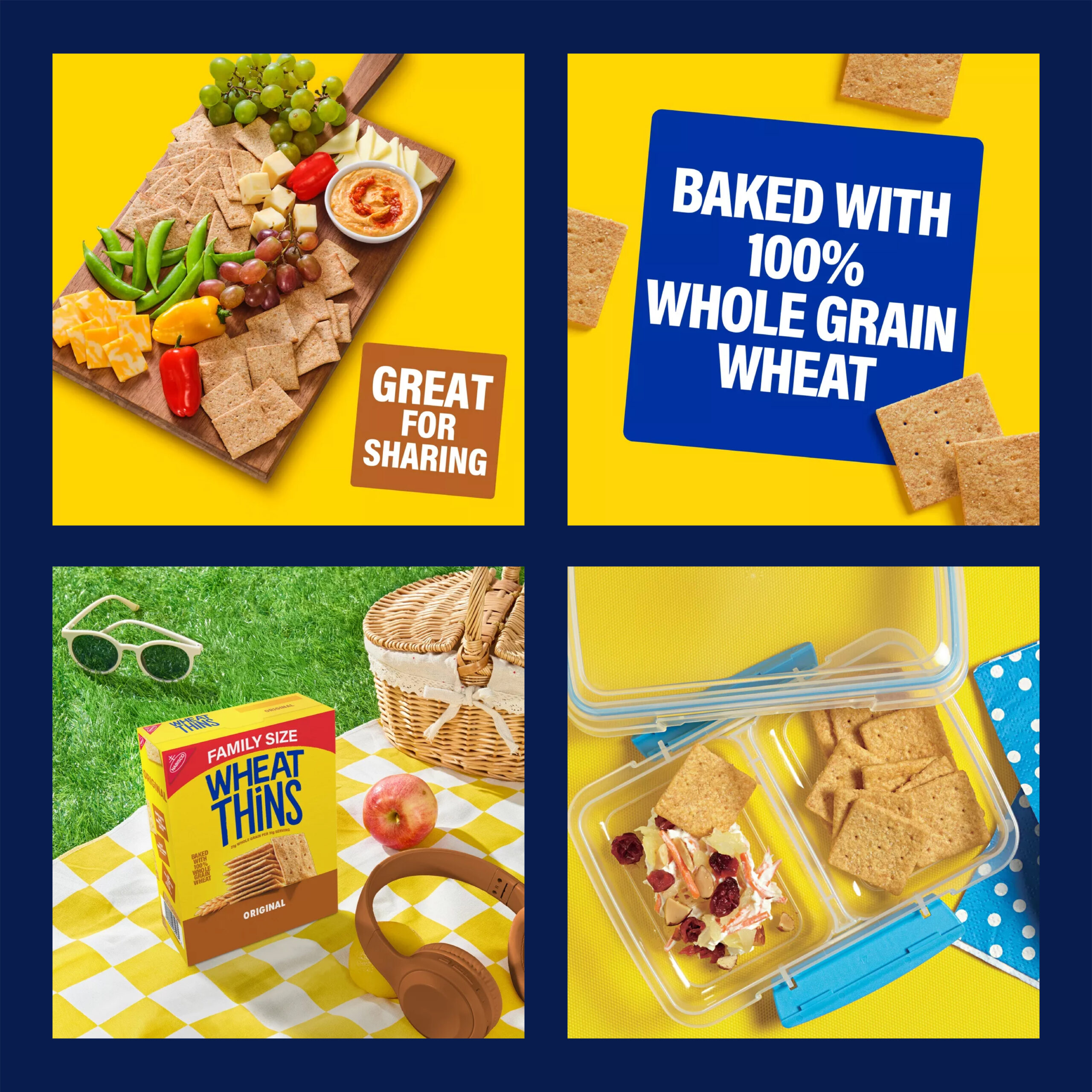
DEVON:
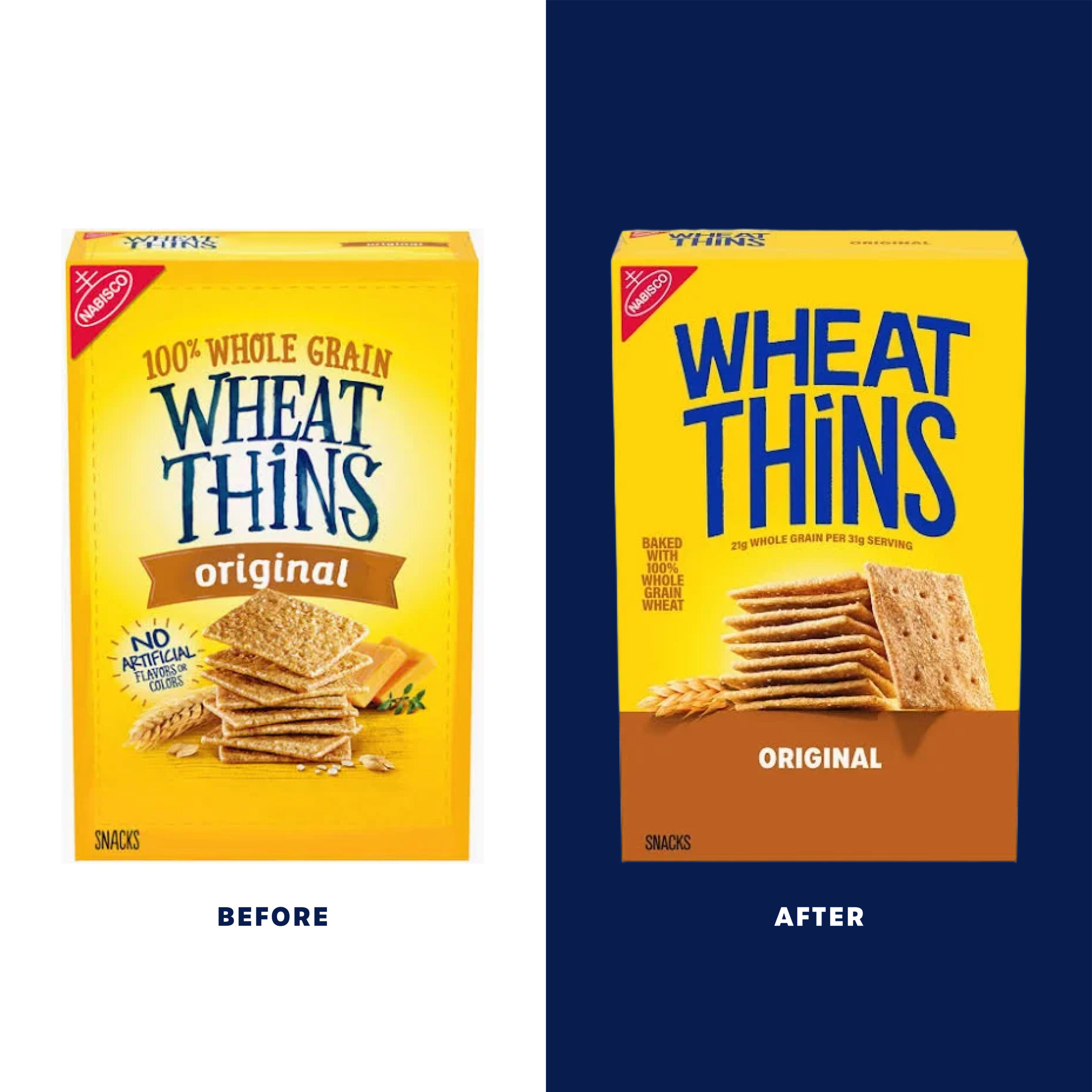
Sometimes a redesign really strengthens a brand and their presence on shelf, but for me, the Wheat Thins redesign actually weakens it. They have stripped away all the personality from their brand, leaving a package that blends in with the category.
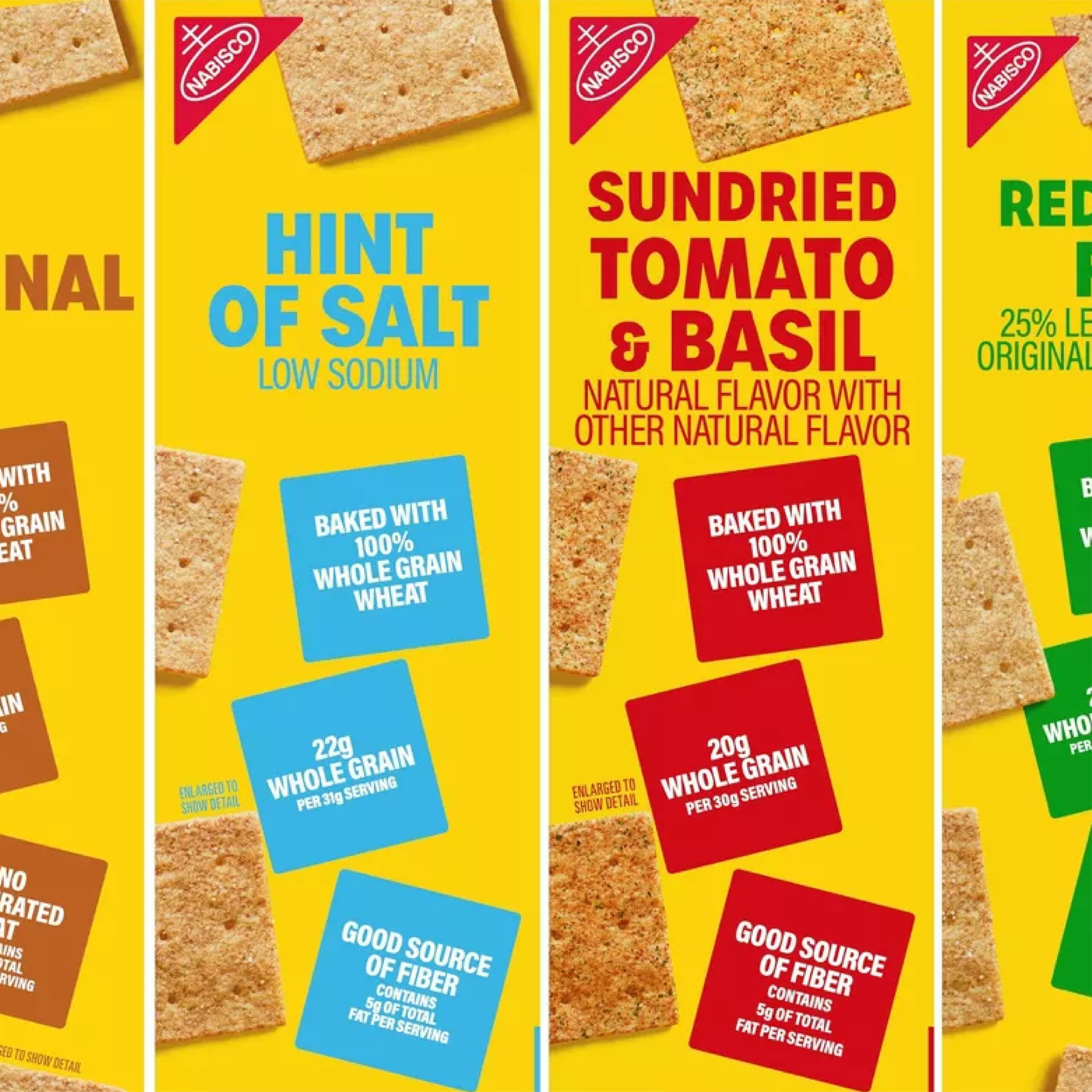
For example, Triscuit and Ritz, who are also owned by SnackWorks, utilize the same split color-blocking layout Wheat Thins has adopted. Yellow is also already used in the category by brands like Simple Mills and Back To Nature (which uses yellow for its crispy wheat cracker SKU).
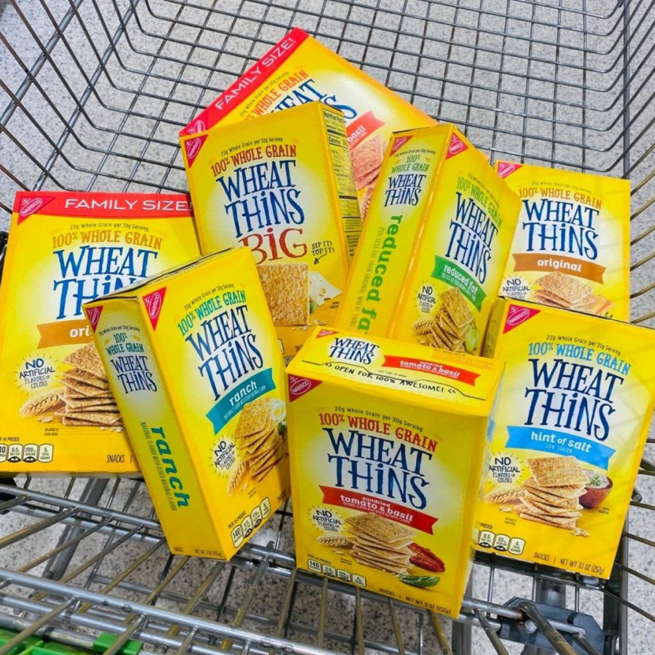
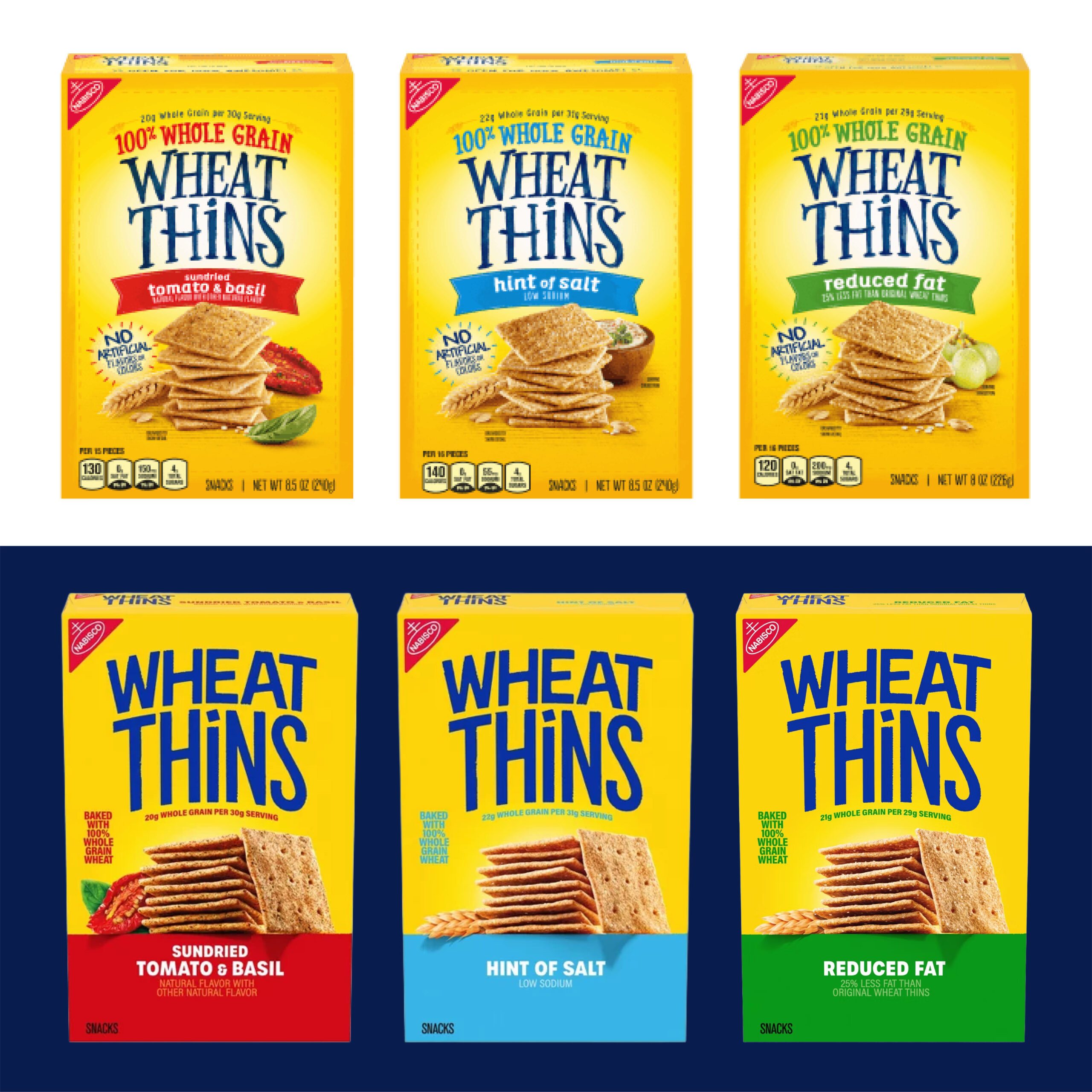
Personally, I miss the whimsy of their old logo. It was unique in the category and helped visually support the healthy aspect of their products. The appetite appeal was also much stronger with flavor indicators or product pairings, and locking it up with the ribbon worked well to distinguish the different flavors.
Previously, they communicated “100% Whole Grain” and that the product was made with “no artificial flavors or colors.” Now, the callouts are small and downplayed—and it appears they can no longer claim no artificial flavors or colors, which may explain why the brand has shifted tonally so much.
In my opinion, the redesign is sterile, bland, and playing it too safe! If you removed the logo, you wouldn’t know which brand this is. If you kept the logo, it’s so generic looking it could literally say anything—it’s not memorable! The color-blocking is expected. The product imagery looks staged and manufactured, as there is no shifting in the stacks from flavor to flavor. They could have had some fun with the other SKUs, but they have taken a very templated copy/paste approach.
Overall, I would have liked to see more of the previous look and feel incorporated into the redesign.

MEGAN:
I’m not going to let my personal dislike of Wheat Thins cloud my judgment on this impartial review of their new packaging. However, this new evolution doesn’t exactly beg for a second glance. The era of bold minimalism, devoid of character and warmth, has persisted to plague our shelves. This could be Millennial nostalgia seeping through, but there was a time when the snack aisle felt diverse, fun, and unique.
This homogeneity in this genre continues with this new packaging done in-house by Mondelez. Their solution for modernizing this “healthy” lunch box classic was to bring rigidity and structure where there was once loose, organic nonchalance, most notably in their logo.
The textured, flowy typography was laidback, set on a soft yellow gradient reminiscent of sunshine touching the wheat fields on the horizon. Maybe I’m romanticizing the industrial reality of how these products are made, but this cracker did feel distinct from its “less healthy” competitors.
Now, it has instead embraced the trends of clean brand-blocking and sharp geometry. The new logo is set in a thin, variable sans serif font in all caps except for the “I,” where the tittle has been replaced by a square. The previous packaging relied heavily on the logo to provide character and a non-GMO homegrown feel. The slight arch is applied to the new one as well, but other than that, the departure makes this makeover generic and expected.
While I’ve been mostly critical of the overall design, I’ll point out the photography is an improvement. This angle adds depth, dimension, and contrast where the former made the product blend into the background. It’s a decently sized stack that almost implies that could be the serving size, and you would still feel good afterwards. The color block is unremarkable.
Overall, as a consumer who might be willing to give this cracker another chance, I’m not enticed or curious. As a designer, I’m bored by this evolution. This category of snack lends itself to natural textures, modern farmhouse comfort, and typography with imperfections and joy. Unfortunately, I won’t be persuaded to give them a taste-test review anytime soon.
RENEE:
When I first looked at the new Wheat Thins packaging redesign, I thought, wow, this feels very modern…but also kind of boring and predictable! The original packaging had a familiar, nostalgic quality that felt unique and ownable to the brand. The warm yellow hues, hand-drawn typography, and illustrated wheat elements gave it a sense of personality and whimsy.
In comparison, the new design feels more corporate and generic, almost as if the cracker brand has lost some of its whimsy in the process of becoming more contemporary! Then, upon further research into the new branding, I came across some relevant context that helped explain the shift.
Wheat Thins was involved in a class-action lawsuit surrounding the use of the “100% Whole Grain” claim. As part of the settlement, the brand agreed not to use “100% Whole Grain” by itself or immediately before “Wheat Thins” without additional qualifiers.
The new package instead places the claim in much smaller supporting copy: “Baked with 100% Whole Grain Wheat.” With this information, the very modern redesign makes more sense. Rather than leading with a natural, wholesome ingredient story, the brand is making Wheat Thins itself the hero of the packaging! Now the new hierarchy reads: Wheat Thins first, then the cracker, the flavor, and lastly, the supporting product claims.
Because the brand is moving away from being so ingredient forward, I think the redesign does make more sense strategically. However, I still think there was an opportunity to bring some of the original whimsy back into the design and create a stronger connection to the brand’s heritage.
Wheat Thins can be modern, bold, and colorful while still feeling uniquely Wheat Thins! Bringing back custom illustration, perhaps in a more contemporary way, could add personality and make the packaging feel more ownable rather than relying so heavily on typography and color-blocking.
Overall, I think the redesign successfully modernizes the brand and creates a stronger shelf presence, but it loses some of the character that made the original packaging memorable.
Images sources for this article: Target.com • Snackworks.com

DEVON PETRIE

MEGAN ROSARIO