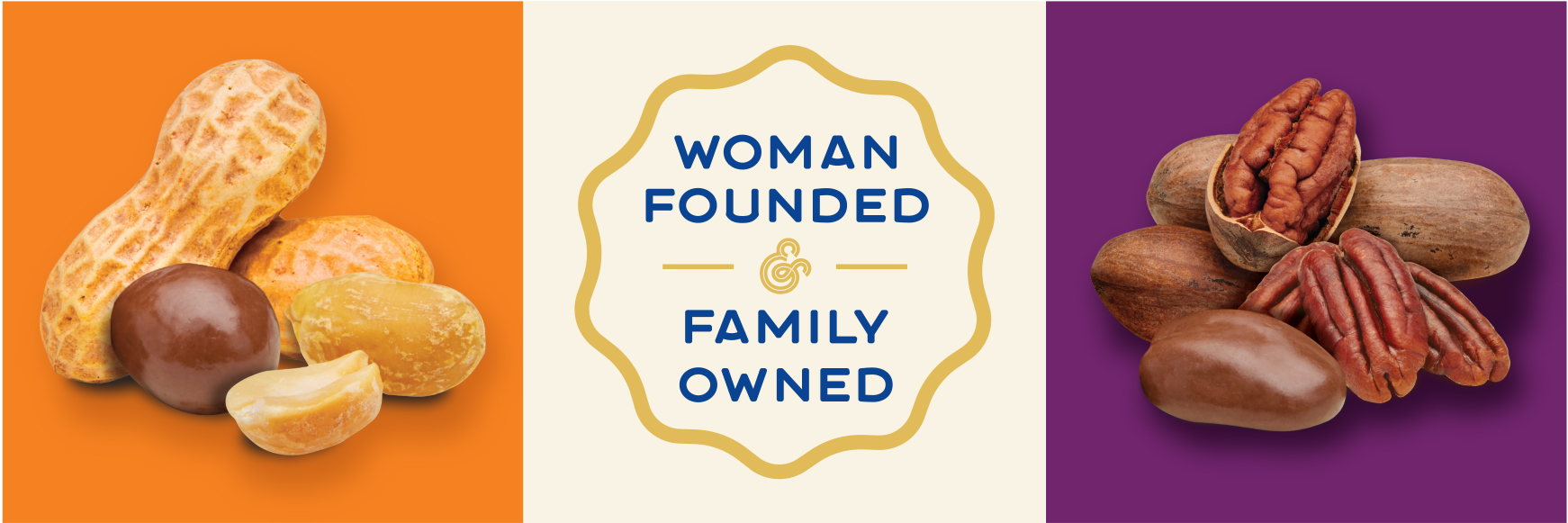
Georgia’s Best
A Classic Treat Made for Everyday Enjoyment
Starting as a small nut-roasting operation in 1945 and evolving into a full-service contract manufacturing and private labeling partner, Georgia Nut Company was looking to bring a selection of its chocolate-covered nut and fruit confections to the wholesale club market. Georgia Nut asked our team to create a new subsidiary name and brand identity for the products, along with eye-catching packaging designed to attract attention on shelf.
AGENCY SERVICES
- Strategy & Positioning
- Naming
- Logo Design
- Packaging Design
- Product Photography
- Production
Strategy & Positioning
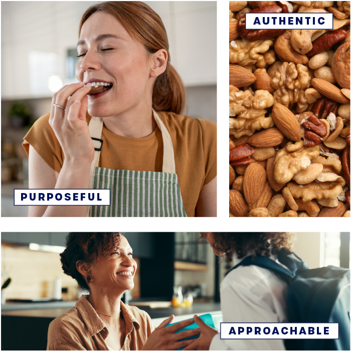
We began the project with a competitive analysis to familiarize ourselves with similar products on the market, as well as an evaluation of Georgia Nut and the treats’ intended audience. Bringing these insights together into a comprehensive brand expression, we developed a vision for how to best position the products. The brand and its visual identity needed to strike the right balance, signaling quality and credibility without feeling too premium for value-conscious club store shoppers.
Concept Development
Naming, Logo Design, & Packaging Exploration
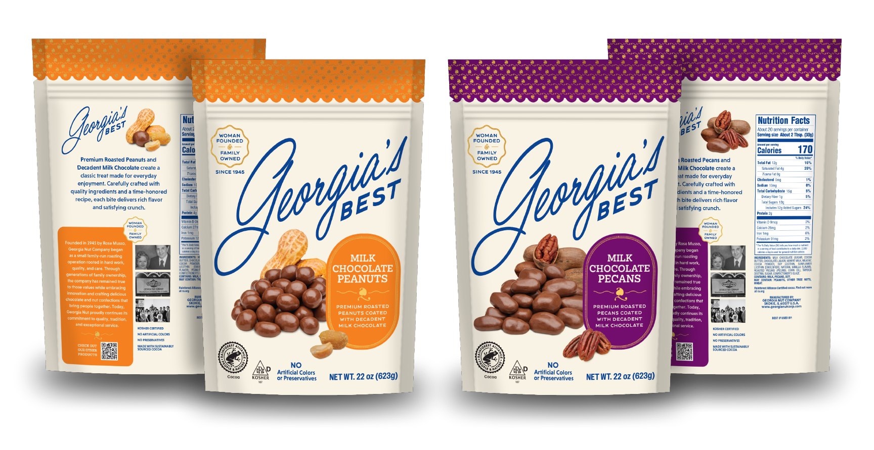
The BrandFirst team came up with a range of names for the subsidiary, bringing the client’s favorites to life through unique, ownable logos. We then explored multiple packaging design concepts, using strategic callouts, product photography, and color coding across SKUs to create a brand presence that would stand out in a crowded retail environment. We ultimately crafted a brand identity that was a departure from Georgia Nut while still fitting within its existing aesthetic.

The Solution
The client selected Georgia’s Best as the subsidiary brand name, a nod to the parent company that also suggests product quality. With this direction in mind, we developed chocolate-covered nut packaging that balanced a fresh, differentiated look with Georgia Nut’s established brand. An element from the Georgia Nut logo created a distinctive pattern and subtle visual connection, while product photography enhanced appetite appeal on pack. The resulting look provided a foundation for display-ready cases, packaging renders, and future offerings as the product line expands.
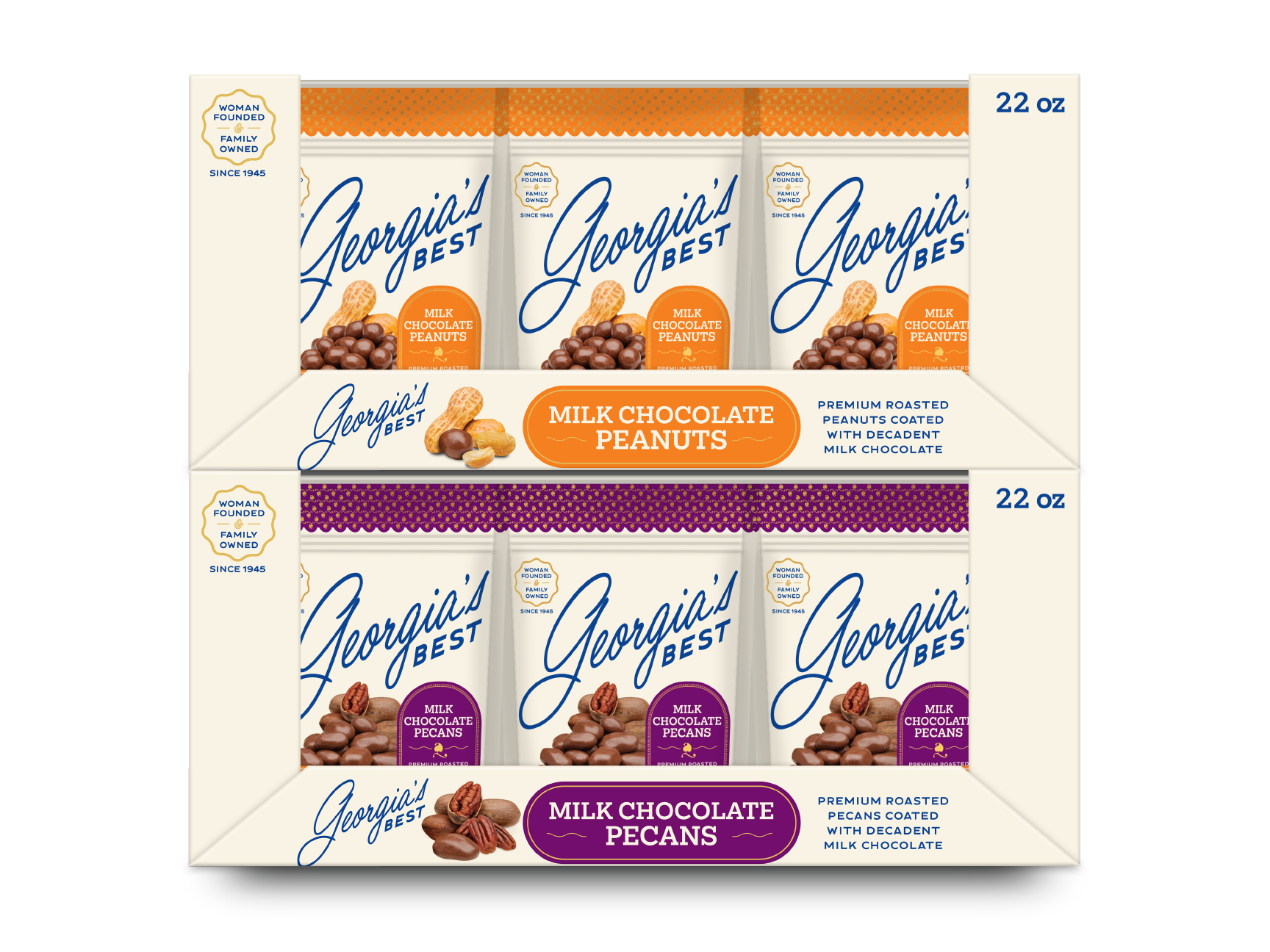
Photography & Brand Assets
To showcase the products, BrandFirst arranged a photoshoot and used custom photography instead of illustrations to emphasize the treats’ appeal. We also provided the client with a selection of brand assets to support future marketing projects.