Goetze’s®
A Classic Twist On What You Love
A legacy candy company known for its classic caramel confections, Goetze’s Candy came to us for a logo and packaging redesign of its iconic Caramel Creams®. They wished to preserve the nostalgic appeal that resonated with current customers while giving the brand a more modern look to entice new consumers. The new packaging also needed to heighten appetite appeal by putting the beloved candy front and center.
AGENCY SERVICES
-
Competitive Analysis
-
Brand Positioning
-
Logo Design
-
Packaging Design
-
Illustration
-
Line Extensions
-
3D Renderings
-
Production
Logo & Package Design
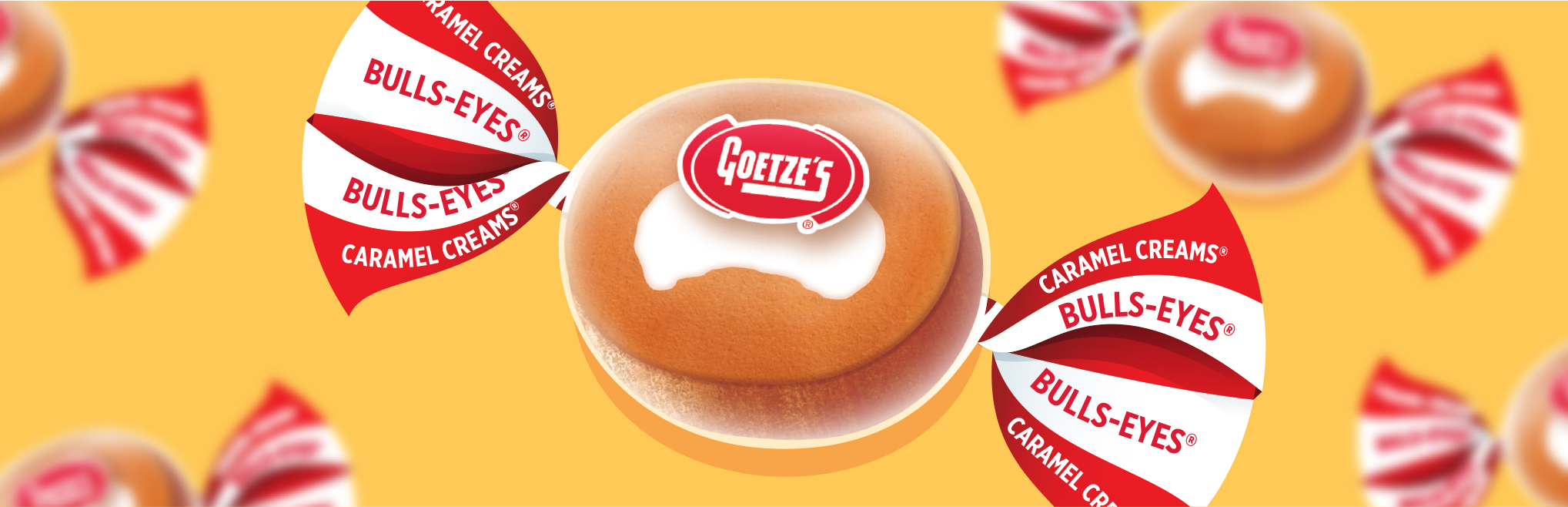
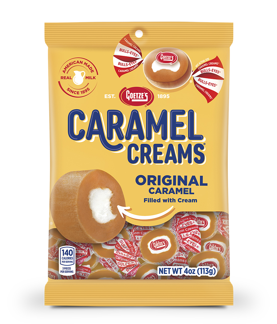
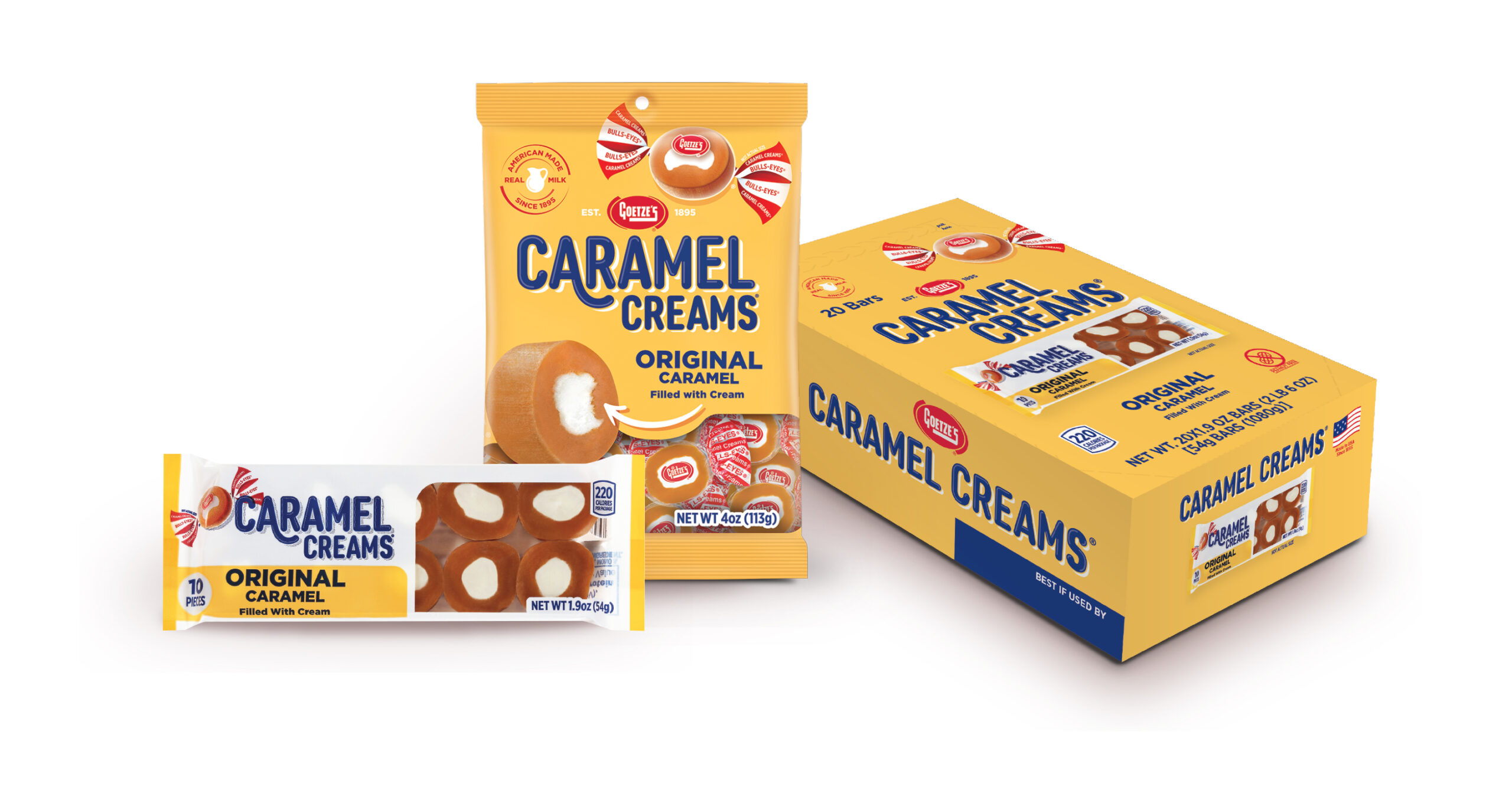
The final design showcases the Caramel Creams® iconic candy piece as the hero of the package. Featuring both an unwrapped and wrapped version, the two pieces illustrated on the front of the pack capture the candy’s well-known shape and instantly recognizable red-and-white-striped wrapper. The new Caramel Creams® logo is fresh yet nostalgic, and the arrow pointing to the piece adds a bit of whimsy to the mix.
Brand Assets
We photographed the candy pieces and then retouched them with an illustrative style that enhances appetite appeal and gives the pieces texture. The American Made with Real Milk seal calls back to the product’s original recipe, which is still in production. We also created a Made in USA icon that reinforces the candy’s patriotic roots.
Packaging Redesign & Rollout
The evolved color palette, enhanced logo, and prominent callouts infused the packaging with personality without sacrificing brand equity. Our design also incorporated photo-realistic images of Goetze’s iconic candy piece for consumer recognition.
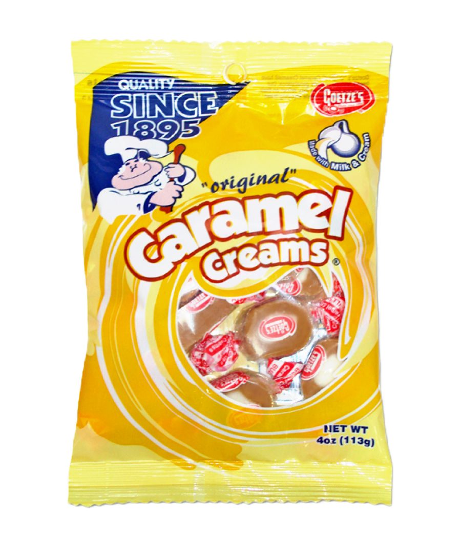
BEFORE
AFTER
Tradeshow Booth
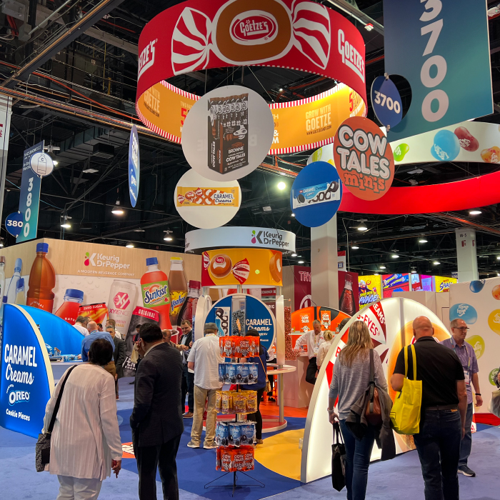
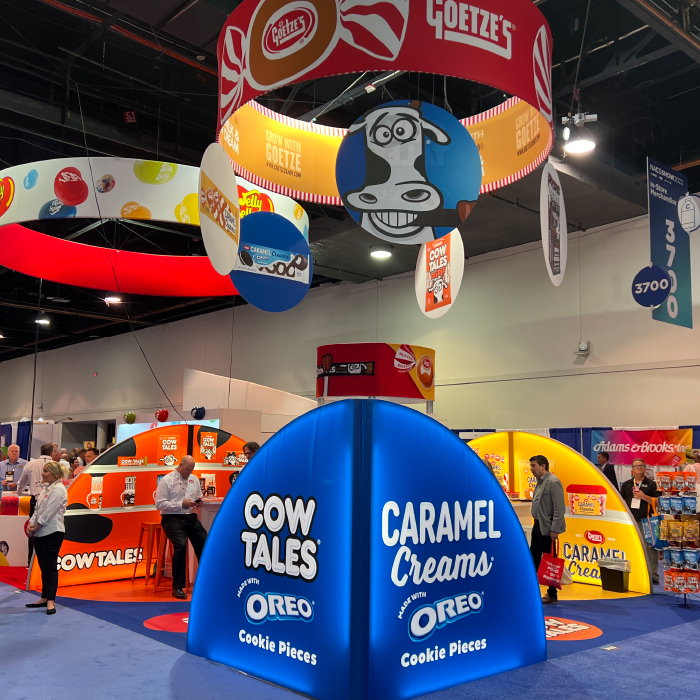
Additionally, we assisted the client in designing a sectioned tradeshow booth with bright colors and dynamic signage to highlight Goetze’s impressive product portfolio and draw the eye at conventions and industry events.
Brownie
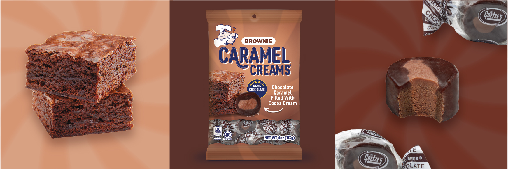
The packaging for Brownie Caramel Creams® received the updated logo, a flavor-specific color palette, and photo-realistic imagery that entices consumers yet retains brand equity. The on-pack callouts highlight the use of real chocolate in the confections.
Honey Bun
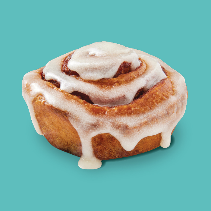
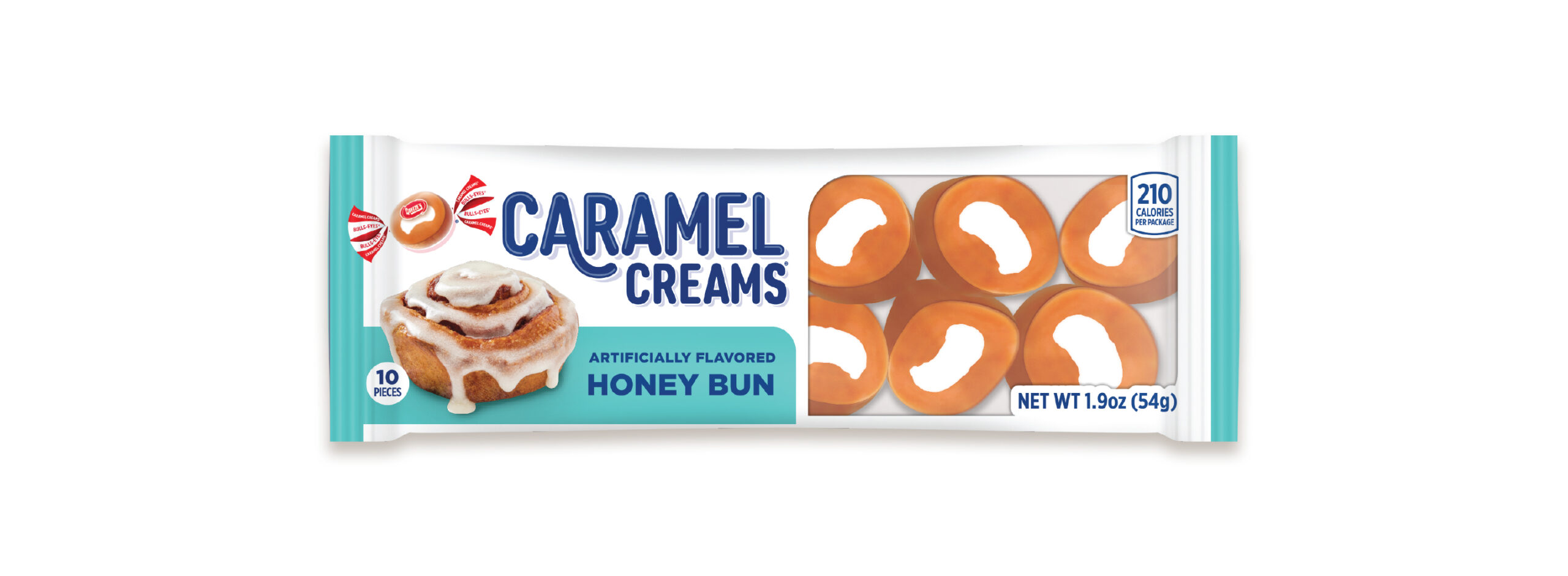
We used photography for the Honey Bun packaging to capitalize on appetite appeal and separate this Caramel Creams® SKU from Cow Tales®, the company’s more youthful sister brand that utilizes a whimsical illustration style.
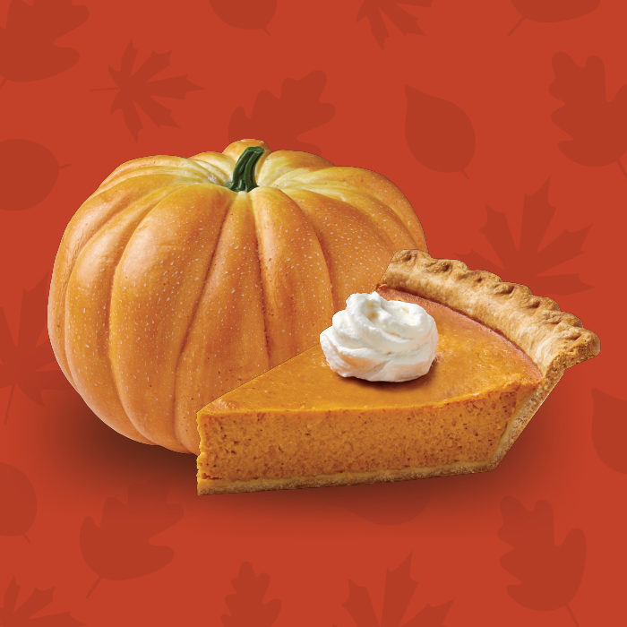
Pumpkin Pie
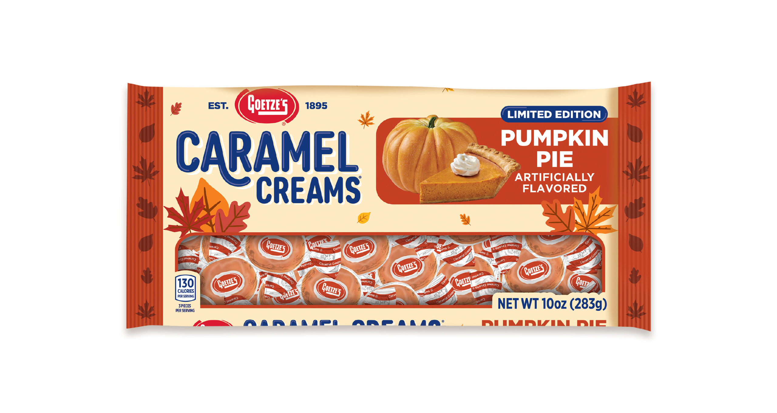
Accentuating the refreshed brand aesthetic with seasonally appropriate colors, food imagery, and leaf enhancements, we designed packaging for this limited-edition flavor that fit seamlessly into the Caramel Creams® lineup.