Counting Down Our Top 5 2020 Projects
A LOT CAN HAPPEN IN A YEAR (WE'RE LOOKING AT YOU 2020), SO HERE'S A RECAP OF OUR TOP FIVE PROJECTS FROM THIS YEAR
Simple Slices Organic Apple Chips
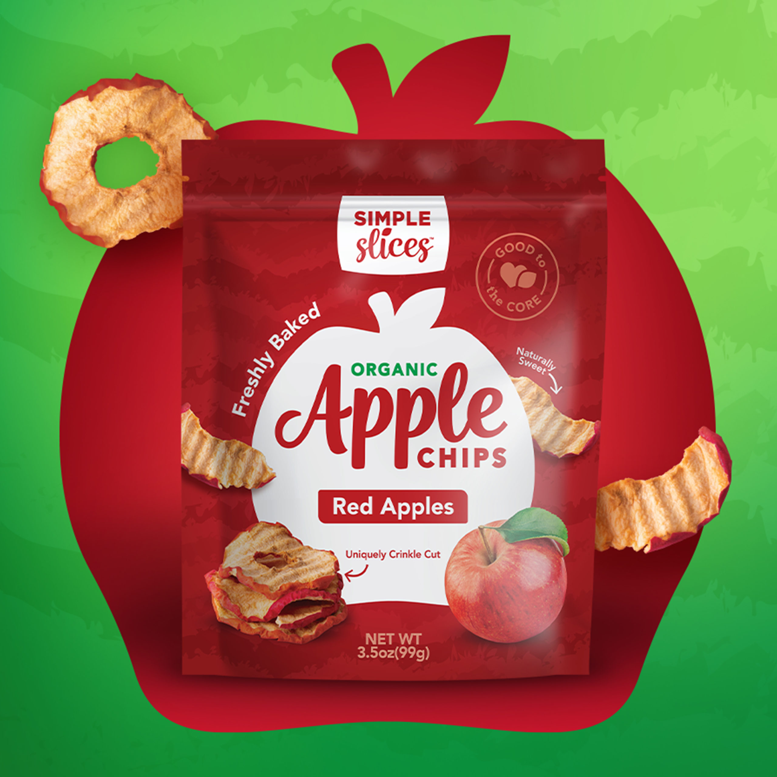
Part of the fun of designing packaging for food is getting to taste the product! These apple chips were unique with a crinkle-cut design that keeps them nice and crunchy when baked. Having sampled the product, we got to work designing. The organic apple chips needed a look that would reflect their straightforward, high-quality ingredients and maximize their appetite appeal. The end result is clean, simple, and looks delicious!
Ty Ling™
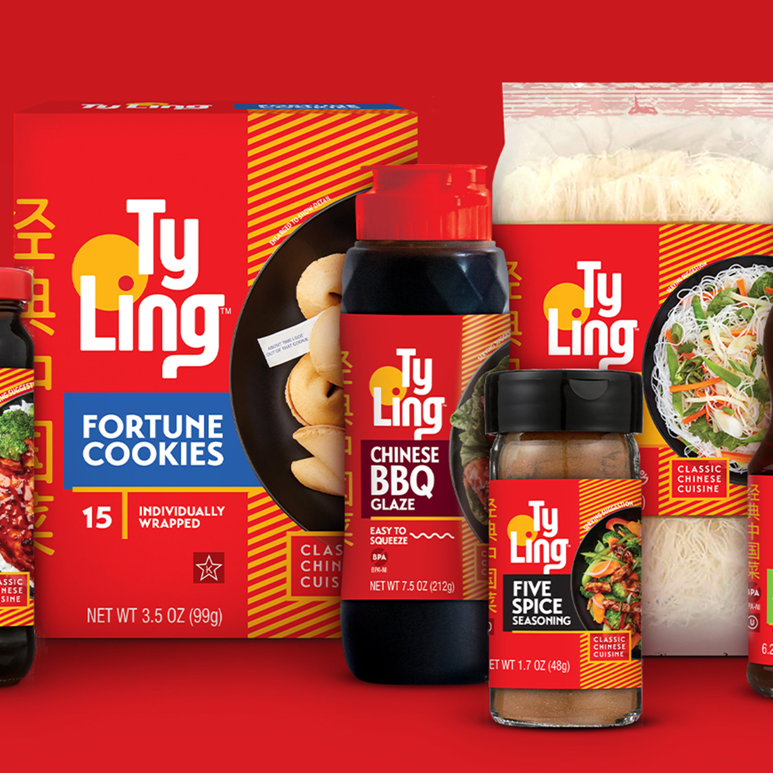
What a fun project! With so many items, we had a great time thinking about how to approach the redesign. With the classic nod to Chinese cuisine, we knew that we’d be keeping the brand’s colors of red and yellow. We brought in other fun elements like product benefit icons and stripes that represent a placemat to round out the brand, while also introducing accent colors to designate the different lines of products. We may be biased, but we are definitely loving the way this redesign turned out.
Gourmet Nut® Power Up® Premium Trail Mix
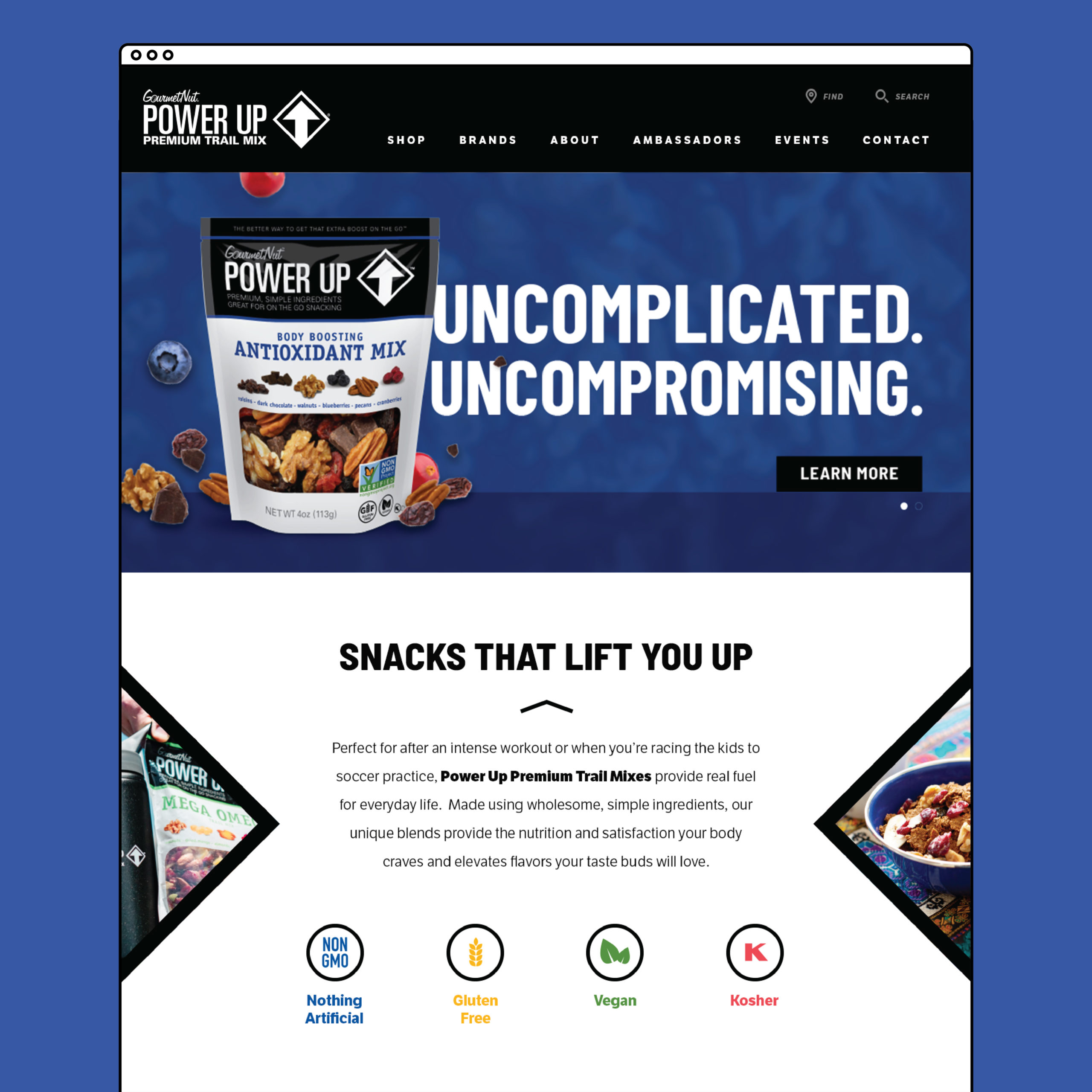
A website does a lot of heavy lifting for your brand and we were more than up for the challenge of figuring out the best way to showcase all of Gourmet Nut’s brands. Emphasizing Power Up, the company’s premium trail mix, the website’s look and feel follows the Power Up branding, but when users navigate to another brand’s page they are able to still get a sense of each individual brand. We invite you to go explore for yourself! Check out www.gourmetnut.com
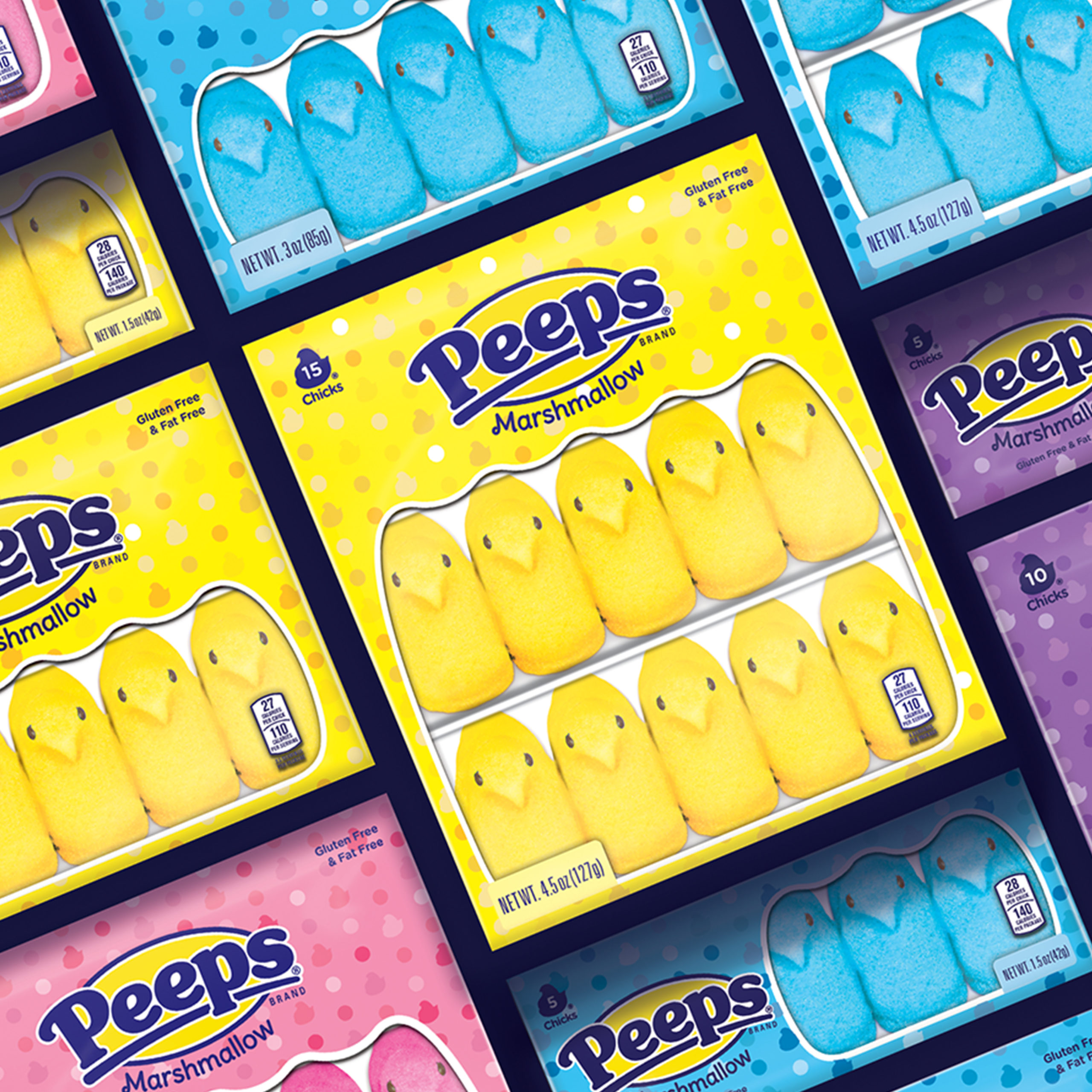
PEEPS®
The sweet treat everyone knows and loves! We were tasked with refreshing the everyday packaging for PEEPS®. A modern take on their previous Swiss dot pattern, we created a new updated pattern that includes the iconic Chick & Bunny shapes!
Whether you reach for classic yellow, bright pink, bold blue, or lovely lavender Chicks and Bunnies, we know that this redesign stays true to the brand while evolving with the times.
Goetze’s Caramel Creams®
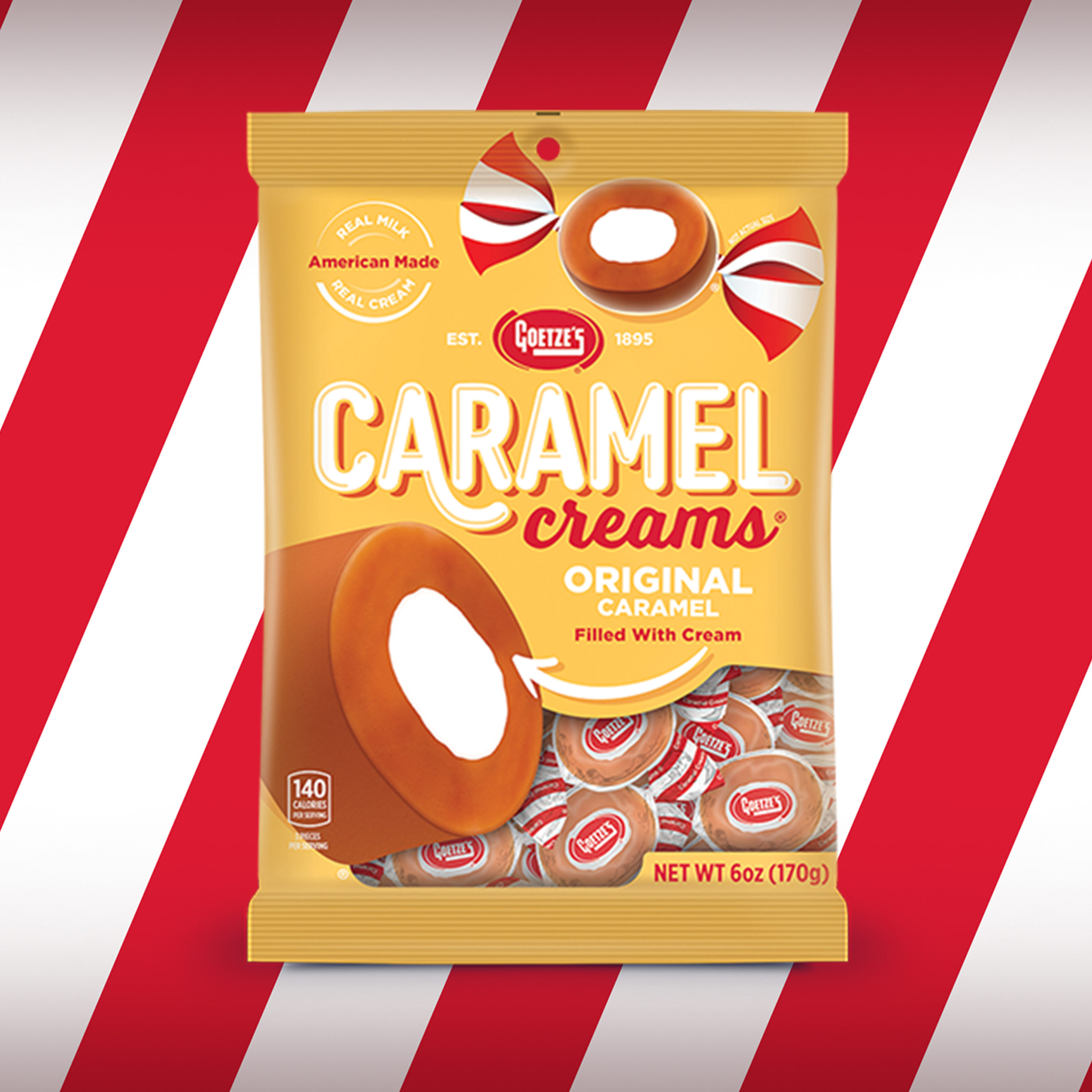
This redesign was equal parts nostalgia and modern-day whimsy! We kept the legacy branding of the iconic red and white striped wrapper paired with golden yellow packaging, but the instantly recognizable candy quickly became the star of the show heavily showcased on the front of the package (both wrapped and unwrapped).
A classic twist on what you love, this redesign delivers!
